Today we’ve had a meeting talking about various improvements for the game as a whole. One such thing we’ve been meaning to add for a while is a proper loading screen before the game starts up: on some computers the game can take a little bit to start (we’re working on making this quicker as well!) and so it’s really nice to be able to get confirmation that you actually pressed the button in the first place.
As such, we’ve decided to add a little splash screen followed by the customary Pixel Ferrets logo (as well as our sound design teams logos) before a (hopefully) short load screen will appear until the game has properly loaded. Adding the splash picture and the logos should give the game most of the time it needs to start up everything it needs, so adding those will likely come with the added benefit of the game feeling like it’s starting up a bit quicker than it actually does as well (haha..)
We’ve also made the decision to upgrade some more menus: you already saw our work on the Trophies menu redesign last week, and we’ll continue to work on giving most of the in-game menus an upgraded look that fits better with the game’s overall aesthetic as well as work better overall – some just haven’t been streamlined enough, or have issues with the game’s various translations. More on that later!
Another thing we’ve been discussing but won’t be added until later on, if at all, is lobby systems, where you can host your game in a public listing, allowing strangers to join you from the game menu itself. While this is a neat feature for players who don’t have friends playing the game and who do not want to join a community in finding players in a similar ping distance, we feel like people are managing just fine for now and that adding it would be better left to after release, if it’s even needed then. We’ll see!
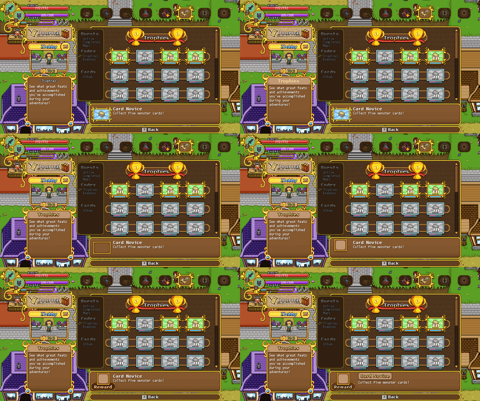
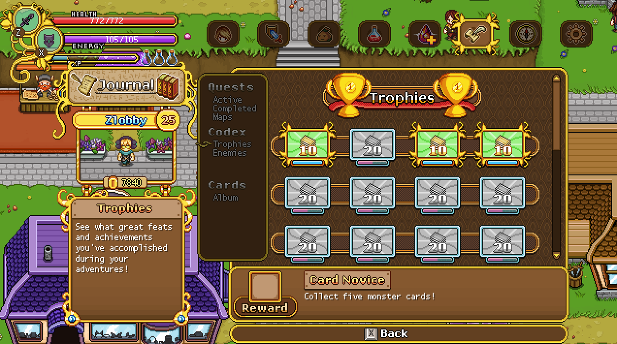
Now, let’s start work on some of the smaller menu improvements. In this post, I’ll mainly be looking at adding some flavour to the box on the left, where you can read a description of the part of the menu you’re currently in. With this new addition, you’ll get a more proper headline than the one in use right now, which is just more of the same boring white text.
We’re also adding a reward box to the trophies menu on the info box to the right, where you can easily see what you’ll get for finishing up the achievement in question. While this wasn’t totally needed, we felt it’s nice for people to be able to know the reward, so they can decide if they wanna pursue a specific trophy over the rest.
In that same box, we’re also adding another proper headline – although we’re not entirely sure it’ll look in this exact way yet, since it takes up a lot of space and we might need all we can get in order to fit the lengthier descriptions.
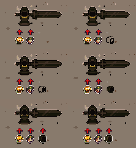
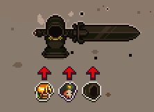
As a bonus, while I’m in the world of interface, here’s a little GIF featuring a battle indicator used for Bishop’s boss battle:
Okay, so time for us to take a look at that loading screen I mentioned previously! First of all, here we have the splash art that will appear before anything else. This won’t have the ‘windowed’ look, but will simply appear for a short while before the actual game window pops up:
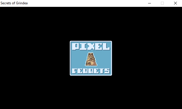
Once the game window starts, you’ll be greeted with the familiar Pixel Ferrets logo, as mentioned before:
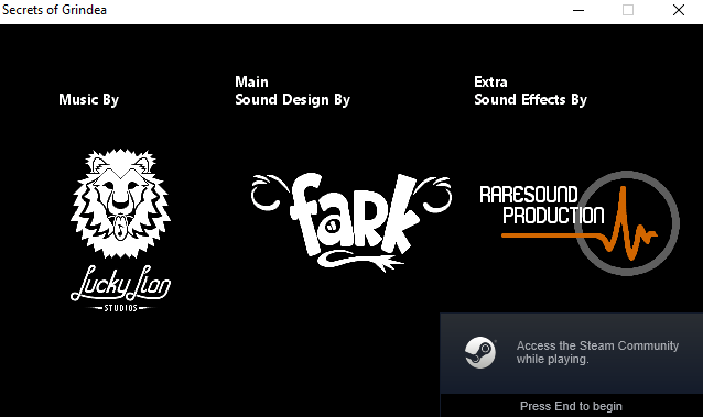
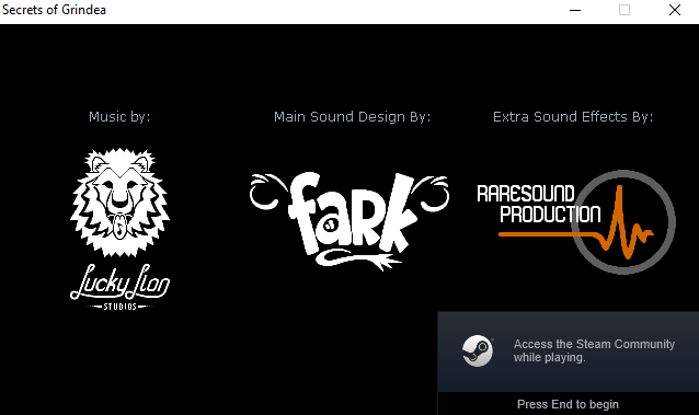
Followed by the three teams that have helped us bring the world of Grindea together in terms of sound effects and music:
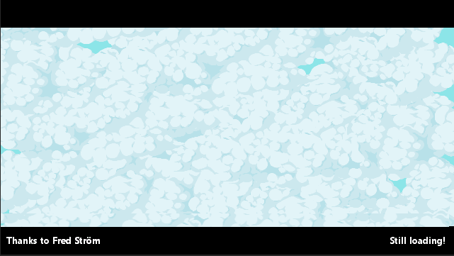
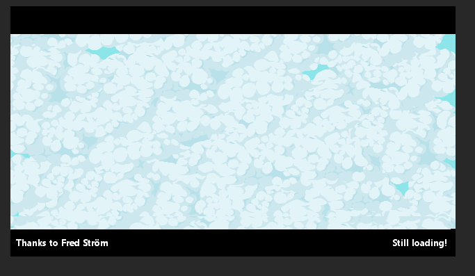
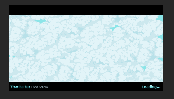
Once that is out of the way, you’ll be greeted with the actual load screen. It’ll start like this, completely covered in clouds, but once the game finishes loading, the clouds will part ways and the pre-game menu will be revealed. To the left in this load screen, we’ll also have a random backer’s names show up as thanks for helping us get this far:
A gif showing how it all plays out once the actual game window starts can be seen here (although my computer already properly loaded the game, so there’s not much of a load screen going on here haha):
Now, some of these things are a bit placeholder-y, one of them being the fonts and overall design of the texts used. For example, I’m not too fond of the readability in the sound design teams part of the load screen, with it being on two rows and a bit hard to read overall:
So I made a couple suggestions making it look a bit more streamlined and less in your face:
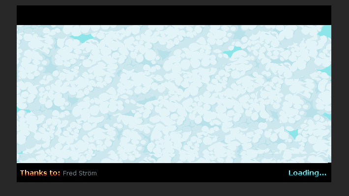
For the cloudy load screen part, there was a bit of a font issue as well. Here’s what it looked like before:
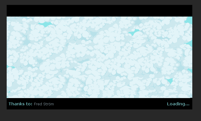
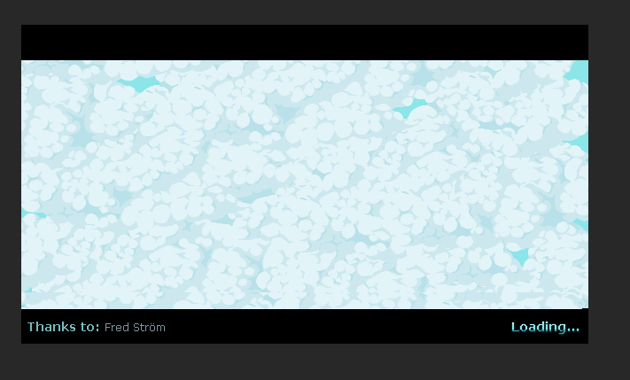
And here are some suggested improvements, with this first one being my personal favourite (although we haven’t made any final decisions regarding which one we’ll pick yet):
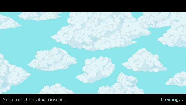
Finally, with this new load screen appearing, I felt like the old in-game load screen between areas look a bit lame (it was one of the very first things we added to the game, after all!) so I made a little mockup of what a new version could look like, tying back to the pre-game load screen we’re implementing right now:
The text on the left will be replaced by the usual gameplay tips, I just didn’t have them on hand so I picked a random rat fact for now! The idea is that the clouds will be floating slowly across the sky, with possibly the occasional bird flying across – although hopefully the game won’t load for so long between areas that you’ll have to spend any longer amounts of time looking at it haha!
Meanwhile, Fred is working on adding and animating some new NPCs, namely the priest and apprentice that will appear in the church in Port Monnaie, as well as giving Bokus the ability to read and turn the pages of his book:







My game doesn’t respond to double clicking the mouse(steam shows to start the game, and then the window closes without any prompt. There is no problem using the game integrity verification.), Higher version of xna4.0 (integrated in win10 20h2) is installed.Net framework 4 installed (in integrated system)