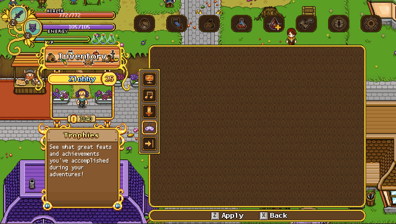
Moving on with the interface improvements, we’re not gonna take a look at the options menu! This one is the most basic one, but also the one in the most need of a slight upgrade in my opinion:

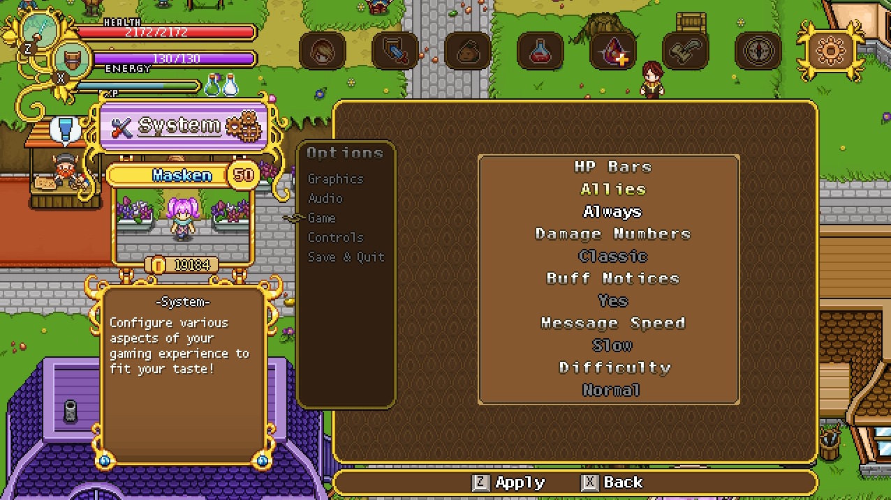
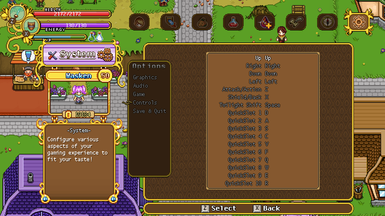
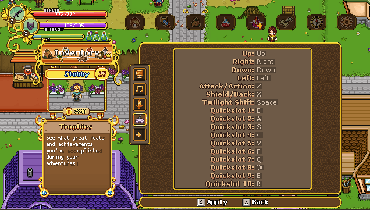
A bit more clear? We’ll continue working with this a little bit more… So in the same vein, the controls menu:

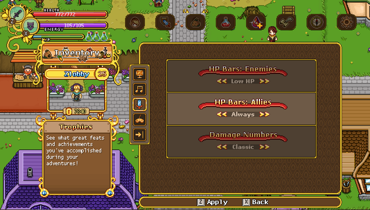
Next in our quest to make things a bit more clear and easily read, we decided to make a version of the options menu featuring screenshots (not that the ones provided below are samples to showcase the general design):

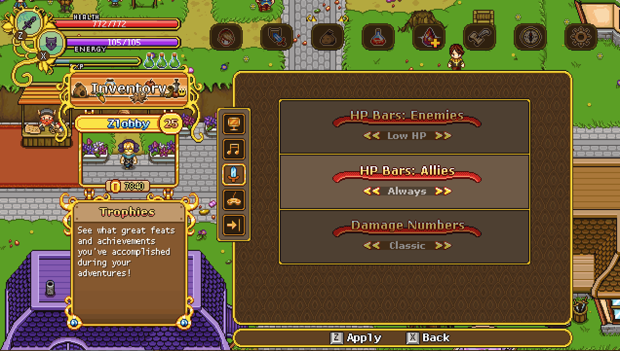
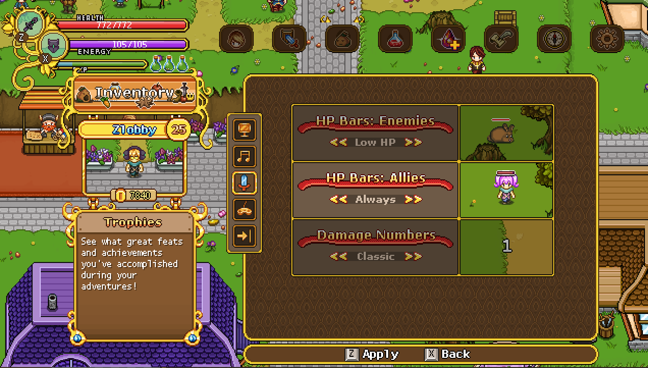
This way you’ll more readily see how your various settings affect the game without having to close the menu and trying them out for yourself!

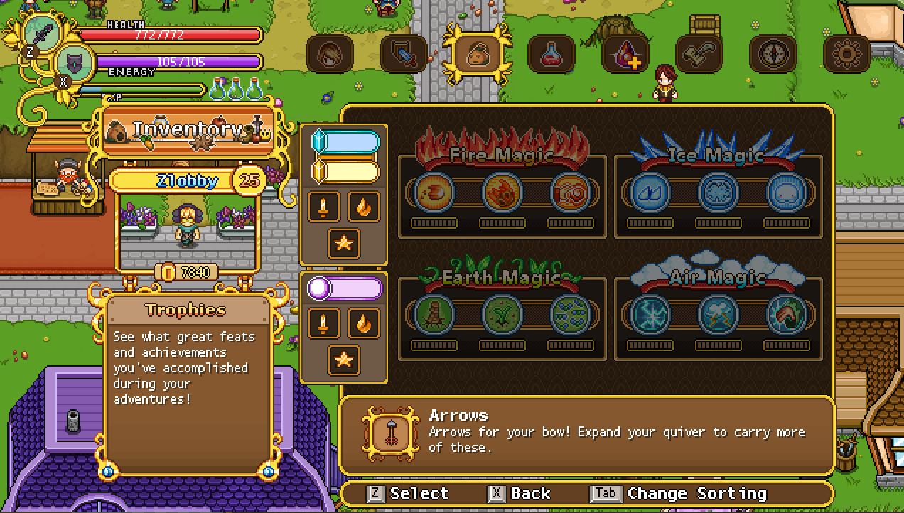
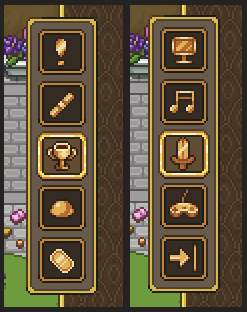
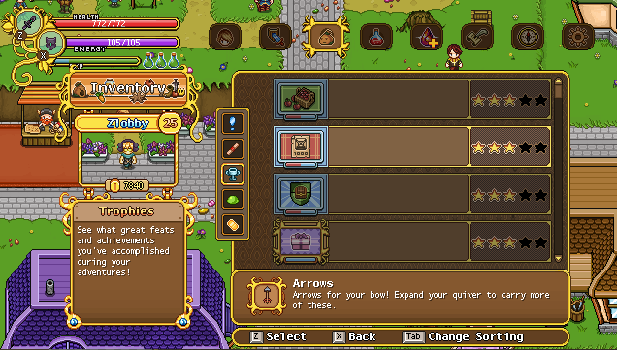
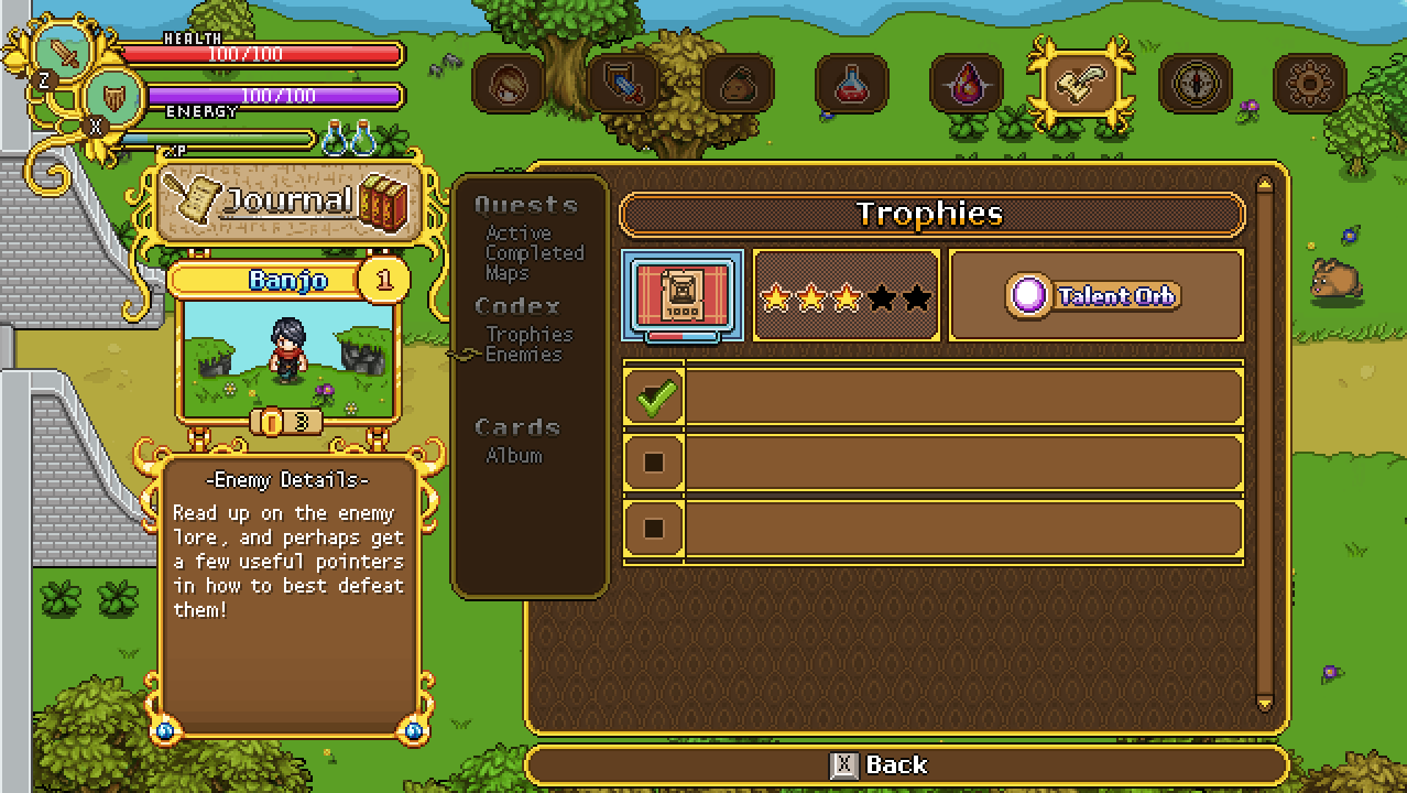
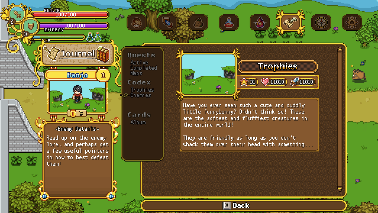
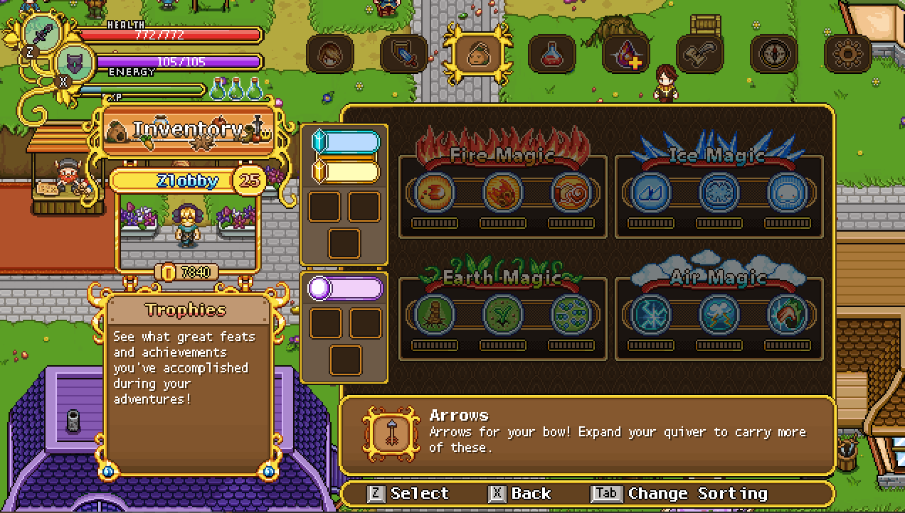
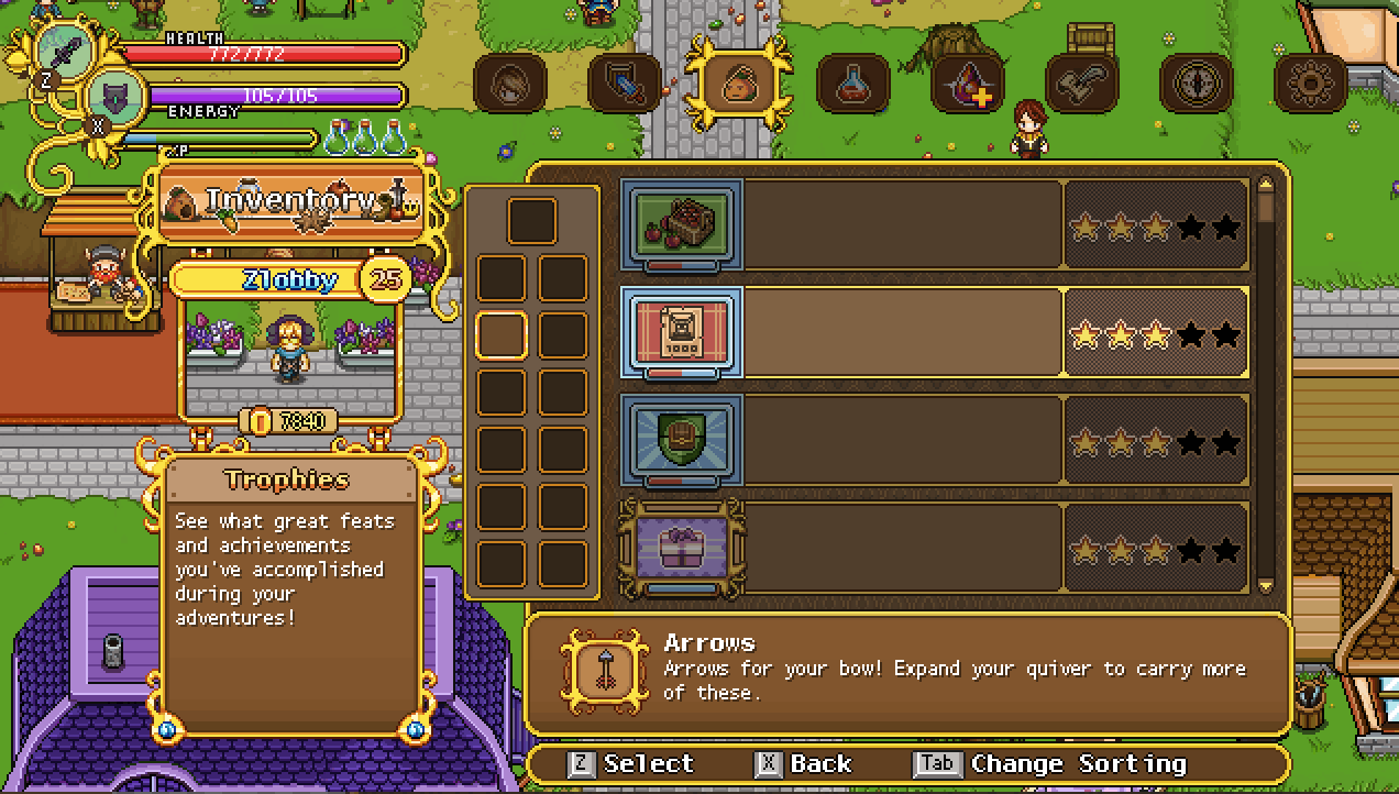
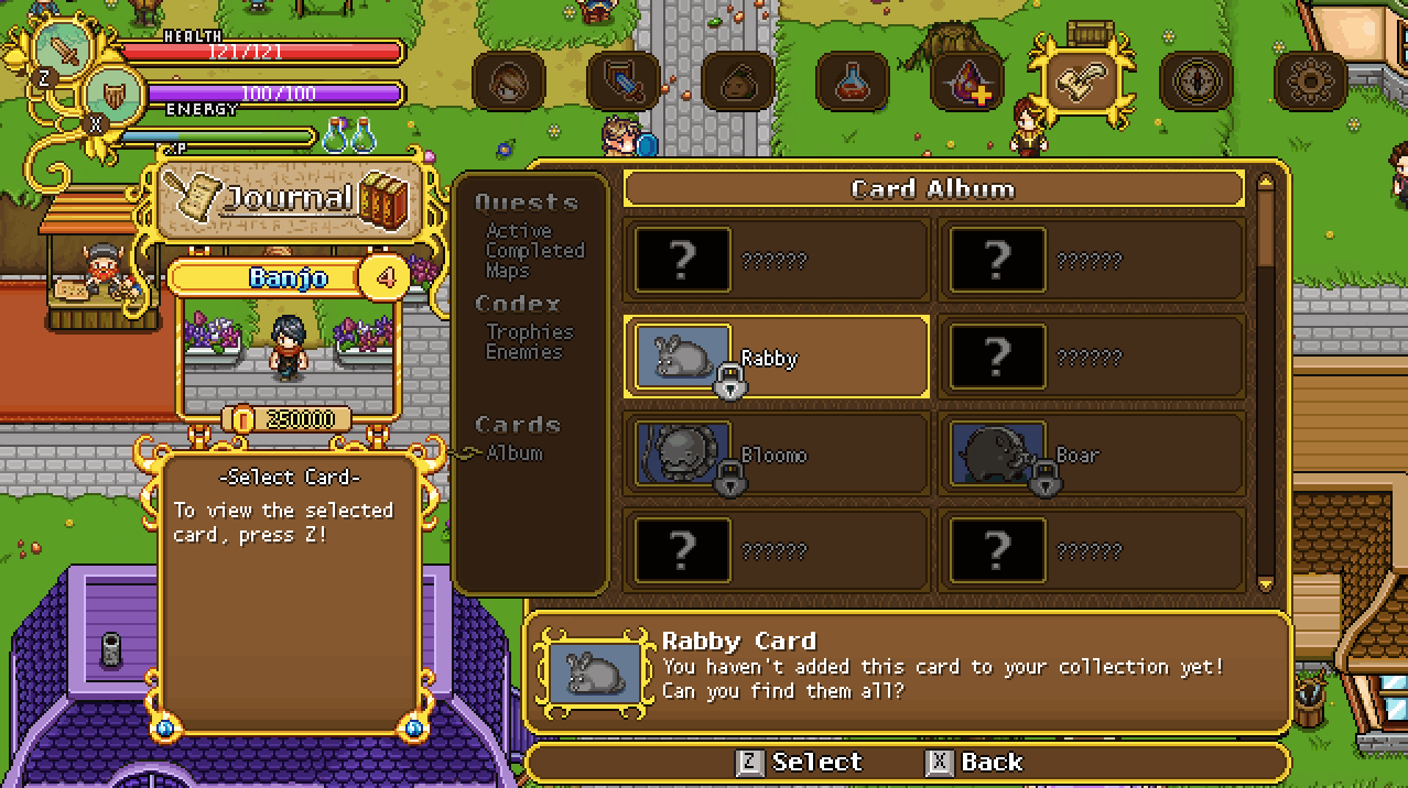
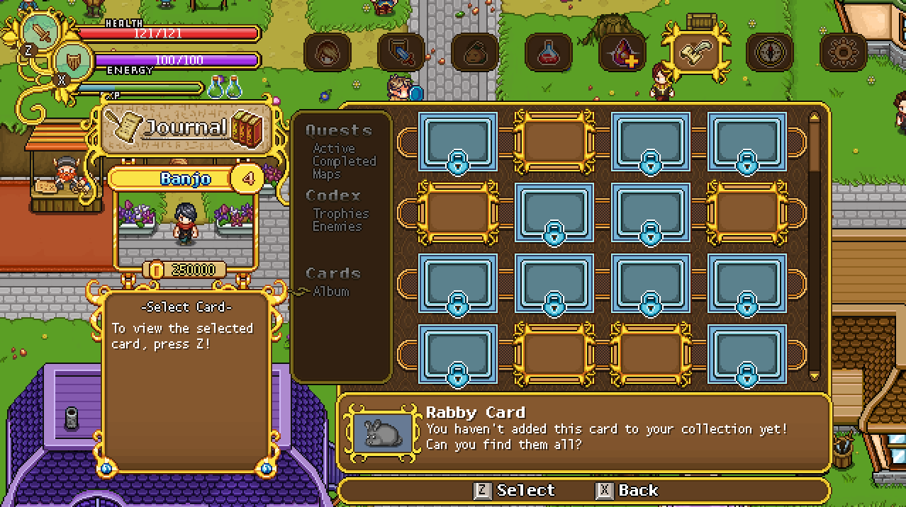
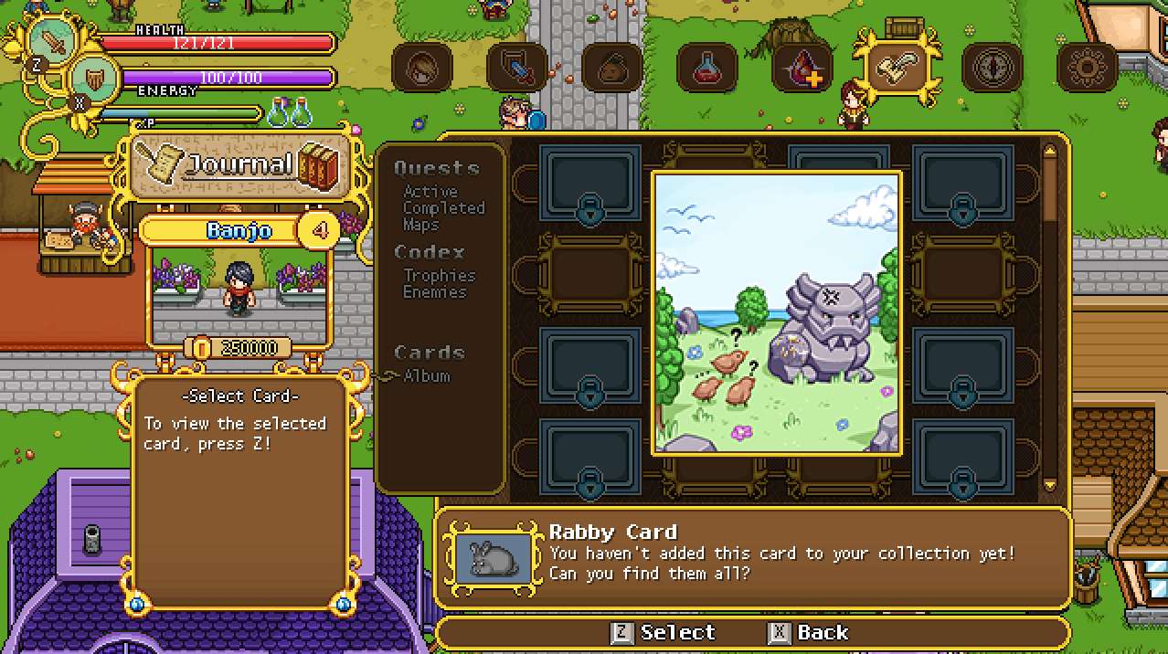
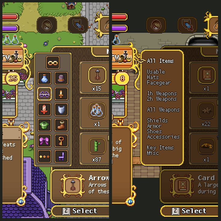
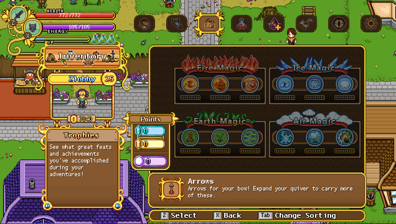
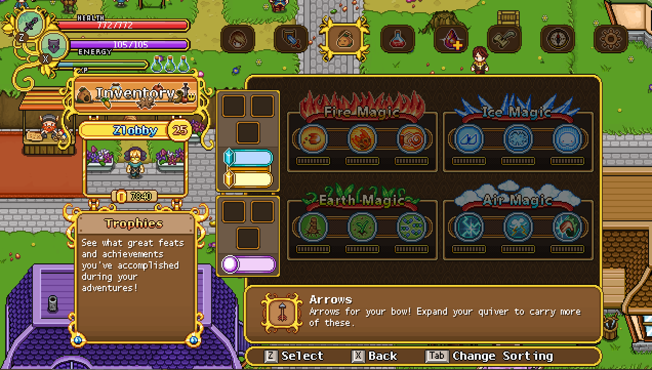
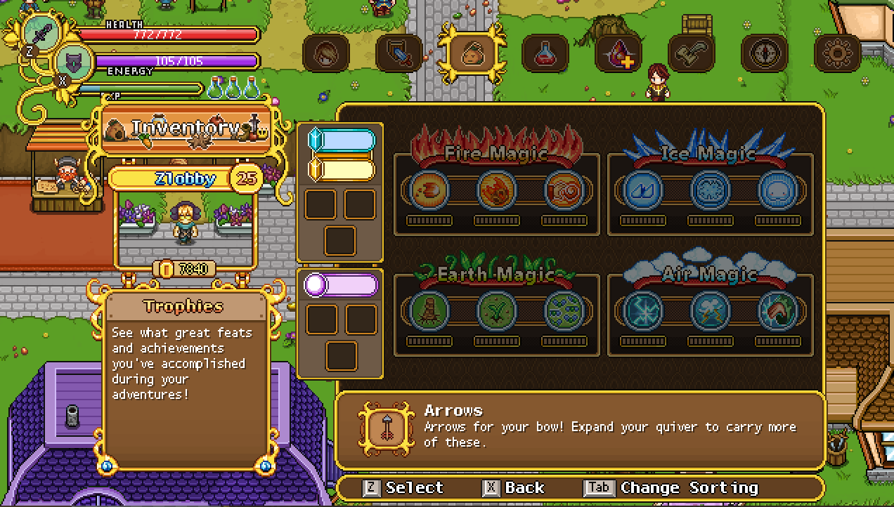
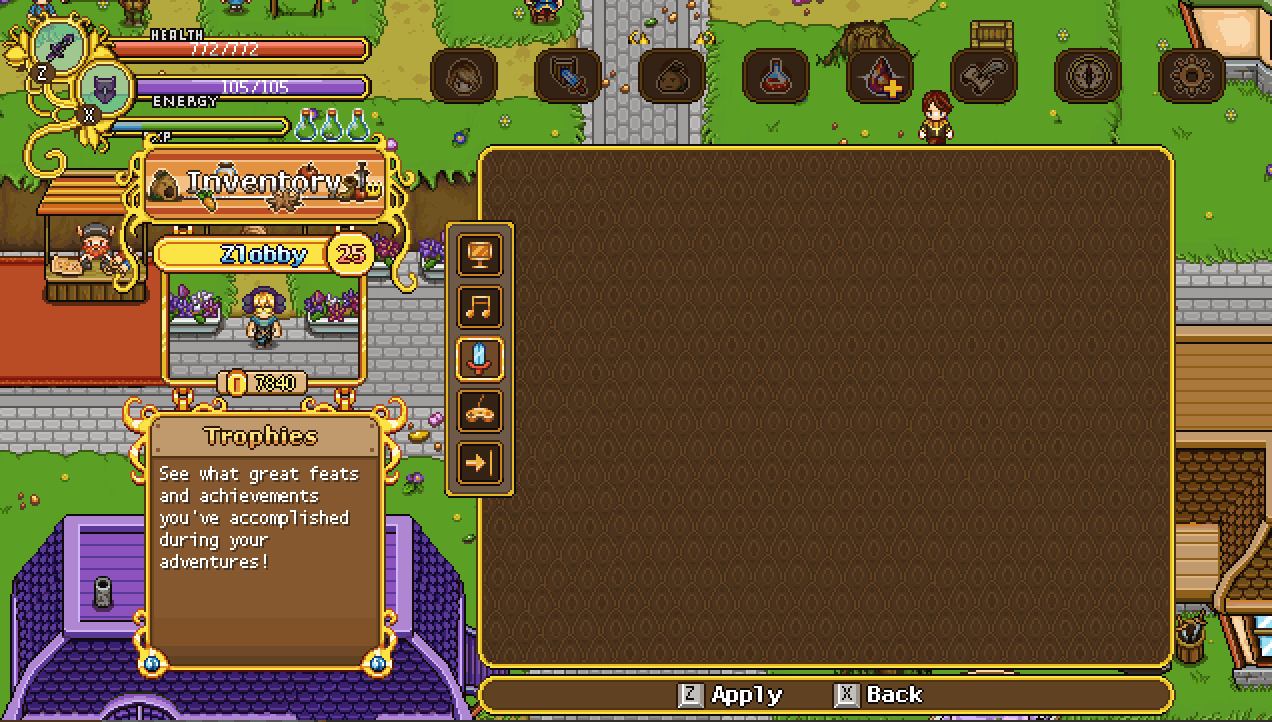
With us deciding to go for the icons rather than the text versions, it’s time to make some slight adjustments to the designs of the journal section, where the icons will only be in a single row:

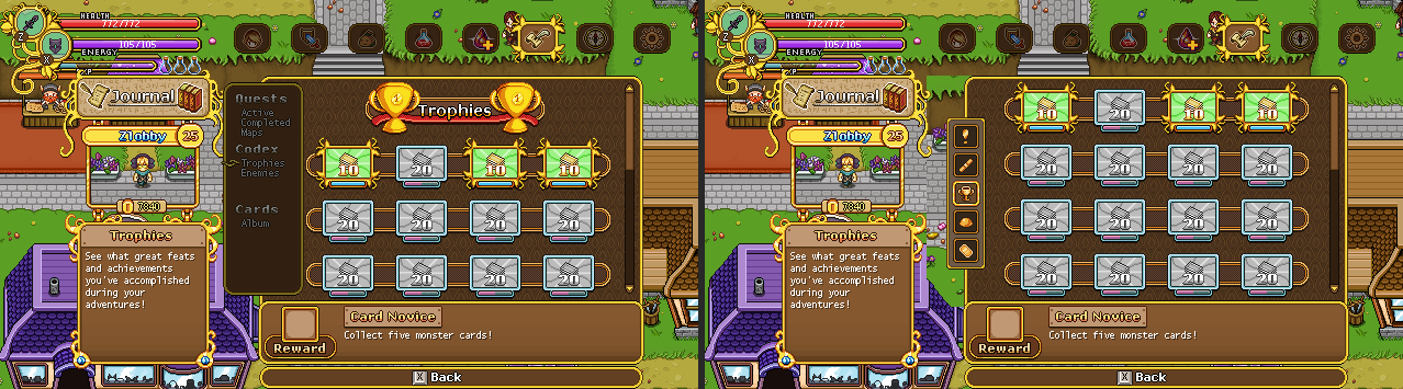
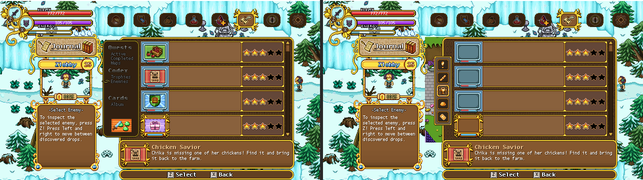
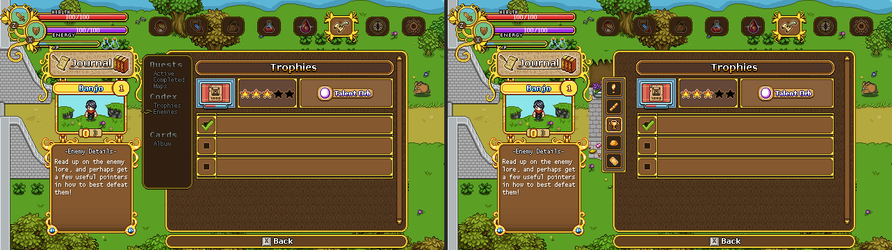
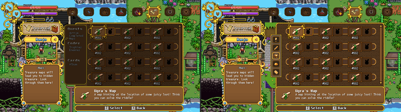
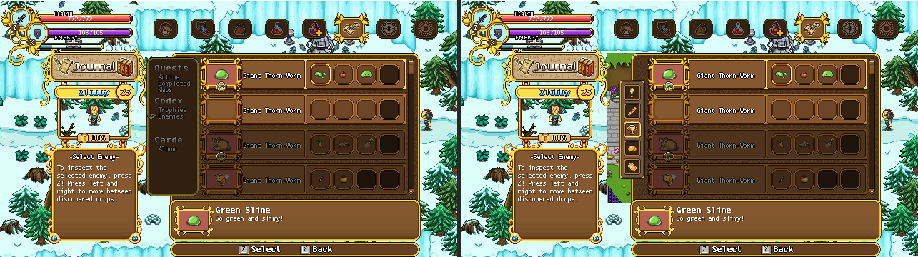
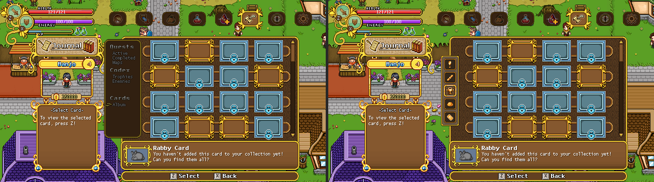
Note also the changes in the Trophies section, where we’ve decided to do away with the title part, making it fit the other designs a bit more!

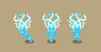
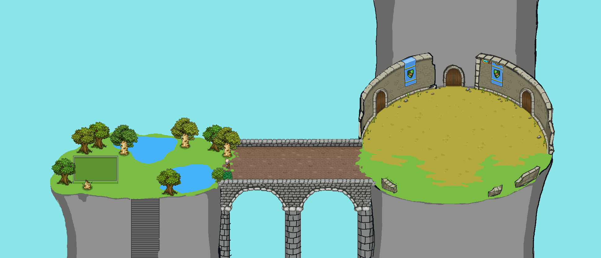
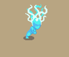
Meanwhile in Fred’s department, we have some more sneak peeks of what to come: more grindea fighting and some desert fishes for the aquarium!

Next up, we’re playing around with some other types of icons for the Talent & Skill menu, with a magic orb as the magic indicator and a star for the utility icon. We’re also considering a third option for the magic icon, with an old diagonal wizard staff. What do you guys think?

Now, time to give some more of those icons a colour wash! Here they are in their before and after states:

And now, time for the next menu to be redesigned: the quest info pages! Let’s have a look:

With the text menu being replaced by icons, we wanted to make a more easily read headline available on the left side for each category, so it’ll be quicker to learn which one does what. Currently, we’ve only had a headline for the main category, such as ‘Journal’, with the character box beneath it and another info box below that – however we feel like it’s very rare for people to even pay attention to what’s beneath the character box, and so moving things around might make the menu a bit more easier to understand. Hence:

I wouldn’t say it looks quite as nice graphically, but I do agree that this way it’ll definitely be easier to see and understand what category you’re on. What do you guys think?

Meanwhile, in Fred & Teddy’s corner, Fred’s been continuing on with Grindea animations! Here’s another sneak peek of that, featuring a running animation:

Teddy has also been hard at work, and besides more Arcade Mode stuff, he’s been spending some time optimizing the loading times of the game! Take a look at this before and after:


With these optimizations, we hope a lot of loading times will be removed, giving you a much more smooth experience while playing the game :)

Taking a little break from the menu reworks and looking towards the future, it’s time to start playing around with sketches and designs for the final dungeon!

Here we have a very basic sketch of the first floor, where you’ll fish and solve a puzzle before battling a ton of Teddy & Fred’s on a really long bridge (it doesn’t look long here, but it’s just placeholder – the actual version will be a lot longer and porbably loopable!) and ending with an encounter in a rather arena looking place:

Very excited to finally take the first steps to getting this final dungeon up and running! :)

Next, let’s make some icons for the skills & talent menu categories I was playing around with last week! I started off pretty basic here, giving melee a sword, magic a wand and utility a shield – however, we’re not completely satisfied with these, so I’ll play around with them a bit more and make a couple more options!

First though, let’s have a look at the Journal icons! For this part of the menu, I decided to go with a single column version, as it’d look better to fit five icons on top of each other rather then going for a 2-2-1 layout in my opinion! If we decide to go for this, it means we get a bit more space in the journal entries as well, which will need to be adjusted later on:

And now, some icons for the options section! As with the journal part of the menu, these needed 5 icons as well. Let’s have a look:

Alright, so what next update will be all about is Arcade Mode, and one key part of that is adding some new challenges for you! If you remember, I made some background stuff for an archery challenge a while back – now it’s finally been implemented, so let’s have a look!

Teddy has also been playing around with a little quiz mini game, which you can see the prototypes of here (there are two types of questions currently):

Of course, I’ll make some background details for the teacher so she’s not just standing in the middle of nowhere, but it’s nice to see some more challenges be up and running, making the coming Arcade Mode runs more interesting!

Now, one thing we’ve decided to do for our translators is to provide each of the shop title backgrounds without the text, so any translator can make their own names for the shops. As such, I spend some time removing said texts and making a bunch of PSD files for them:

(Ignore the Egg Shop one in the middle, accidentally added the text version of that!)

I’ve seen some of you have already started playing around with these backgrounds and I gotta say it’s really fun to see! :) If any of you are working on translations, this feature should be up and running right now. If you decide to use it, please feel free to share your work on any of our communities (such as our Discord server) so we can see! :D

Now, time to get back to those interface upgrades! Next up, we have the card album, which we’ll streamline a bit and upgrade the graphics of as well:

Like the new maps, we’re also playing around with having the cards displayed as a popup rather than on a page of their own too:

One thing we’ve talked about a lot recently is whether or not to remove more of the menu text and replace it with icons. As you know, and can see again below, we’ve already started work on replacing the menu text with icons in regards to the inventory categories:

In many ways we do prefer this, as it’s a bit more visually pleasing and makes things easier when it comes to translating the game. But for some categories, it can be a bit tricky to come up with a satisfying layout and icons that represent their category well: with text you always know what category you’re on, while it might a bit less clear with icons. We still haven’t really decided what we’re gonna do, but I’m gonna play around with some alternatives for the remaining parts of the menu in the coming days.

What do you guys prefer generally? Icons or text?

Either case, it’s time to start experimenting! I’ll begin with playing around with the Skill & Talents part of the menu, and here we have two different alternatives for the layout, as well as the progress:

No icons yet, as you can see, but we’ll get there! To start with I just wanted to get a better grasp of how the icon categories could look. What do you guys think?