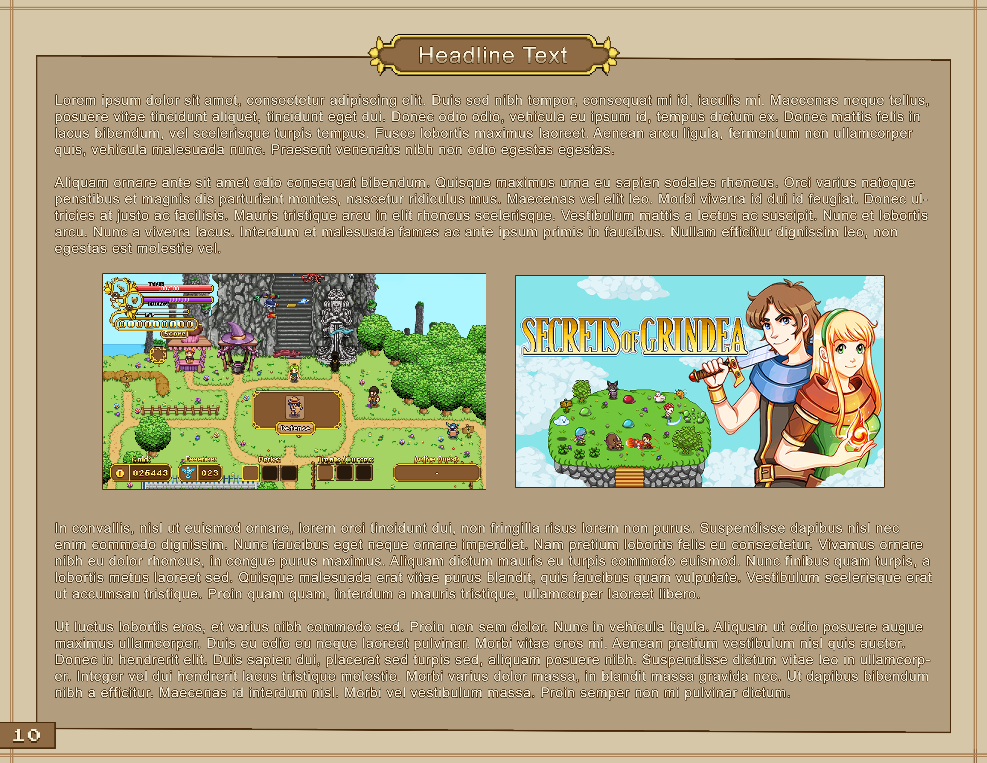
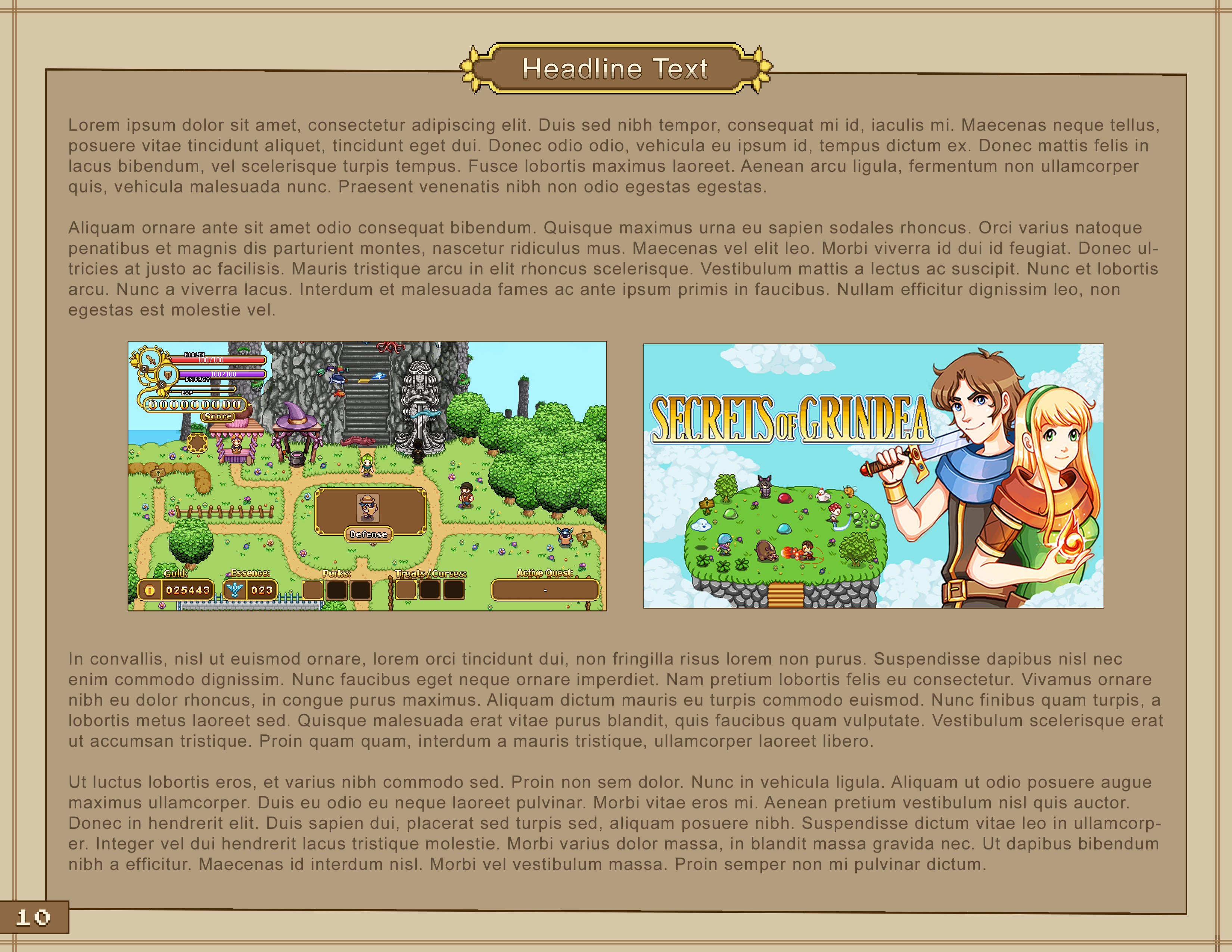
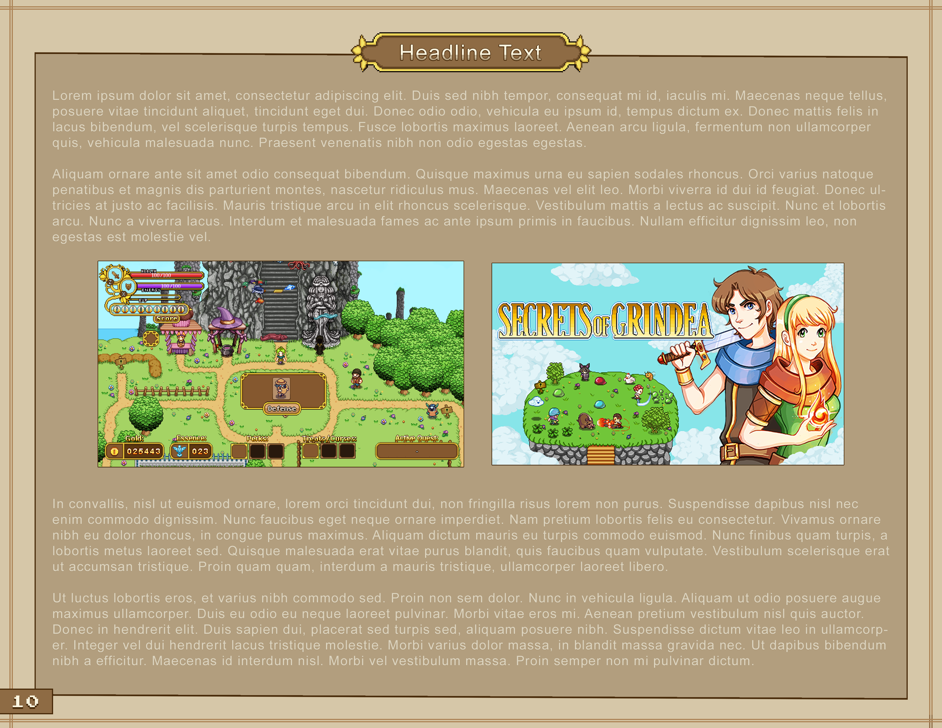
Work on the cutscenes continue on this week! Cutscenes are one of those things that take the longest to make, both in terms of programming and animation, and there’s sometimes not a lot to show for all the hours put into making them work – especially when they’re filled with so many end-game spoilers as these are (we are, after all, working on the very last bunch of cutscenes for the game). It’s difficult deciding where to draw the line for how much to show you guys on the blog. On one hand we really value your feedback and want to show you what we’re working on, on the other hand it kind of (literally) spoils certain surprises. Since these are the last bunch of cutscenes and show pretty much how the game ends, we’ve decided to not show much progress from these. Because of this, the blog posts have been pretty short as of late, and I hope you can forgive the lack of juicy art and progress videos. At least this journey is soon coming to an end, and you’ll be able to see all of the cutscenes in their full glory as you actually finish the game! :)

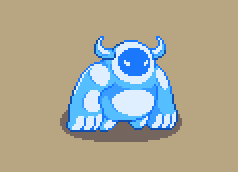
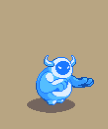
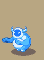
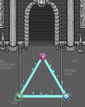
For now, here’s a couple of effects that won’t tell you too much about what’s going on story-wise:

Meanwhile, I can recap what’s been going on with the Visual Novel we started working on ages ago!

I’ve actually finished writing the outline and have let it rest for a while to make sure I catch any problems I didn’t see when first putting it together. The working title for the project is Tales of Grindea and as of now it’s a pretty short visual novel companion piece to Secrets of Grindea which explores the world through the eyes of a collector and a newly created sentient artefact. It’ll have six chapters, of which the first serves as an introduction to the world and characters and the last is the conclusion where your decisions throughout the story decide which ending you get. As I write this, I’m in the progress of writing the actual chapters, so wish me luck on that! :)

First of all, thanks everyone for your input on the fonts last week! We hear you and we’ll continue to try our best to make sure the book will be as readable as possible! :)

As for the actual content of the production book, last week I made the decision to start cutting out a ton of stuff from the production book in order to make it more about art and the interesting bits and less about long texts and too much dry information.

While the previous outline had over 85 categories, I’ve now narrowed it down to 18, which I intend to be about one page each:

While most of these texts have already been written, they’re still way too long and will need to be cut down and polished a lot before I’m happy with them. I am certain this is the right decision though, making the whole book a lot easier to digest as a reader.

Aside from the 18 or so pages in the outline above there will be an undecided number of images from the production with comments on the progession.

Fred and Teddy, meanwhile, continue working on the cutscenes! Each cutscene needs a bunch of animations to make sure what’s happening is properly conveyed visually, so there’s a ton of work to do there. Here’s a couple of the animations Fred’s been working on for those cutscenes this week:

This week I’ve continued to focus on the visual aspects of the production book! Even with the general style decided upon there’s still a ton of smaller details to take care of, such as picking fonts and proper colour schemes. While it might seem trivial, it’s in fact extremely important since it determines if the book is comfortably readable and whether it’s visually pleasing at all.

Below you can find a few mockups with some of the fonts we’ve gone through:

Our current favourite is the third. Which one do you prefer? :)

As I’ve been going through more art and game books I’ve also come to the realization that I need to cut more of the original text than I initially thought. I don’t want the production book to drag on with boring details, instead I want the focus to be on the process as a whole with as many pictures as possible and short and succint comments rather than whole chapters. Perhaps I will change my mind again, but for now it seems like an overall better approach for a project like this.

As a result I’m currently going over the text once more with the scissors, trying to polish it down as much as possible!

Fred, meanwhile, has continuined his work on the Frosty Fiend, which now has a proper spawn animation, death animation, roll and soon (!) an alternative attack animation:

Teddy has shifted focus from the boss battle to work on some cutscenes between the two major battles, as well as the cutscenes surrounding one of the endings. This week the both of them will likely team up to finish up those cutscenes, with Teddy requesting animations for the cutscenes whenever he feels he needs one.

A new week, and more Frosty Fiend progress! He has, as of today, one regular attack (he will get another one, but one is enough for now to just test how it feels in-game), then Fred made a “hulk smash” for a potential special attack. It was a bit tricky as the pose was a bit difficult to get right but after much fiddling and reference checking, it worked.

Fred has also made a cannonball dive for him (he was first going to have a regular dive but he soon realized the cannonball felt more appropriate). He thought he would be extra smart here and just use the hulk smash pose straight away and just adjust the arms, but realized quite quickly that he needed to redraw everything for it to look nice. It went smoothly though! Nothing is 100% finished-rendered at this stage, but it’s taken far enough that one can test it in-game and get a fair idea of how it will feel.

Teddy has also continued with Frosty Fiend. He has tinkered together a (nearly finished) test for a snowball attack where the Fiend throws straight ahead instead of lobbing (which is what he has done so far). This way he has equivalents for both the snowball attacks we have previously used back in Seasonne through the snowball-throwing Scroundrel!

As for me, I have gone through more art/game books to get ideas and inspiration for the layout of the production book and made a ton of different design mockups before settling on something like these:

We are still evaluating what type of text design will be the best in terms of balance between readability and aesthetics, so it will probably change a bit before we are completely done:

Which version do you prefer so far?