This week has been all about finishing up that last bit of Arcade Mode stuff, for me (Vilya) anyway!
That means a bunch of new items have been made that will be available as various rewards, some of which you can see here:

These are, in order of appearance:
* A phonograph that let’s you change the music in your house
* A hat in the shape of a cloud
* A trinket thet lets you have a Lood as a pet
* A trinket that lets you levitate
* A trinket that makes you look similar to Grindea
* A cursed figurine that makes things in your house levitate

I’ve also been working on ways of showing how many catalysts were active during any run on the high score list, which for now looks something like this:

Now it’s back to Story Mode stuff for me, while Fred and Teddy will remain doing a few more things to finish up Arcade (and a ton more bug testing)!

This week has been mainly about bug testing and the fixing of found bugs, as is pretty standard after a new frontline patch! But we’ve also been working on one of the remaining additions to Arcade Mode, and this is something that will be available in Story Mode as well – the statue shop!

You’ve already seen a bunch of the statues made for this shop, but now it’s time to add some more:

And here’s all of the currently available ones:

Of course, these statues will need smaller sprites as well, to fit in the menu and shop interface. Let me tell you it’s quite a challenge making smaller versions of these guys, trying to make them as clear as possible without going over the size restrictions!

Finally, the statue shop needs its own shop graphics, so here goes:

Next week I’m gonna finish up the remaining items and sprites needed for Arcade Mode! Stay tuned :)

As you may have noticed in previous images of the seed system, the Jumpkin was missing from most of it! Therefore, let’s start off this week by making all of the Jumpkin stuff, including a new drop for the Jumpkin, replacing the pumpkin seeds it dropped previously (it’ll now drop a singular seed, which looks a bit different, which will let you plant it, but it’ll also drop a jumpkin stem)!

There’s also a menu button for the seed system store, which can be seen below as well:

Time for the final veteran portrait, this one featuring the lady with the giant hammer! Let’s have a look:

Now it’s time to make a little redesign of the enemy codex! As mentioned, we’re going to redesign most of the menu, but the enemy codex is the one we’re aiming to actually get into this patch as opposed to a future one, as it will show information on which enemies drop seeds!

Here’s what it used to look like:

And here’s the process of the redesign:

As you can see, we can now fit twice as many enemies on every single page, giving a better overview of each enemy and what it drops:

We’re not 100% this is the iteration that will make it into the game yet, but at the very least, it’s a start! What do you guys think? Better or no?

Continuing with a couple more iterations of the codex, these ones have fewer details for more readability, and some bigger spacing:

Which one is your favourite this far?

Meanwhile, Fred’s been working on some fun stuff, including a little cloud that will water those growing plats for you, and Grindeas idle animation! How cool is that?

Now that the month has drawn to a close, it’s time to do a quick recap of what’s left for this patch, especially what we want to add to frontline (which is out already, by the way!!) and what we’ll save for stable – so it was high time for another meeting!

One of the things we’ve been talking about has been the boss drops. Right now only a few early bosses have boss drops, which aren’t even dropped 100% of the time, which is a bit weird even now that we’ve added boss rebattles in the arena. We had two options for this – either remove the boss drops altogether or let the boss drops be at 100% and add some more to other bosses across the game. In this case, we decided to go with the later, adding a bunch of new boss drops, including a seed allowing you to grow a Power Flower inside your house, an evil eye mask dropped from the evil eye in the ghost ship, a thorn worm cap allowing you to wear thorns on your head, and a cog shield dropped from the toy machine in Seasonne!

The Power Flower Seed brings us to the next topic, which is a plant system where you can plant seeds and have them grow in your home! How this will work is that you’ll find a seed, dropped from various plant enemies, and if you take the seed to the tree in Seasonne he’ll put it in a pot for you, which you can then place in your house. After some time, the seed will turn into a full grown potted version of the enemy you got the seed from. While this completed system won’t make it into this frontline update, we’ll start it up at the very least.

For the stable update, we’ll be adding Penn Wrythe’s novels, which will appear throughout the game in parts. After meeting her in Port Monnaie you’ll get to influence the way the final part of the story turns out, so think about your answers carefully! We’ll also be adding the cellar beneath the church in Port Monnaie, as well as a bunch of old books here and there across the game.

We discussed whether to add the player scaling feature yet or not, but we’ve decided to save that for another update – possibly the one after this one, where we go back to focusing more on Arcade Mode again.

Now, time for some last minute additions, starting with the final arena award, the arena hat:

Adding some backgrounds for Bishop in the journal, as well as a background for your character when they’re in Bishop’s own little realm:

Here’s something that won’t appear in this next patch, but is important to start working on anyway, namely our continued rework of the menu! In this step you’ll see me making a new layout where we’re removing the text titles of each inventory category and replacing them with icons (although the actual icons haven’t been made yet):

And as an additional bonus, a sneak peek of what Maracus Skill-to-Talent transmute looks like, complete with the awesome song made by our amazing music creator Andrew Riley of Lucky Lion Studios! Look at the old man go :3

Since we decided to make a bunch of new boss drops as well, I better get to work making those! Here’s a Power Flower seed, an Evil Eye Mask, and a Thorn Worm cap:

I also went ahead and made the drop appearance of the power flower seed all grown up for its place in the housing system, although you won’t be able to use it just yet (next update, maybe!)

Finally I was a bit cheeky and made my own suggestion for what the Toy Factory’s shield drop could look like, although it’ll most likely be edited and adjusted a bit by Fred:

And finally, here’s a little early sneak peek of three new collectors that will appear in the collector’s HQ or around the world, featuring a few more veterans, since we felt like the collectors all seemed awfully young:

Now go forth dear friends and try out the new patch over on the frontline beta! Among the new stuff is:

* Three big but optional side “quests”/objectives has been added, you can find them in the lost ship, Pillar Mountains and Mt Bloom respectively

* You can now refight all bosses in the arena, which has been improved in terms of UI and has a few more challenges as well

* A new load screen and splash screen for everyone who has been working on the game; the game should also load more quickly

* More bosses have drops (if you’ve killed them already you have been awarded the drops retroactively as all boss drops are now at 100%)

* Talent orbs can now be transformed into silver skill points and the other way around in the HQ

You can read the full patch notes over at the forums! And as always, all feedback is appreciated, please continue to help us make this game the best it can be, we value each and every one of your comments <3

Now, with this patch out and about, we’ll be taking a little belated easter holiday, since we haven’t had any off time for a while! The blog will be back as usual on April 26th, after we’ve had a full week back at the office with new content to recap for you guys :)

Another week starting with a portrait! This time it’s the mother of a whole lot of guards, chilling in her cottage north of Pumpkin Woods:

Next up, the final room of the mansion, and the room you’ve all been waiting for… Marino’s own! Here it is:

As we may have mentioned before, the tree guy in the tree stump in Seasonne will sell you furniture items for you house, and to be specific, he’ll be selling… Yeah, you guessed it. Trees! So, here’s a bunch of the trees from around the game, converted into housing items:

Now for something completely different, the portrait of a toaster! This was one of our backer items, which we decided to make into a talking toaster. Soon in a treasure chest near you ;)

Finally, Fred’s been finishing up the animations for the two boss battles you’ll be dealing with! You’ve seen a bit of the troll before, but here’s also a new face, that of a strange giant plant creature:

Continuing with the memory orb stuff, it’s time for me to make a bunch of edits to the backgrounds! Since the world the memory orbs show are several (sometimes hundreds of) years in the past, it’s only natural some things have changed.

For one, since we’ve seen the Rabby statues be made around the time of your completion of the Collector’s trial, it needs a background version where they don’t exist yet:

And in Santa Fae / Seasonne, the NPCs comment on how it’s not supposed to be winter in the area yet. So what better way of showing the memory shown in the memory orb is nowhere near recent, but the make the world it shows in a different season altogether?

Finally, in Startington, we go so far back in time there’s not yet anyone living on the mountain. Instead it’s infested by slimes and trees!

Of course, in the above version, we used the old version of the trees, which has since been replaced by the correct ones (and slightly edited since Teddy changed the number of slimes between me making the background above and the finished thing):

As we’ve also decided to add the season orbs needed to reach certain parts you haven’t been able to reach yet, I’ve been making some snowy paths around Grindea to get you across where you need to go:

We’ve also decided to add a housing item in the form of a bowl of cat food! This will be awarded in a quest, and if you place the item in your house you’ll soon find you have a guest… :)

As such, Fred has been making some additional cat animations, to make sure your cat can move around the house:

Teddy, meanwhile, has been implementing said quest and will soon begin working on the next things, among which are those memory orbs!

We’ve also received the sound effects we need, and although there might be a few more needed for these side quests and memory orbs we’re currently working on, most of them have been chosen and ready to be implemented. I think it’s gonna be a quite different experience to play through the areas with all these glorious sound effects, so stay tuned for that :)

P.S. Remember how I mentioned the Ghost Ship “cleaning room” was the first room of the second floor, but it mysteriously didn’t have any stairs leading below deck? I’ve fixed it! And also added a missing door to the right, leading to the bunk room:

Though now I wonder if I should remove the windows haha! Having them there would probably only work if you imagine they’re *really* thick… Oh well!

And now…

https://youtu.be/souq841cuXM

What’s this?! A new kind of room, not exactly fitting into any of the sceneries we’ve been working on lately? Where could this be?!

Alright, so this is a “hidden” (not exactly) room that will be added to the church of Port Monnaie, where you’ll be able to read some interesting (?) documents on the history of the faith and Grindea herself.

…Because that’s clearly the kind of things one would keep in a damp cellar such as this…

Not sure whether this will be added to the upcoming stable patch or if it’ll be a later addition yet, but now it’s been made, anyway!

We’re not only making progress with the stable patch, there’s been a ton of progress in the enemy department as well! Let’s take a first look at our set of enemies, starting with the sword-wielding sailor:

As you can see, his sword is part of the physical world and can harm you even outside of the ghost world. Unfortunately, you can’t damage the sword, so you’ll have to toggle into the spirit world, where his ghastly form is visible, to do damage to him!

On this ship we also have a new and improved version of the Ghosty, which leaves a trail of some kind of ectoplasm on the ground. The ectoplasm doesn’t do anything in the ‘regular’ world, but once you enter the ghost world it will slow you down a lot! Both the Ghosty and the ectoplasm will probably be recolored, the ghost so it’ll look more unique compared to the Pumpkin Woods version, and the ectoplasm because.. red ectoplasm seems weird!

In the gif above you can also see something we’ve been playing around with: a line of skulls that do damage in the ghost world which you can only avoid by toggling back to your own dimension.

And this leads us to the third enemy so far, the sailor mage! These fellows have two main abilities – they can damage you, and they can turn another enemy into an elite. Below you can see our first iteration, where the mage channels a spell at you, which is basically a lightning blast that will hit you for sure unless you return to the regular world, as well as it channeling the make-elite spell at the sailor swordsman:

Since we felt this could be improved on quite a bit, we made a bunch of changes, merging the mage with the skull-line ability: meaning we removed the channeling lightning blast and instead having the mage cast the skull line we played around with in the Ghosty gif.

We also changed the spell type of the make-elite spell from something that channels on top of the enemy to an orb that is released from the mage and flows into the enemy it’s buffing, in this way making the battlefield much less cluttered while the mage channels his spells:

We’re also working on a third type of attack for the mage, where he’ll be able to pick up items in the regular world and hurl them at you from a distance – like some kind of poltergeist! Needless to say, working on these enemies around the the time of Halloween has been great.. :)

…so here we have the first iteration of the poltergeist attack! First as a WIP in Evergrind City:

… and then as a more finalized version inside the ghost ship, looking more like it should in the end:

This attack definitely make things more interesting! With this set of enemies, things are already pretty hectic and fun, but in the end we’ll likely make one more; a crab of some kind that is a ‘regular’, that is, living enemy that works the same both in the normal world and the ghost world.

I personally feel the battles on this ship are among the most fun we’ve made in the game so far, so I hope you guys will enjoy it too!

Lastly, Fred’s making a bunch of progress for the memory orbs as well! Gotta have young version sprites of Dad, Ivy and Charlotte after all! Here we have a bunch of them in action:

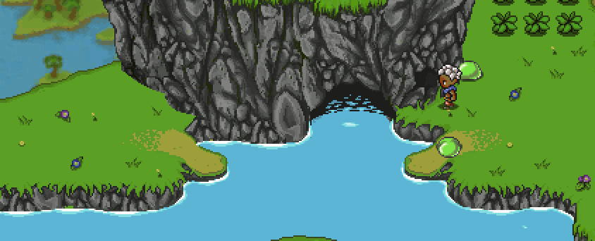
Last week me and Teddy had full focus on getting the house building tools up and running, and I’m happy to say the patch is ready and has been uploaded!! Finally you’ll be able to be more creative with your house, adding new rooms and editing their shape or size in more detail.

The full patch notes can be seen here, and as always, we’d LOVE to hear your feedback on these new tools, anything that may be confusing with them, improvements to be made etc. Let us know! You can comment either here or in the thread above (or make a new suggestions post on the forums).

Last week, Fred was also gone on vacation, and since he returns tonight and the build tools are done (aside from some polishing and anything we learn from your feedback), our next move will be to get together and discuss the support skills! Yes, finally! We’ve put them off for so long, but with the game drawing ever closer to a finished state I guess it’s best we finally get to adding them before there’s no reason to use them anymore, right?!

We’d like to thank all of you for your input and suggestions in regards to them up to this point, and we’ll consider each of them as we move on to iron out in which direction we want to take these spells. Again, though, it’s unlikely there will be any kind of healing skills, but most of you are used to the thought of that by now! It’s a cool skill to have, but we’ve made the decision it won’t be available in Grindea (unless you’re a certain NPC) for a variety of reasons I don’t think we need to rehash once more.

What we DO end up implementing we’ll only know after tomorrow’s meeting, and will be disclosed in a future post!

Since I don’t get to do much for the support spells (it’s mainly Teddy implementing mechanics and Fred doing animations for them), I’ll return to focusing on the Arcadia rework and its new floors until the skills are properly decided and I can make icons for them (likely after some prototyping as been made). We’ll keep you updated!

FOR NOW THOUGH, let’s take a look at last week and the path to creating the tools you now have in your game:

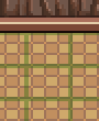
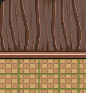
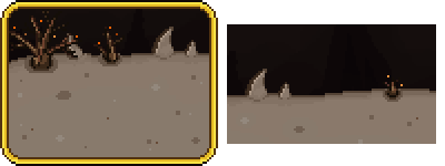
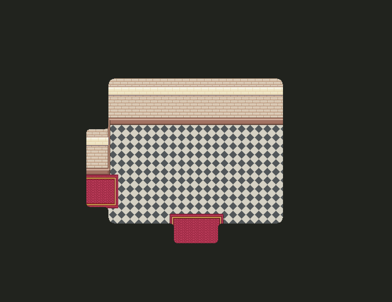
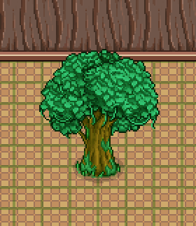
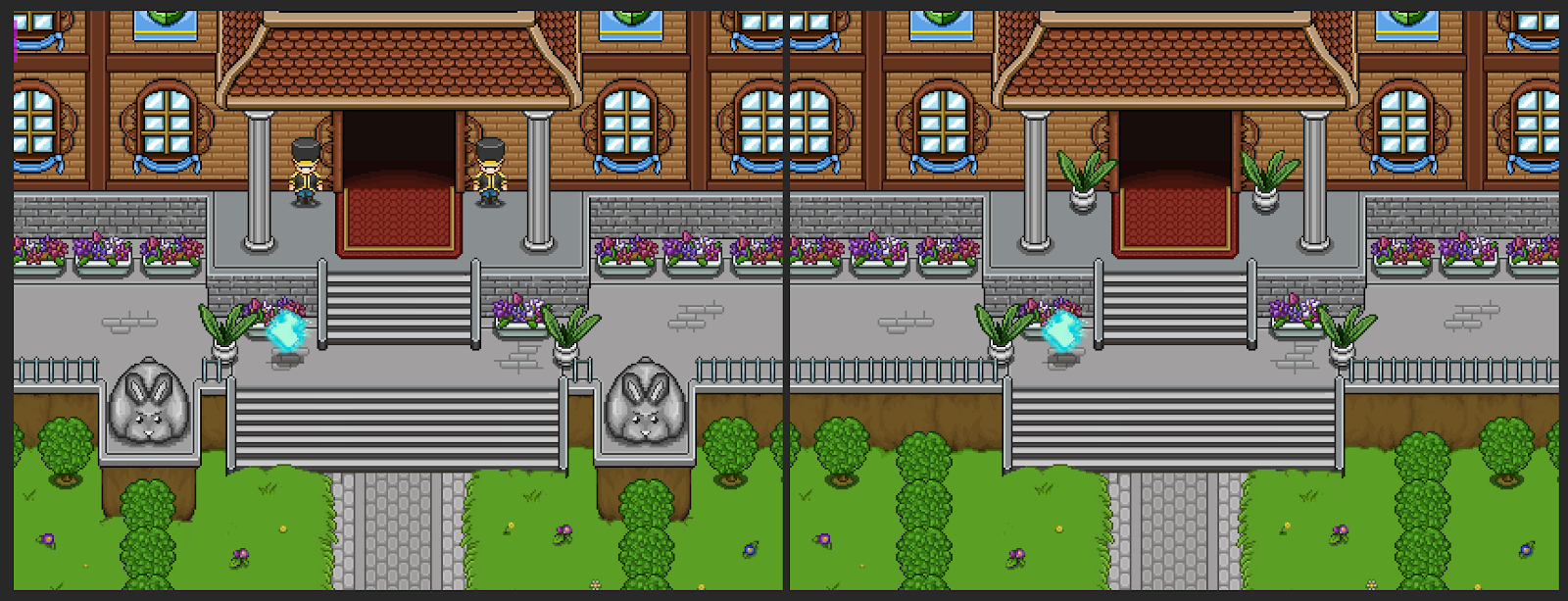
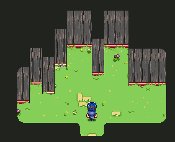
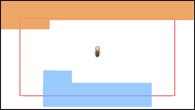
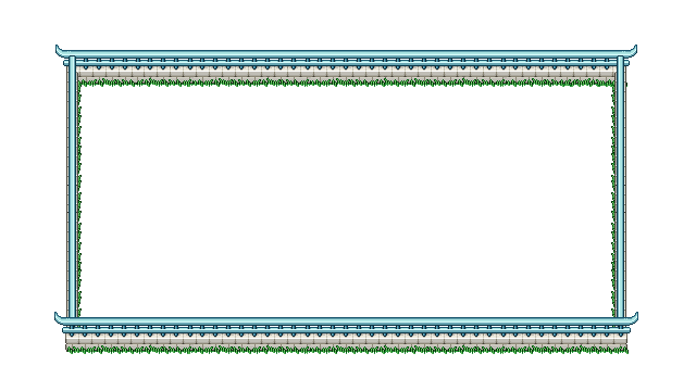
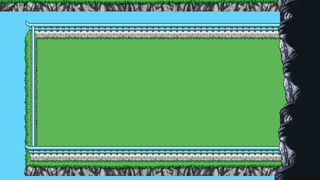
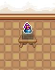
In the first screenshot (above), we added a very simple way of being able to drag each wall tile down however far you need. At the point of this screen, it’s a very basic way of handling things: the darkness above each wall tile looks very square and unpolished, and the black outlines have actually been added manually in Photoshop as a visual test.

Since we don’t want the outlines to be completely black in the final game – it will look jarring next to some of the wallpapers – what we’ll do is have me make a 1 pixel wide line for each wallpaper, using a much darker version of its own color. This way we can also manually account for the lower part of the wallpaper being a different color. For the particular wallpaper above, this would mean the outline will be dark gray and dark red.

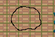
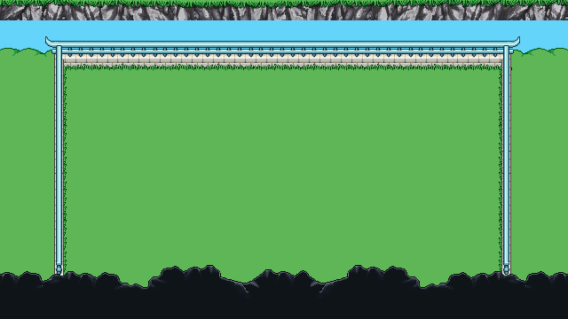
As a next step, we polished the darkness, and added a way to pull wall tiles upwards as well, as seen below:

If you’ve an eye for details, you’ll notice the corners aren’t as rounded as in the previous screen. The reason for this is that rooms with multiple extra corners (such as the one above) looked super weird with the smooth corners attached everywhere – it looked less like a house, and more like an organic shape. Even now, the edges might look a little bit too rounded, but I think this is a lot better, and I feel completely square corners would end up looking too flat.

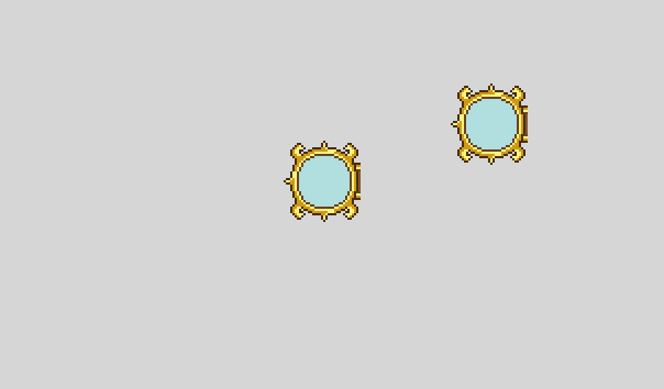
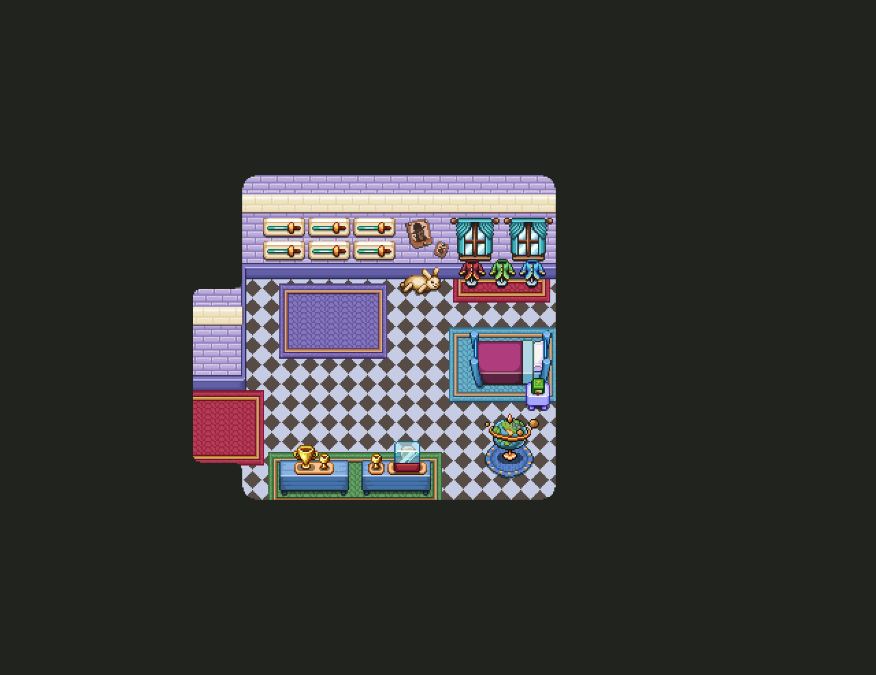
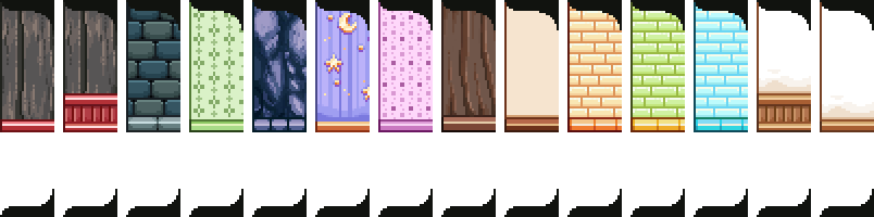
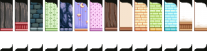
Next step: attaching doors that connect your rooms. Each wallpaper will have its own door, and unfortunately as of now you won’t be able to mix and match between them.

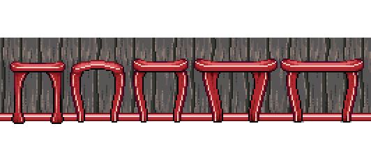
When making the doors, we had two options regarding sizing: either making them 40 pixels wide, equaling 2 floor tiles – which honestly is rather small compared to most doors in the game – or going for 60 pixels / 3 floor tiles, which is rather huge compared to most doors in the game.

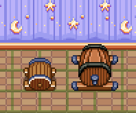
SO, I made a bunch of suggestions, the left ones being 40 pixels / 2 floor tiles and the bigger ones on the right equaling 3 floor tiles of width:

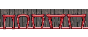
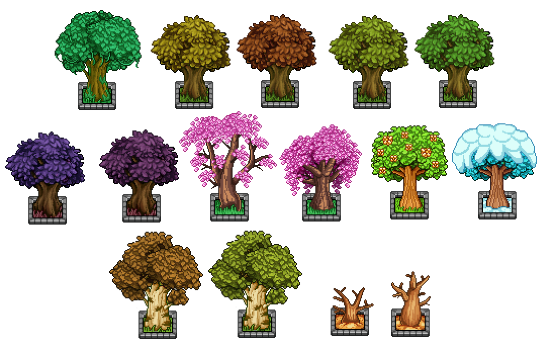
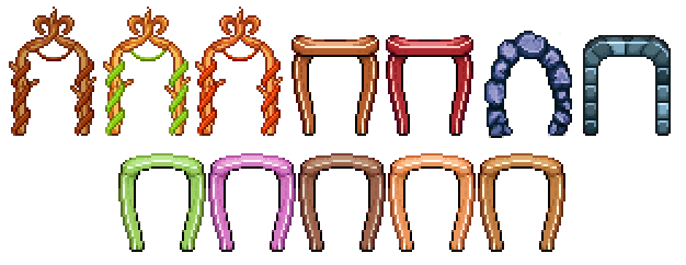
In the end, we decided to go for the smaller doors, as they don’t look quite as gigantic and it seems easier to fit in doors that are 2 tiles wide inside your house. It’s going to be a challenge keeping each door this tiny, but that’s what makes it fun too, right? Continuing on, I made one door for each wallpaper, both facing upwards and to the sides:

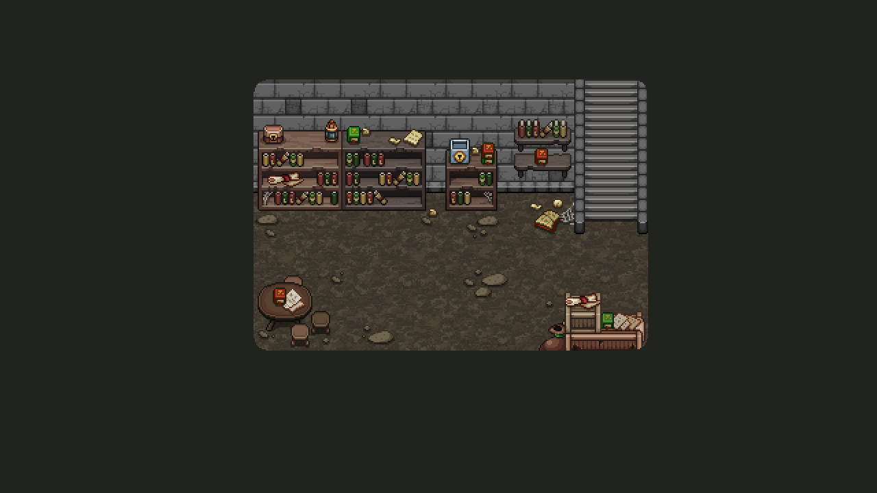
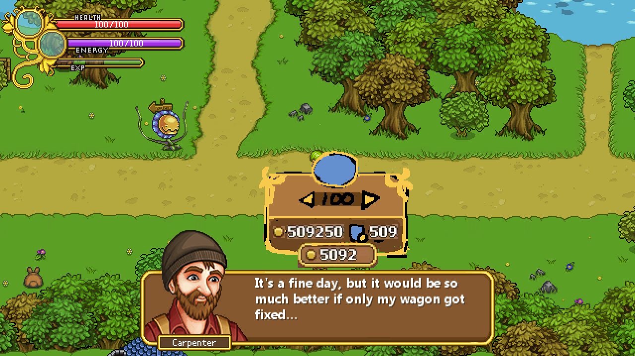
And now that those are out of the way, it’s time to return to something we haven’t touched in a rather long while… User interfaces! First, we need to get some stuff together so you can purchase the lumber that allows you to extend the size of your house and rooms!

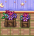
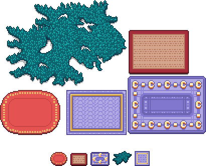
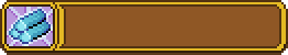
And it all begins with a basic item sprite (you will be carrying the lumber in your inventory, after all), and a modified version for the shop menu:

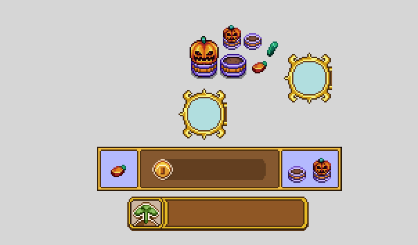
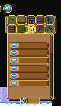
Next, we begin sketching what the lumber purchasing interface could look like. Since lumber is a very different item compared to furniture, we wanted to keep them separate. Therefore, rather than being part of the regular sales, lumber purchasing will have a special interface, loosely based on the Nurse in Arcade Mode:

The main things of importance in this interface is how much lumber you wish to purchase (and how much it costs), how much gold you have, and how much each lumber costs at this level. We decided that after you’ve purchased a number of lumber, the overall price per lumber will go up. This way it’ll take some extra work (or rather gold), to get those huge mansion type buildings!

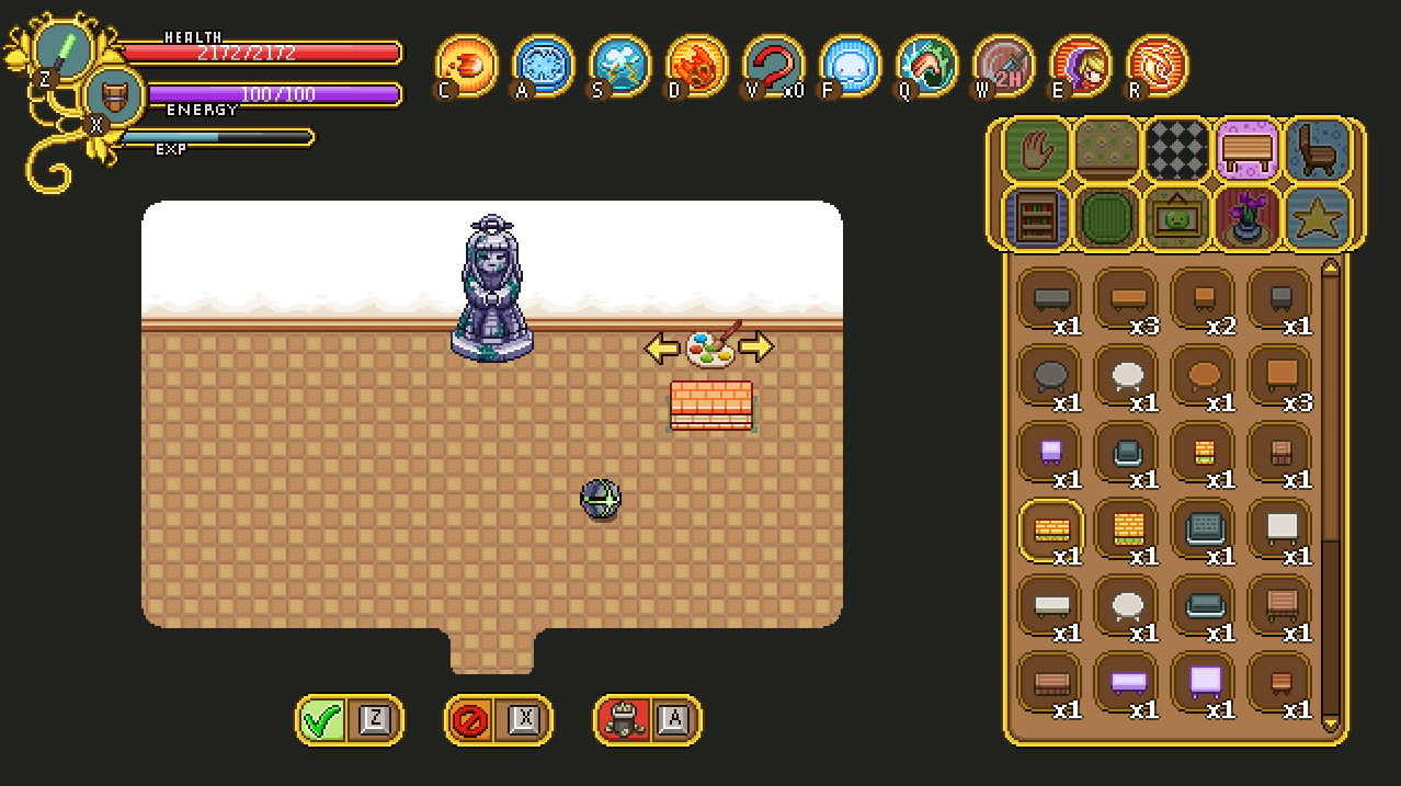
Once we were satisfied with the sketch I went ahead and made the rendered version, also featuring how much lumber you currently own, which we realized might be interesting to see as well:

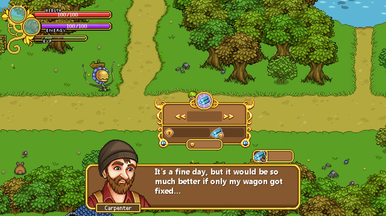
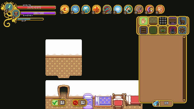
Next up, the build tools menu! Gotta access those tool some way, right?

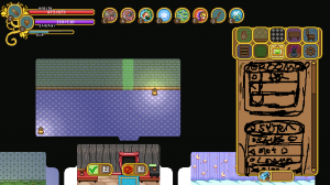
Every menu we design starts with a basic sketch, and in this case a messier one than usual! In the above screen, we were discussing various ways of making the tools available to the player, sketching as we went on. Our first idea was to merge the build tools with the hand tool, but we quickly changed it to be its own focused menu in the settings tab, where we could fit all of them – including the light settings, which would be slightly out of place otherwise.

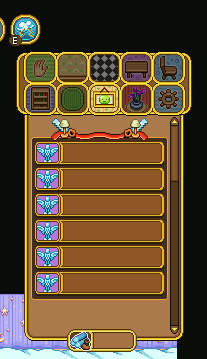
Similarly to the shop menus, this menu will use buttons that allow you to enter each tool. In the above screen, I added some of the already made shop menu buttons to see what it’d look like if we used them as a base for the new bunch. Since the size in length fits well with the background and it’s edited to fit all font types in height, we decided to stick with these and just swap out the icons to represent each tool.

Next I began editing the background to make the buttons stand out more, as well as making room for the menu title (which as of now will be”Room”). The icons on each side of the band (on which the title text will be) will move with the text, so no matter the length of the title they will be a pixel or two away. We made it this way to make sure it’ll look as good as possible in the translations:

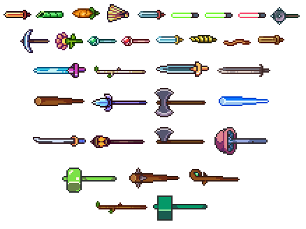
Then it’s all about making those icons, and doing our best to come up with images that fit with the tool and make them easier to understand. Can you guess what each tool means below?

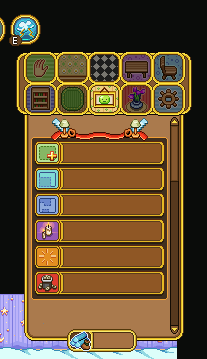
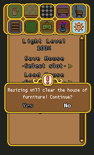
The correct answer is, from top to bottom: Add New (room), Resize, Reshape, Light Settings, Clear and Delete!

Add room will create a ready room with a door that you’ll be able to place on the wall in the room you’re currently in. Resize will replace the current resize system and allows you to pull at any of the walls, making the room longer in that direction. In Reshape you can pull down (or up) walls to change the shape of the room, and Light Settings will replace the current light setting – after you press the button, it’ll allow you to change the percentage. Clear will clear all furniture from the room, and Delete will, naturally, delete it.

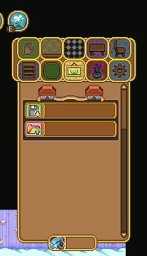
Since this will be the new settings menu, you might wonder what will happen to the Save and Load options. They will remain in their own box, beneath the above Room settings (you might have to scroll down to access them). These are designed much in the same way, and will work just like the Light Settings button: after you press their buttons you’ll be able to edit which slot you want to save/load into, just like before:

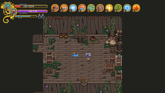
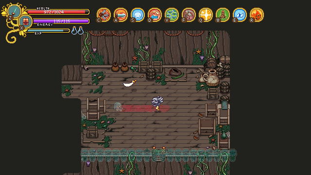
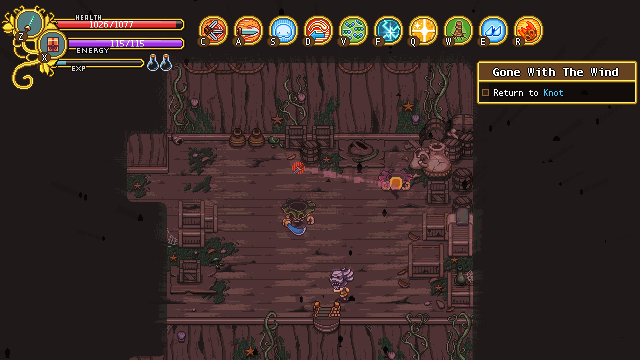
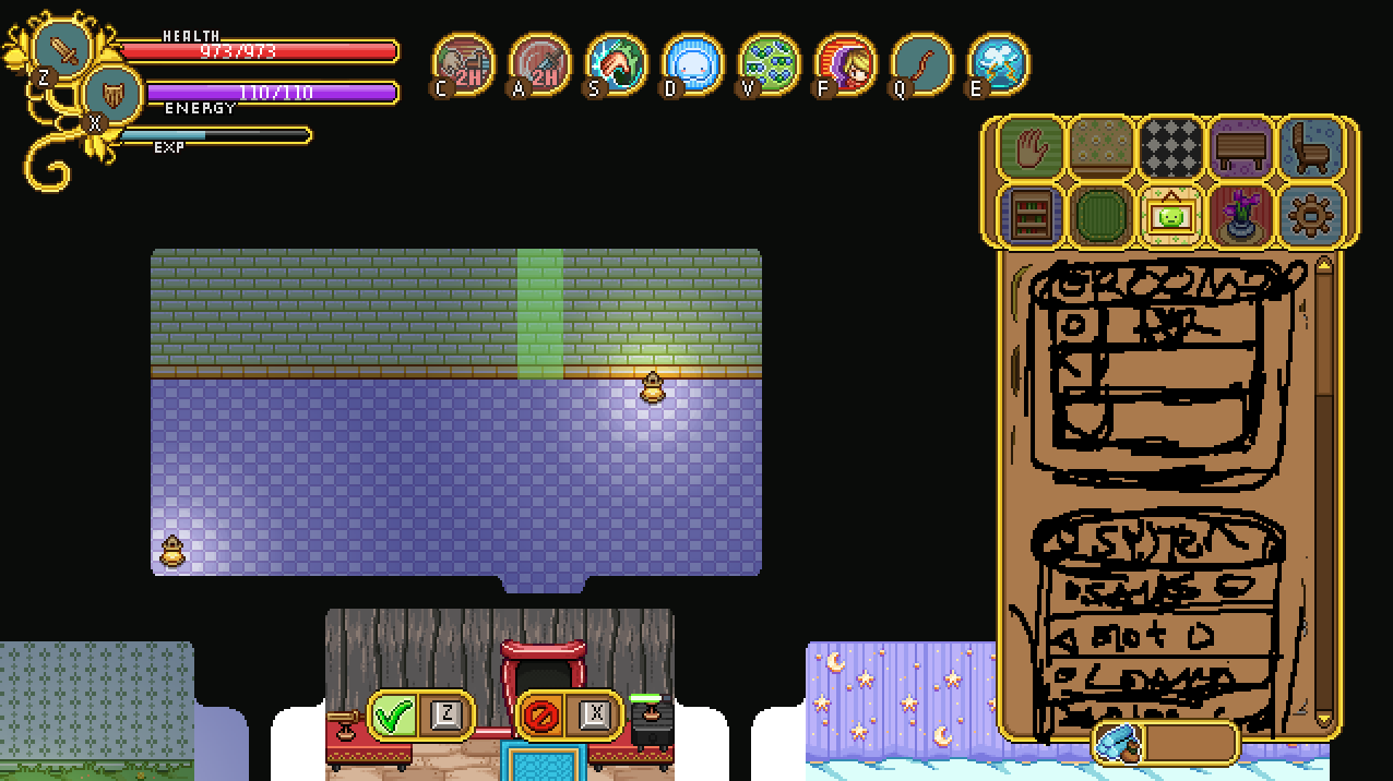
And now, some work in progress gifs showing the early stages of the build tools:

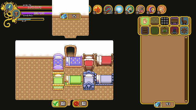
First up, the add new (room) tool, seen above! The cost of the room will be shown in the middle, and you use the arrow keys to decide where to place the entrance.

Below, you can see the prototype for the resize tool, where you use arrows to first select which wall you want to make bigger, and then keep pressing the arrow key in the direction you want it to increase. As you do this, the amount of lumber needed to complete the action is shown. Right now it displays with a minus sign, while the add new room does not, but in the end they’ll both use the same format.

You’ll be able to pull at the walls however long you wish even if you cannot afford it, but you won’t be able to confirm your edit unless you have enough lumber. The reason for this is so that you can try making the room the size you want it and see how much lumber you’d need to make it that big before you go purchase more at the Carpenter.

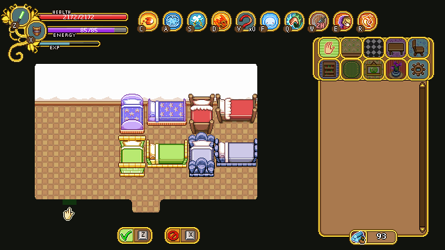
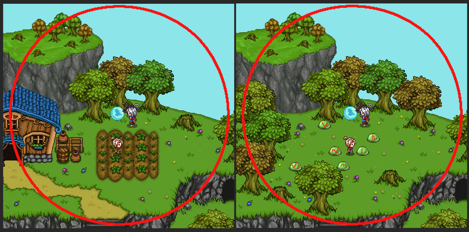
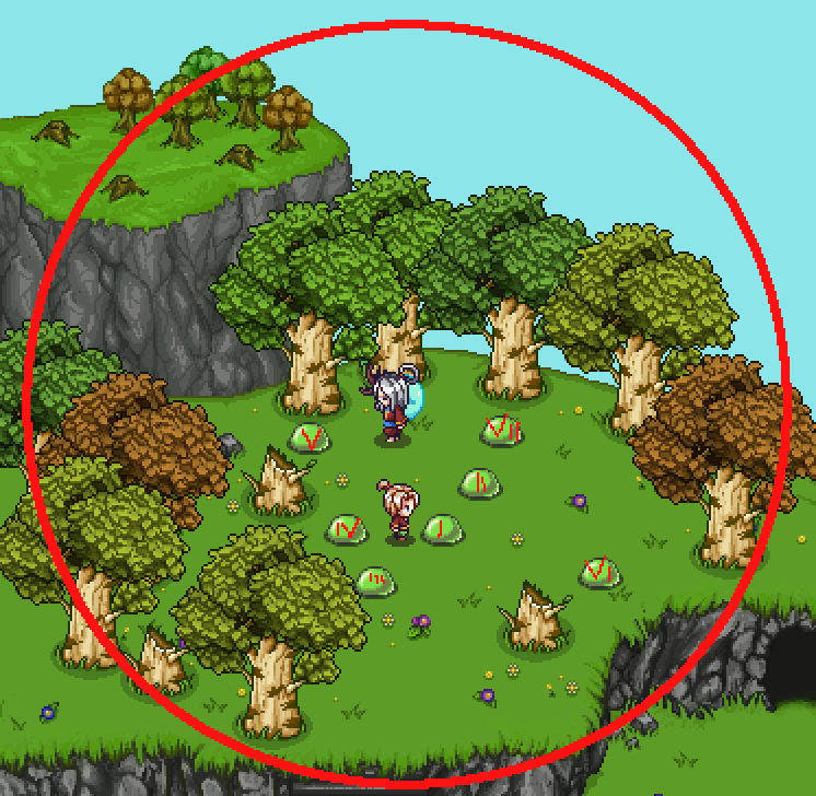
Finally, there’s the reshape tool, where you can edit the inside of the room. Pulling down (or up) these walls don’t cost anything, so you can redesign the shape of your room freely!

In case you missed it, the housing patch is now up and running, so if you haven’t tried that yet, go ahead and test it!

The initial feedback seems very positive, and I’m actually surprised to see how many of you seem to really enjoy building your houses! The interiors that have been posted all look great and so creative, I didn’t even know you could make such cool layouts with the things we made so far. Thank you for that all of you! We’re still going to introduce a ton of new pieces of furniture, of course, and we’ve already gotten a ton of cool ideas based on your suggestions! If you have any more ideas for housing and what to do with it, please go ahead and let us know by commenting or posting on our forums!

Now, we’ve decided that we do want to further improve the housing system – specifically the layout – and we’d rather do it now while it’s fresh in our minds rather than sometime in the future. Since we estimate the development time will be more or less the same between creating pre-designed layouts or having you guys make those layouts yourselves, we’ve also decided to go for the the later, allowing you more freedom in your house building endeavors.

This of course means a whole new set of design decision that needs to be ironed out before things can be implemented properly. For one, we need some kind of build tool where you can edit the walls, pull them down or up and change the size of each individual room. This will be a challenge in itself, but will have to wait until the system runs properly (Teddy has already started working on this).

Second, we had to discuss whether increasing your house size would be completely free or something you pay gold to do. The idea we came up with is that each tile/square in the house represents a number of “Lumber” (might change the name later). This means that as you expand your house you’ll use up lumber, but should you make it smaller again, you’ll regain them. You will be able to purchase the lumber at the carpenter store for gold, though we haven’t decided how expensive it will be yet.

As now, there will be a minimum number of tiles each room can be, but you’ll have a lot of options in terms of the shape, since you’ll be able to move each wall tile up or down. While this system will need a lot of fine tuning, I think it’ll be great in the end!

As for the general feedback we’ve received since the housing launch, two requests stood out above the rest: bookcases facing sideways and chairs facing upwards!

The reason we didn’t include sideways-facing bookcases was, honestly, because we thought it looked boring and we thought nobody would be interested in that anyway. After listening to your feedback, we know we were wrong, and agree that there’s definitely uses for them – and so they will be added in an upcoming patch!

Along with the bookcase update, there will also be chairs facing upwards, so you can put chairs in all directions. We always intended to include these, but for some reason, we kept forgetting to actually make them. Oops!

As per request, there will also be a style for the female statue without the moss, as pictured below:

As you can see, there’s also a bunch of beds in that picture, and you might wonder why. Well, we’ve had a discussion about the perspective in the game and whether some items look better in their correct form or not.

You see, the vertical beds that are currently in the game are wrong according to the perspective – they are much smaller than they should be, compared to the horizontal version – and Teddy suggested we should correct it since it was something that bothered him as he was flipping between the two.

When I took the above screen, I had started fixing the vertical beds, but something felt kind of off. I asked Teddy to upload the Pumpkin Woods bed so we could test it and compare it to the old, smaller version.

Turns out we ended up preferring the smaller one, even though it’s technically wrong. For some reason, the beds end up feeling huge when they’re in their correct size, and it actually felt a lot worse than flipping between the original ones. I will still fix two that felt a little too small, but the rest will be kept the same, and the “fixed” versions will go to the trashcan!

Another thing that will be added is the !-mark seen above. It will appear above important notices, and serves as a warning of sorts. Or just to make the boxes a little more interesting-looking, if you will!

We also decided to do a bunch of fixes to items that didn’t properly fit within their tiles/squares, making placing them in a house rather awkward. First up, the beer keg, which has been changed to a bigger version. In the original, left version, it was simply too small and left a lot of space on each side. Making it even smaller (to fit a single square) wasn’t an option, so instead we decided to make it a lot bigger. It now takes up 4 squares, and while there’s still some space remaining, there’s not nearly as much of it:

Next up, some of the Temple of Seasons bushes, which used to take up about 1.5 squares, also making them very annoying to place within your house. For these, we decided to make them smaller instead:

This flower crate also got a smaller version, which now fits a single square as well:

The Pumpkin Woods bench and chair, which weren’t pictured above:

We’ve also started working on a new object, which is a weapon stand where you can place your 1- or 2-handed weapons to show off within your house. In the top left corners of the below picture, you can see two of our iterations for the 1h version. In the end, it’ll be something closer to the right one, as it shows off the weapon better and feels more balanced:

In semi-related news, another thing that will be included in the next patch is the long-awaited feature of being able to skip quests you previously finished in a multiplayer session! Before this patch airs, you’ve had to redo every single quest in single player, regardless of how far you got with your friends (unless you were the one hosting). Now, you’ll get a notification about having completed any given quest in a previous multiplayer run, and the option to skip to the end of it:

As for Fred, his focus has been more enemy animations, as well as laying the groundwork graphically for those weapon stands that will feature any weapon of your choosing as a housing item!

In order to make the weapon stands work, Fred selected a frame from one of the attack animations featuring each sword and edited it to fit the weapon stand sprite. He also had to add a hilt to each of the ones that needed one, since he never made on for the animations: the main character’s hand typically covers where it would have been.

And as for the enemy animations, things are moving forward with the desert enemies and in particular with the Mrs Bird enemy:

Finally, there’s another portrait for the upcoming desert town! A winter fae, to boot – Talk about getting out of ones element!

This poor guy has been dragged along to the desert by a summer fae friend. How cruel! He doesn’t particularly seem to enjoy the heat, does he?

This week was a very special week, since the annual GGC was hosted (and also the week where we launched housing on frontline – go check it out)!

GGC is short for Gotland Game Conference, which is basically a game expo where the students at the game design education showcase their game and a bunch of people from the industry is invited as judges to give feedback and select which ones did the best. It all culminates in an award ceremony with an after-party where we all get a chance to hang out together and share experiences with other game developers. So basically, it’s great!

For those of you wanting a glimpse of all the game presented at the conference, check out this video:

One of the showfloor favorites, and clear winner of many of the awards at the award ceremony was this little gem called Pump the Frog, made by a bunch of first year students:

Totally charming and so well polished. It was hard to imagine they only had 8 weeks from start to finish, incredibly impressive work! It’s also nominated for several SGA (Swedish Game Awards) categories, so its success might continue on to other venues as well!

If you want to know more about the conference or would like to see some cool pictures from the showfloor and presentations, head over to the conference website!

———–

Now as I mentioned, this week we also launched the housing system, which is now playable on frontline! So, when we weren’t at GGC judging games and hanging out with fellow game developers, this week was all about some last minute housing polish, finishing up the remaining details and the graphics needed for them!

First up, we realized there were some more forgotten things we needed to take care of!

Some miniatures for the carpets from before, for example:

And then, a couple of items some of you have likely had in your inventory for quite some time! The red slime carpet and the green slime bad:

Hopefully that’s the last of our forgotten objects, and we can now focus on just adding new ones in the future :)

As for the housing system itself, the way you get the house, for now, is that once you’ve completed Flying Fortress, the scientist Kim will appear in Evergrind City next to your currently not-yet-built house, explaining one or two things about the science behind the houses in the game (and your own)!

She also wonders if you’d like to help test out some new systems, and upon agreeing to do so you’ll be able to purchase the house from the carpenter, who will build it for you. After this is done we plan to move Kim back to the lab in the HQ where she’ll continue doing other experiments (gotta keep busy, you know)!

As for the house, once it’s been finished (this happens once you change screens once), you’ll get a very short and basic explanation of how to use it upon entering the building.

We’ve continued working on the icons that illustrate what tool you’re currently using, and here they are in action:

First up, the style icon (seen above). After some thinking we’ve decided the arrows for each of the icons need to be remade, and it’s also missing a proper outline and an animation at this point.

Next, the carpet tool’s “carpet version”:

For this one we’re actually considering using the old version (seen below) after all, to make it stand out a bit more from the carpets you’re editing.

Finally, a GIF showcasing both the stack and the move tool:

The stack tool (as well as the carpet tool) don’t use the correct freeze frames in these GIFs which means the animation isn’t paced exactly right (it’s supposed to pause for longer on each stack), but it gives you an idea of what it’ll look like. The move tool is missing an animation in these GIFs as well, but it has since been added to the game. Finally, we added outlines to all the icons, which made them stand out a bit more against the background. This can also be viewed in the game.

We did have a discussion regarding whether or not to use a more simplistic style for each of these (like the old version of the carpet tool), but decided against it in the end. This way there will be a little more color, and hopefully each icon will stand out enough on their own once the outlines and proper animations have been added!

As for Fred, his main focus has been getting all those housing icon moving. Here are the finished icons he worked on:

We didn’t talk about the hand tool much in the previous post on housing, but the hand tool is a very basic tool accessible from the housing menu that allows you to move around your house and select any furniture piece you want (which in turn brings you into the other tools). The hand tool is also connected to your skin color in-game, and matches that of your character.

Here’s the new and improved move tool! We changed the arrows quite a bit, both in shape and color, plus it now moves and has an outline. It works a lot better than the old version, to say the least!

There’s also this new and improved version of the carpet tool icon (above), and the stack tool which you’ve already seen, below:

And here’s the style tool, a little bit interesting now that the brush is moving about:

Finally, Kim got a slight redesign to better resemble her portrait as well as an additional animation. In her regular one, she’s doing some chemistry stuff, mixing a liquid of some sort. While she’s outdoors telling you about the housing science, we thought we’d give her a different animation to better suit the theme (as well as one that doesn’t make sounds every few seconds):

We currently haven’t decided whether she’ll pick her chemistry set back up once she returns inside, or if she’ll continue using her newfound tablet instead!

Now, if you haven’t tried out the housing system yet, go ahead and let us know what you think! We’re eagerly awaiting your feedback :)

Hello guys and sorry for the late recap! Apparently, someone (me) forgot to hit ‘publish’ after finishing the post and nobody noticed until now… Ooops!

Oh well, ready for some new Housing info?

Our basic prototype is more or less done: the items that have been made so far have all been implemented, and most of the ones that will move in some way have their proper animations. Teddy is currently working on two things, the light settings (which are coming along rather nicely so far), and the rather complicated systems behind being able to add more rooms and change the layout of your house.

You see, previously we decided that you’d be able to select between a bunch of pre-designed layouts for your house, which could be unlocked at the proper salesman or through your housing menu (not fully decided). As our conversation went on, though, we started thinking it’d be really cool if you could design your house however you wanted, adding new rooms and change their sizes freely.

Before we fully commit to that can of worms, our current goal is to upload what we have to Frontline (any day now, possibly even tonight!) and let you guys try it out. We’re still a little torn between having pre-designed layouts or having you design the house more freely, as the latter definitely would add a ton more work and I’m sure most of you would like to see the game finished sooner rather than later.

So for now, we’ll upload what we have: a single layout, and the current housing items. The shop and house will be placeholder, with more finalized look for each of them coming later on, as we’ll use the Arcadia redesign versions as a base for the story mode versions after they’re finished.

With your feedback we hope to be able to gauge how much more work (and polish!) will be needed before the housing system can truly be complete, and as such will give us a better idea of which of our options to pick.

There’s also a third option here, where if people are satisfied with the basic version of the house, we might just stay off multiple layouts altogether as that would save a lot of time and would mean we could add the proper housing system much sooner. Anyway, your feedback will decide! Stay tuned for that :)

And now, time to make some walls for Tai Ming’s arcade mode!

“Walls?” you might ask. “Isn’t that quite straight forward?” Oh yes, my friend! Typically walls are the least of my worries when I make Arcade floors, as they’re just a very basic edge signifying the end of the battle area. In other floors, they’re a bunch of random generated trees, or a basic stone wall.

As mentioned in last week’s post, however, Tai Ming will be different. We’ll mix and match various ways to block off the battle area, ranging from streams of water, fences and even cave walls. And while creating each of those is a rather simple task in itself, they also need to be able to connect with each other and different types of walls – and they all need to work together!

Above you can see the size of the battle area we decided to work with for these rooms. It’ll be slightly bigger or smaller depending on which walls are used in the room, but most will be of approximately the same size.

So, first of all, let’s take a look at what we have to work with. In order of appearance: wall, mountain, stream and fence:

In a coming post, we’ll also take a look at houses that will serve as walls, and maybe one or two variations of these that account for other town-like features. After all, we want to convey the feeling that this is town, in whatever ways we can while keeping the Arcade feel!

For now though, let’s look at how we can use these pieces together to create a variety of different room types:

…and so on! Of course, not all of the rooms will have streams or mountain walls, though I suspect many will and they do make for more interesting looking rooms so far (at least until we’ve added some houses)!

There’s still a way to go, but the basics are down and I think this will end up quite interesting once it’s all done.

And now, some housing icons to indicate which tool you’re currently using! …Cause there are quite a few tools, actually. First up, the carpet tool:

This tool is used to edit the size of the carpets. You’ll be able to change the size of many of our carpets freely, and this icon will help indicate what you’re currently doing. The upper version is Fred’s basic version, but we’ll also make one featuring the carpet design beneath to see which one we like the best.

Next up, the move tool, which is rather straight forward:

Select a piece of furniture with the hand tool, and move it around to wherever you wanna put it. We’ll probably add some kind of animation to the arrows, as most of the tool indicators will be animated in some basic way (much like the carpet tool)

Next, the stack tool:

This “tool” appears when you try to select a square that has multiple objects stacked on it, and helps you select which parts of it you want to edit or move. Do you only want to select the top object, the topmost two or the whole stack?

Below’s a test animation I did to make the indicator easier to understand, and beneath it is Fred’s finished version:

Finally, the style tool, which allows you to change the basic appearance of an object. This is indicated by a painter’s brush and palette. The first version had a rather crude version of the brush, so it was quickly changed:

And now, another portrait!

Not much is known about this guy yet, I’m afraid! Other than the fact he’ll be staying in the desert, of course. I’ve been watching a couple of documentaries on Versailles in general and the era of Louis XIV in particular, which I guess shows through the design?

These portraits are a lot of fun to make, and I’m itching to remake the earlier ones to bring ’em all together style wise. That should probably wait, though :D

Finally, some animations! This week, Fred has been busy with the enemies, bringing the Cacute and Mrs. Bird to life~

First up, we have Mrs. Bird’s idle animations, and her laying one of those annoying eggs that will either spawn a new bird or slow you down if you decide to break it:

The annoying and OMG-SO-CUTE egg in question:

And next up, the Cacute! If you decide to be really evil, this is what it looks like when you kill it:

Though why you’d wanna do that when this is how cute it looks in its idle and movement animations, is beyond me:

Now that most of the Housing stuff has been animated, Fred will continue to work with the enemies to ensure that Teddy can just dive in and prototype them once he is done with his part of the housing. The less he has to wait on new animations, the more focused he can be when the prototyping phase starts!

For now though, both he and I will continue to be stuck for a while with housing and Arcadia stuff, as that’s our main missions before we can move on to the desert and rejoin Fred on that venture!