


Over on the very small super early betas, the next update is already up and running now, featuring the new books! One thing we decided to add is proper book fronts, which look something like this:
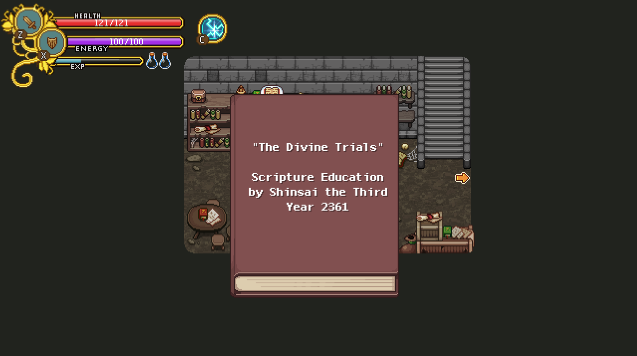
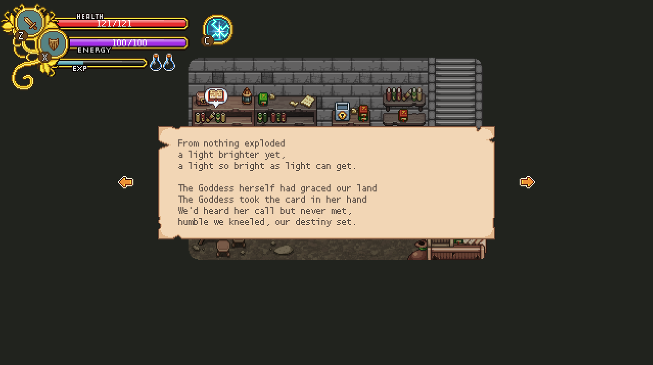
Sample of the actual text in the game:
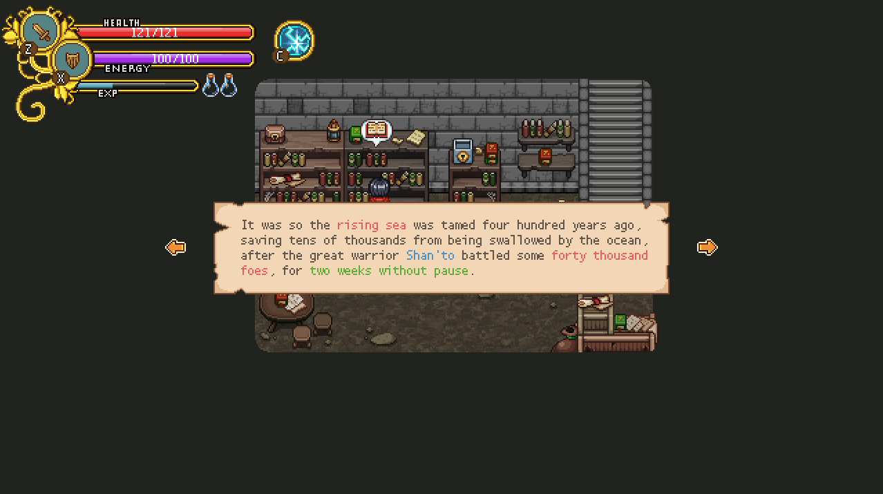
And here we have some of the text with some of the color variations:
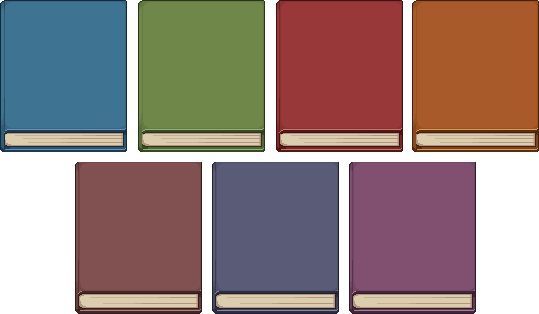
We’ll be adding more book covers as well! By the time the game is finished, I would like to have more variations, but for now the main difference will be the color:
Next, we’ll be upgrading the look of the map interface, seeing as we’ve been adding a bunch of new maps recently! Let’s take a look:
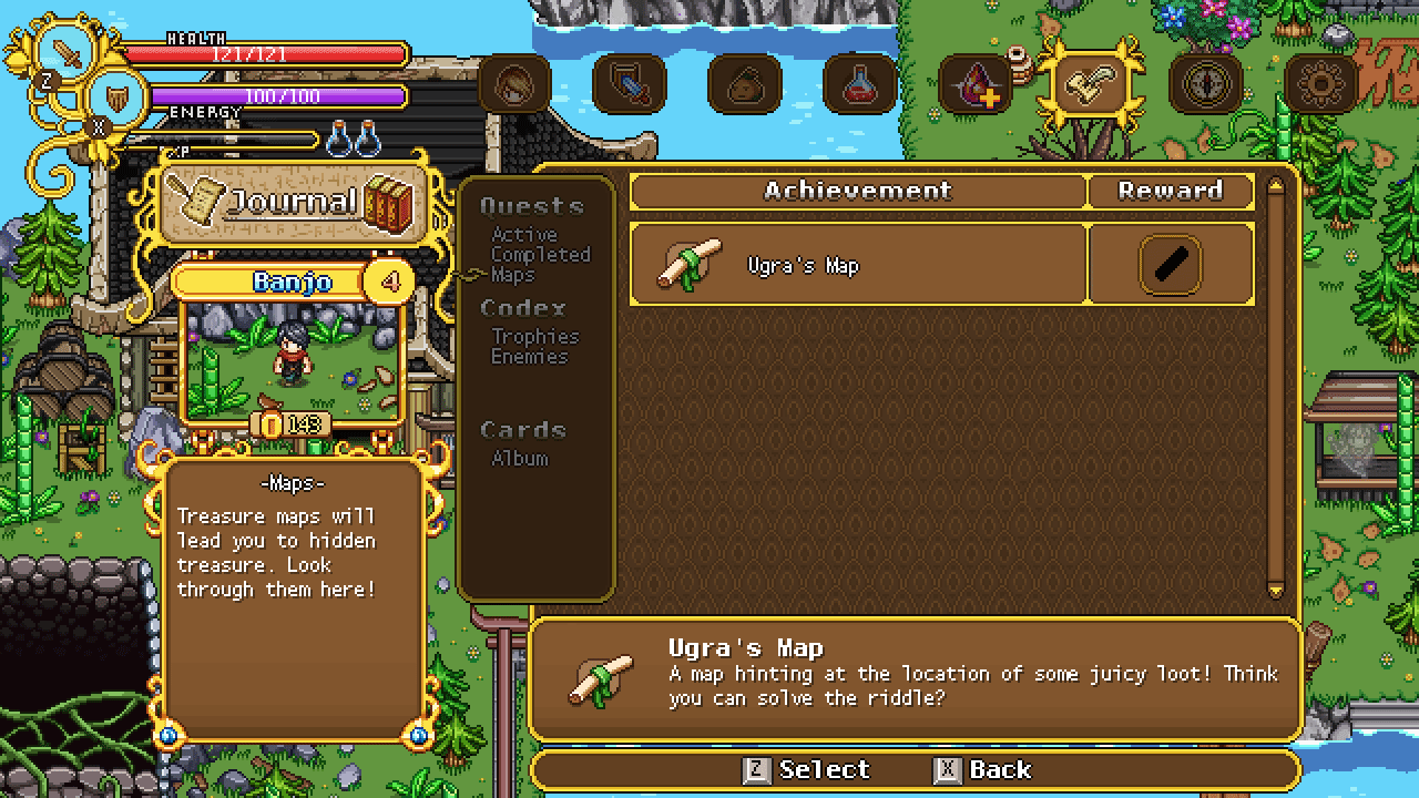
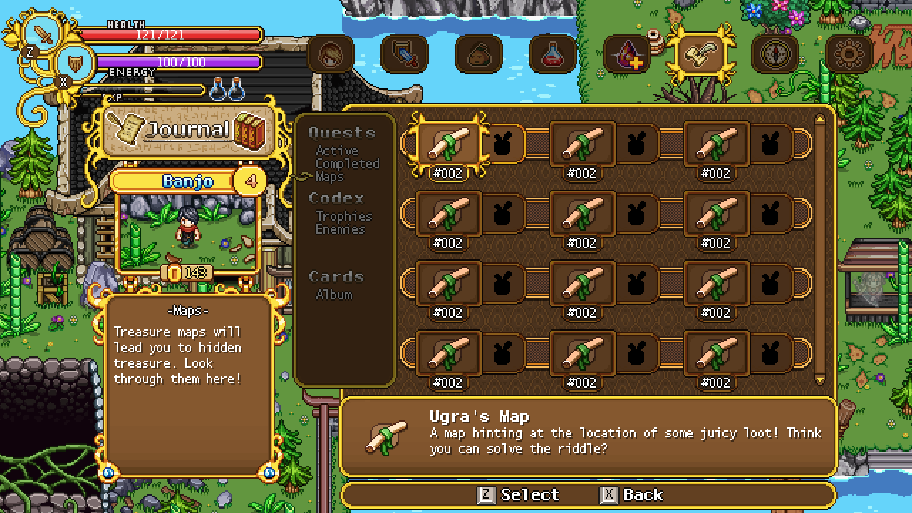
This is a bit more streamlined, and allows you to see more maps on each page!
We’re also adding a different way of showing the maps, namely a pop out function which shows you the map on a piece of paper! This is what it’ll look like:
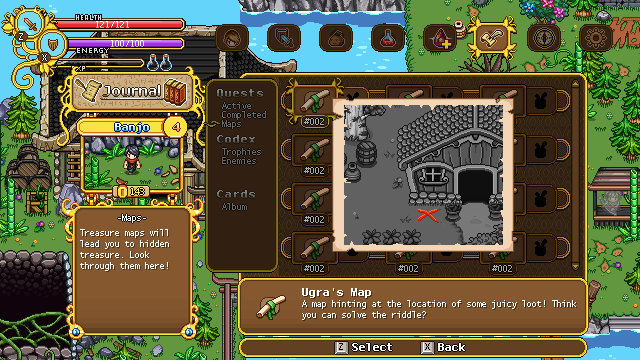
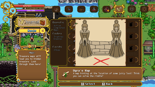
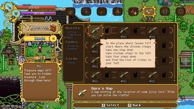
Give it more of a map-y feel, doesn’t it? :)
Now it’s time to upgrade another interface! Let’s take a look at the good old quest part of the journal and see how we can improve it:
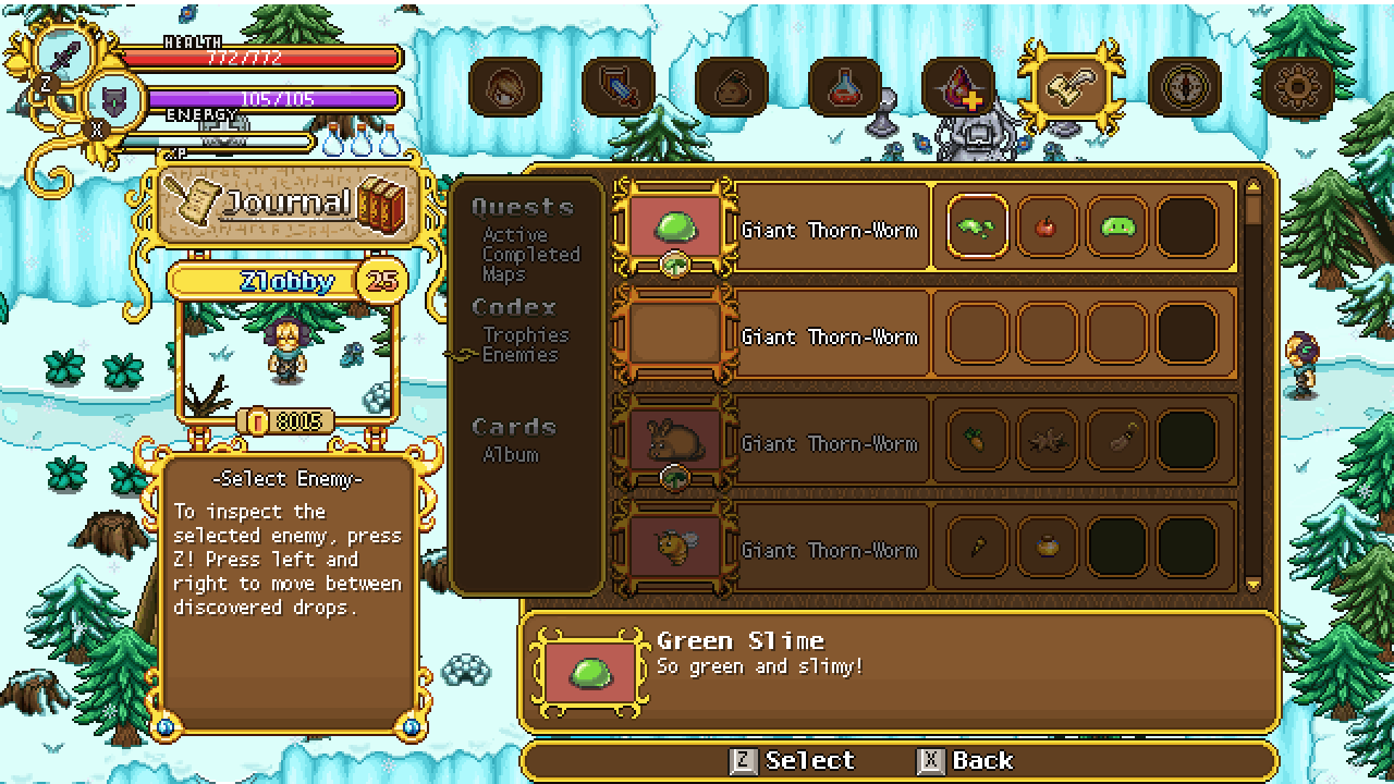
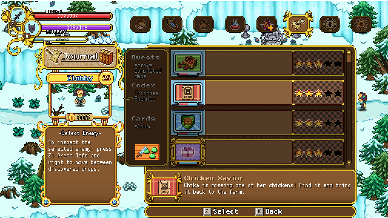
With this new setup, active and completed quests only need one menu, and whether a quest is active or finished will depend on whether they’re gold or silver colored, just like in the Trophy section! I also upgraded each of the quest indicator images while I was at it. What do you guys think? :)
In Fred’s (and Teddy’s) department, we’re playing around with some light effects for that Grindea sprite! Below you can see some tests, as well as a palette swap – it won’t be used the way it looks there, but it shows how we pretty easily can swap her colours around if we need to during the fight, for effect purposes :)


For the quest indicator, you may want to add something that will show more clearly whether the quest has been completed or not.
In my opinion, color shift is not clear enough to understand from first sight that gold is for completed quests and silver for uncompleted one.
That’s for my opinion. Others may give you the same advice or not but in the end I do believe that no matter what, you will as always make the better choice for your game.
I hope my advice will be of some use. If not, nevermind then ! I’am glad to be given an opportunity to share my opinion, good or not, with you all.