


Now, one thing we’ve decided to do for our translators is to provide each of the shop title backgrounds without the text, so any translator can make their own names for the shops. As such, I spend some time removing said texts and making a bunch of PSD files for them:
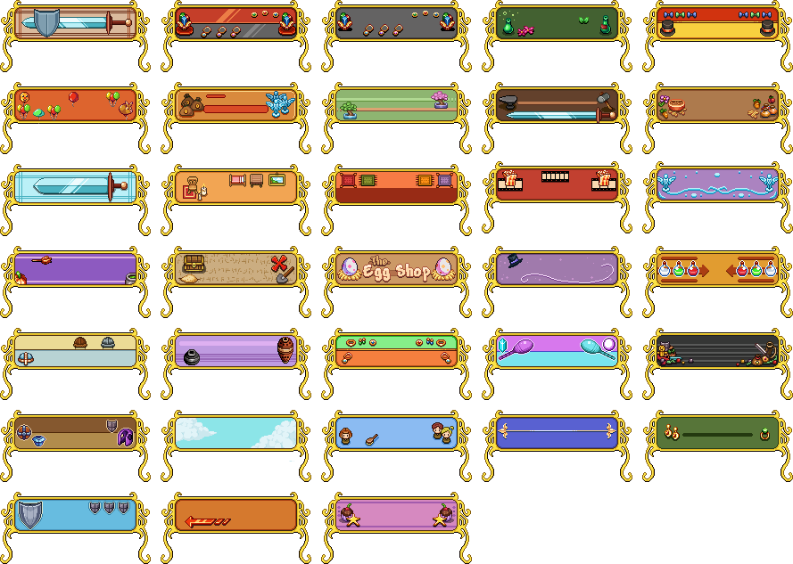
(Ignore the Egg Shop one in the middle, accidentally added the text version of that!)
I’ve seen some of you have already started playing around with these backgrounds and I gotta say it’s really fun to see! :) If any of you are working on translations, this feature should be up and running right now. If you decide to use it, please feel free to share your work on any of our communities (such as our Discord server) so we can see! :D
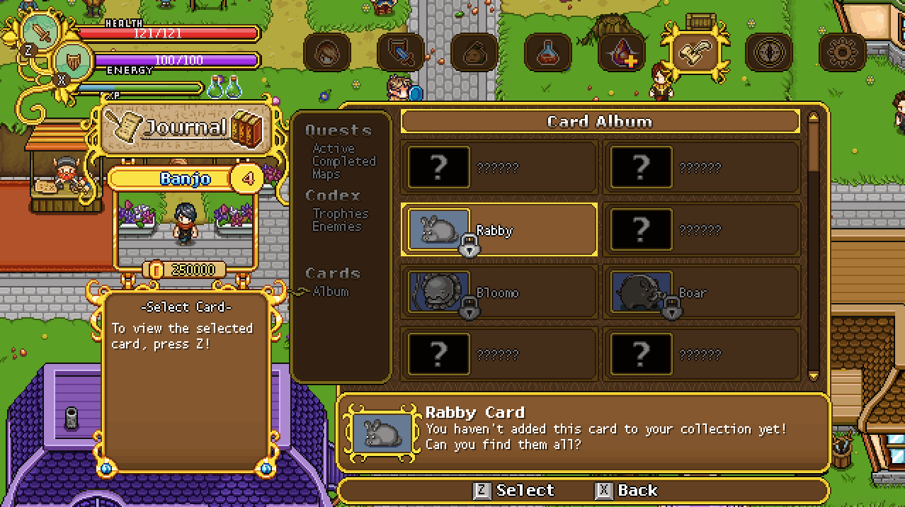
Now, time to get back to those interface upgrades! Next up, we have the card album, which we’ll streamline a bit and upgrade the graphics of as well:
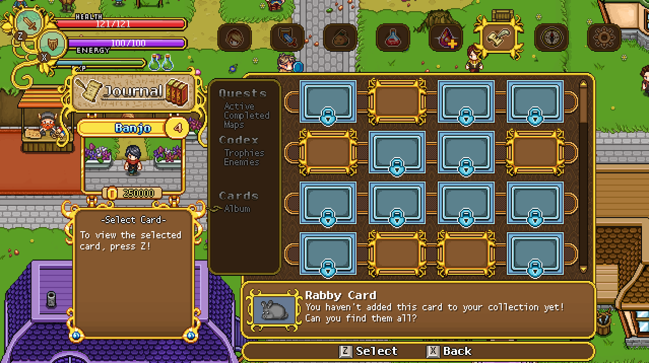
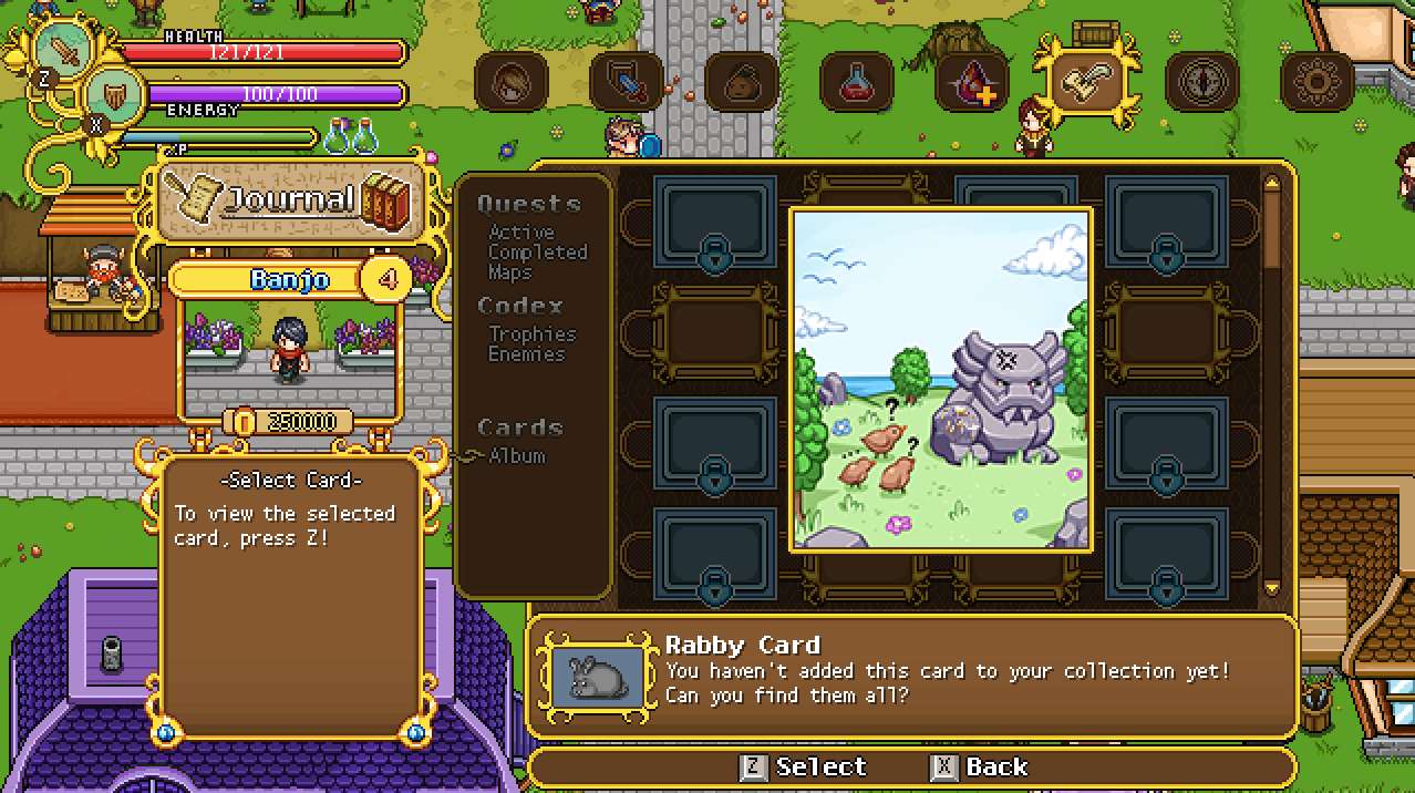
Like the new maps, we’re also playing around with having the cards displayed as a popup rather than on a page of their own too:
One thing we’ve talked about a lot recently is whether or not to remove more of the menu text and replace it with icons. As you know, and can see again below, we’ve already started work on replacing the menu text with icons in regards to the inventory categories:
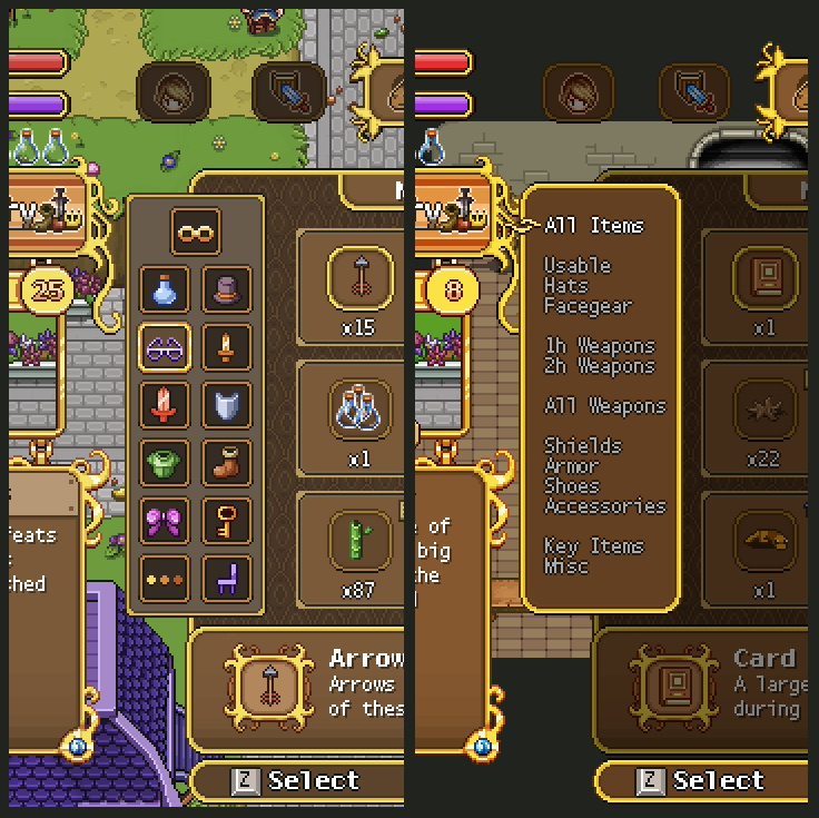
In many ways we do prefer this, as it’s a bit more visually pleasing and makes things easier when it comes to translating the game. But for some categories, it can be a bit tricky to come up with a satisfying layout and icons that represent their category well: with text you always know what category you’re on, while it might a bit less clear with icons. We still haven’t really decided what we’re gonna do, but I’m gonna play around with some alternatives for the remaining parts of the menu in the coming days.
What do you guys prefer generally? Icons or text?
Either case, it’s time to start experimenting! I’ll begin with playing around with the Skill & Talents part of the menu, and here we have two different alternatives for the layout, as well as the progress:
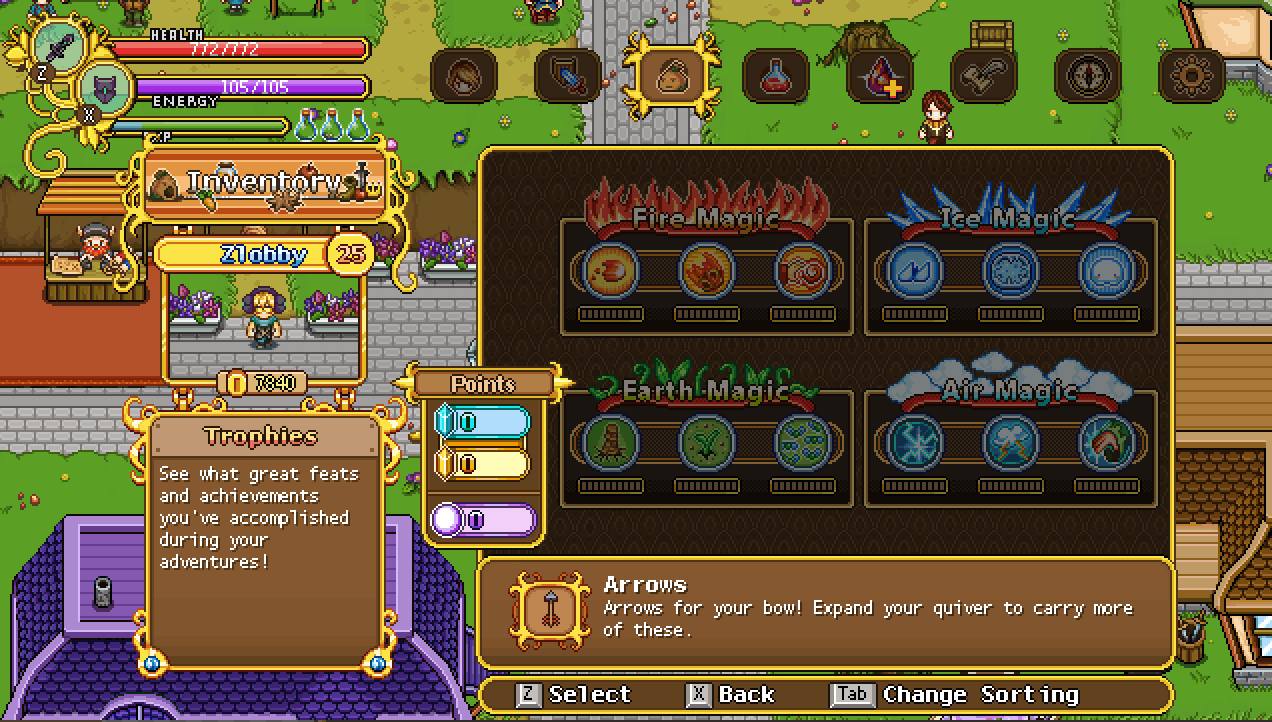
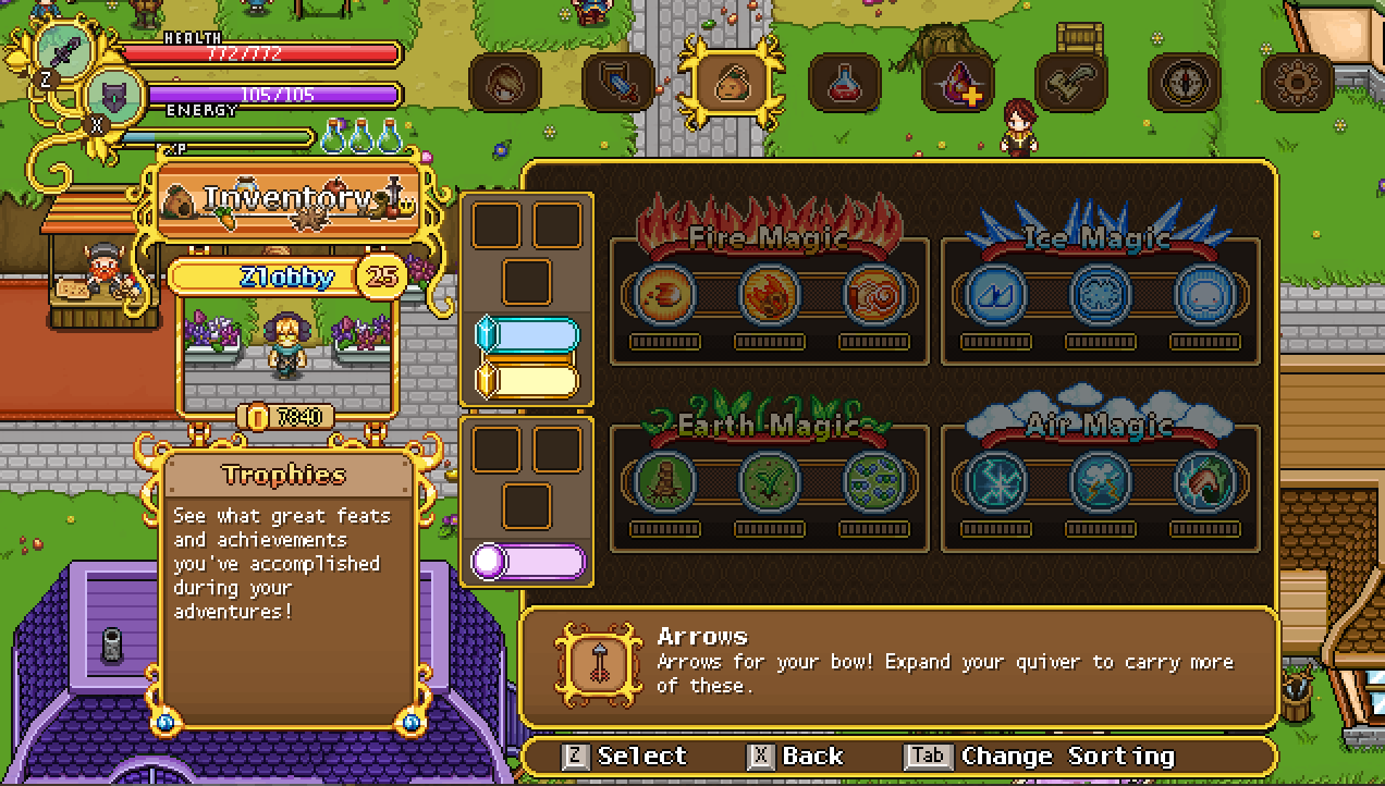
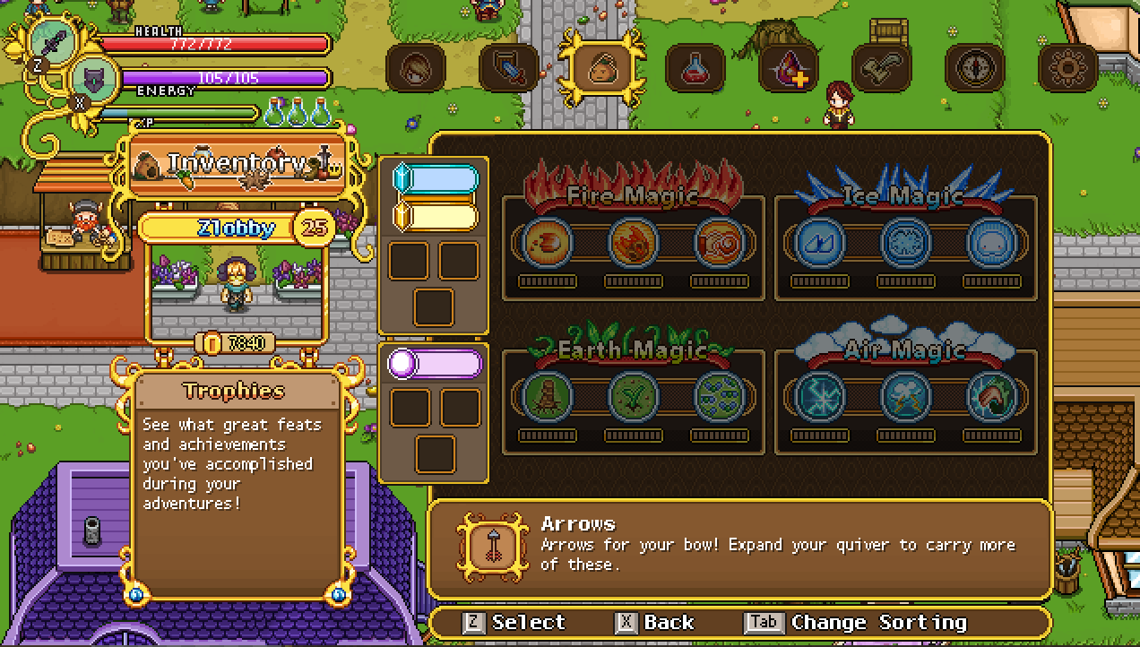
No icons yet, as you can see, but we’ll get there! To start with I just wanted to get a better grasp of how the icon categories could look. What do you guys think?


I prefer the text in the menus honestly. It’s straight and simple but icons are necessary if translations are going to be easy I think.
Good work so far! :>