


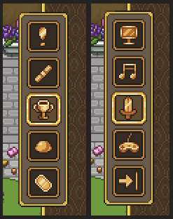
Next up, we’re playing around with some other types of icons for the Talent & Skill menu, with a magic orb as the magic indicator and a star for the utility icon. We’re also considering a third option for the magic icon, with an old diagonal wizard staff. What do you guys think?


Now, time to give some more of those icons a colour wash! Here they are in their before and after states:

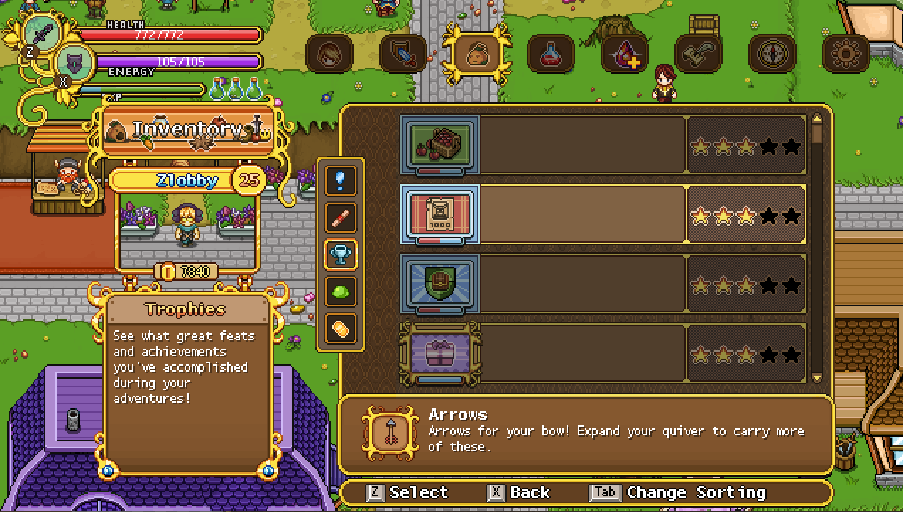
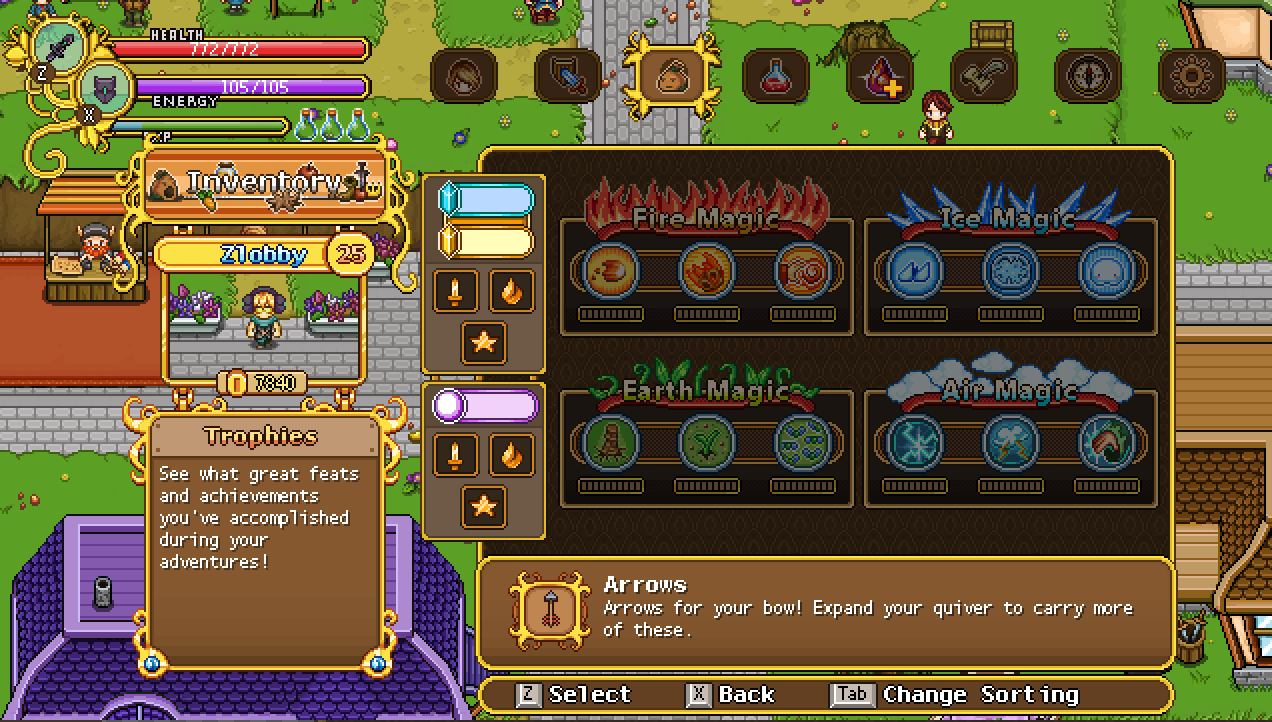
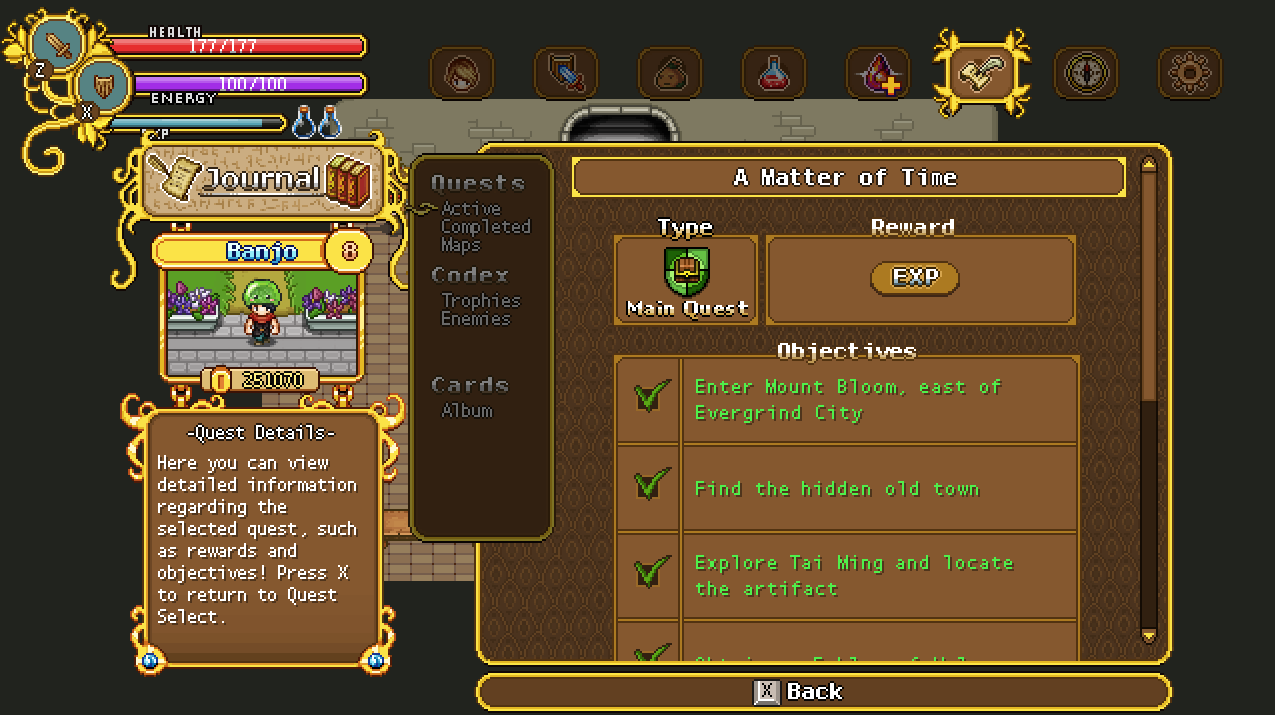
And now, time for the next menu to be redesigned: the quest info pages! Let’s have a look:
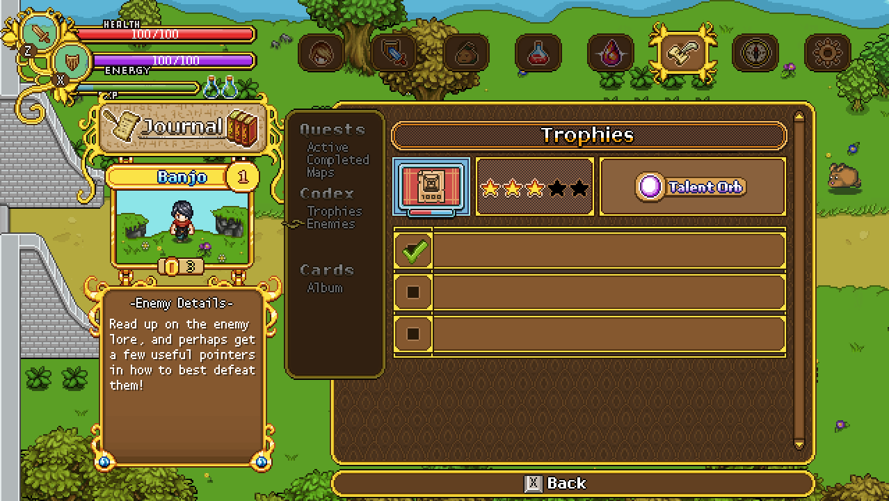
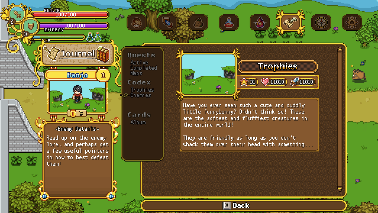

With the text menu being replaced by icons, we wanted to make a more easily read headline available on the left side for each category, so it’ll be quicker to learn which one does what. Currently, we’ve only had a headline for the main category, such as ‘Journal’, with the character box beneath it and another info box below that – however we feel like it’s very rare for people to even pay attention to what’s beneath the character box, and so moving things around might make the menu a bit more easier to understand. Hence:
I wouldn’t say it looks quite as nice graphically, but I do agree that this way it’ll definitely be easier to see and understand what category you’re on. What do you guys think?
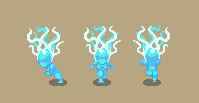
Meanwhile, in Fred & Teddy’s corner, Fred’s been continuing on with Grindea animations! Here’s another sneak peek of that, featuring a running animation:
Teddy has also been hard at work, and besides more Arcade Mode stuff, he’s been spending some time optimizing the loading times of the game! Take a look at this before and after:
With these optimizations, we hope a lot of loading times will be removed, giving you a much more smooth experience while playing the game :)


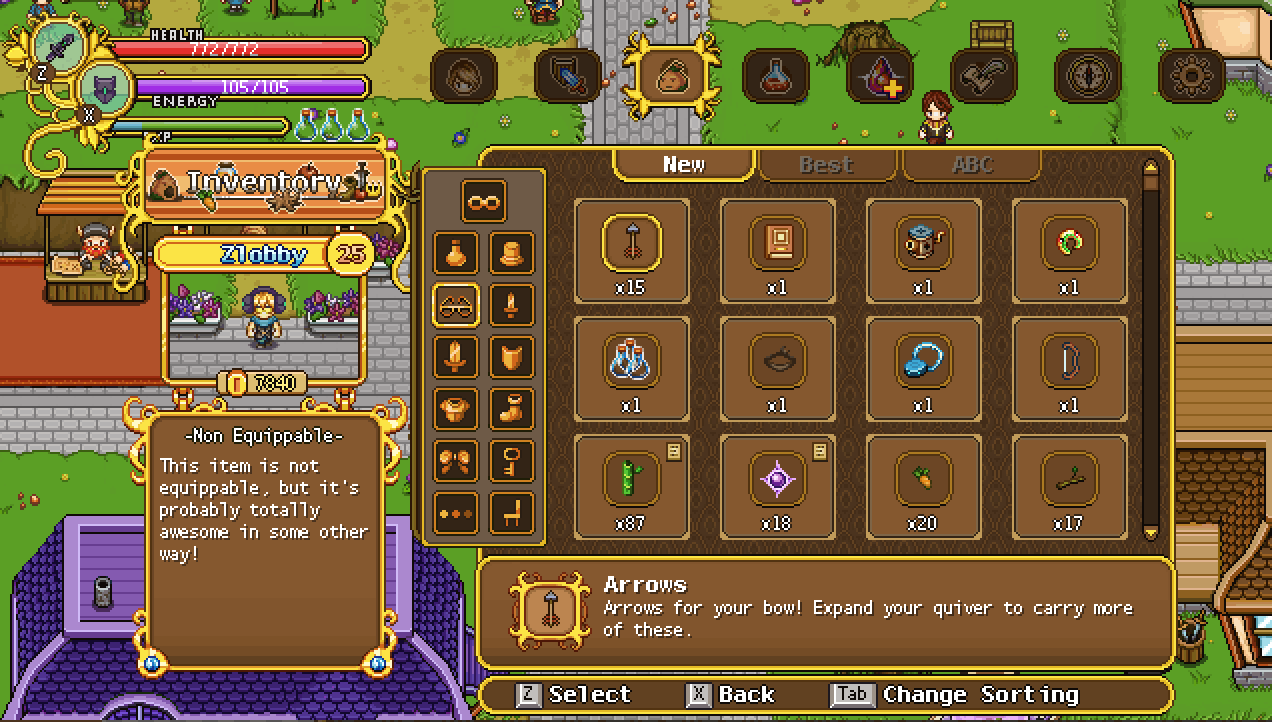
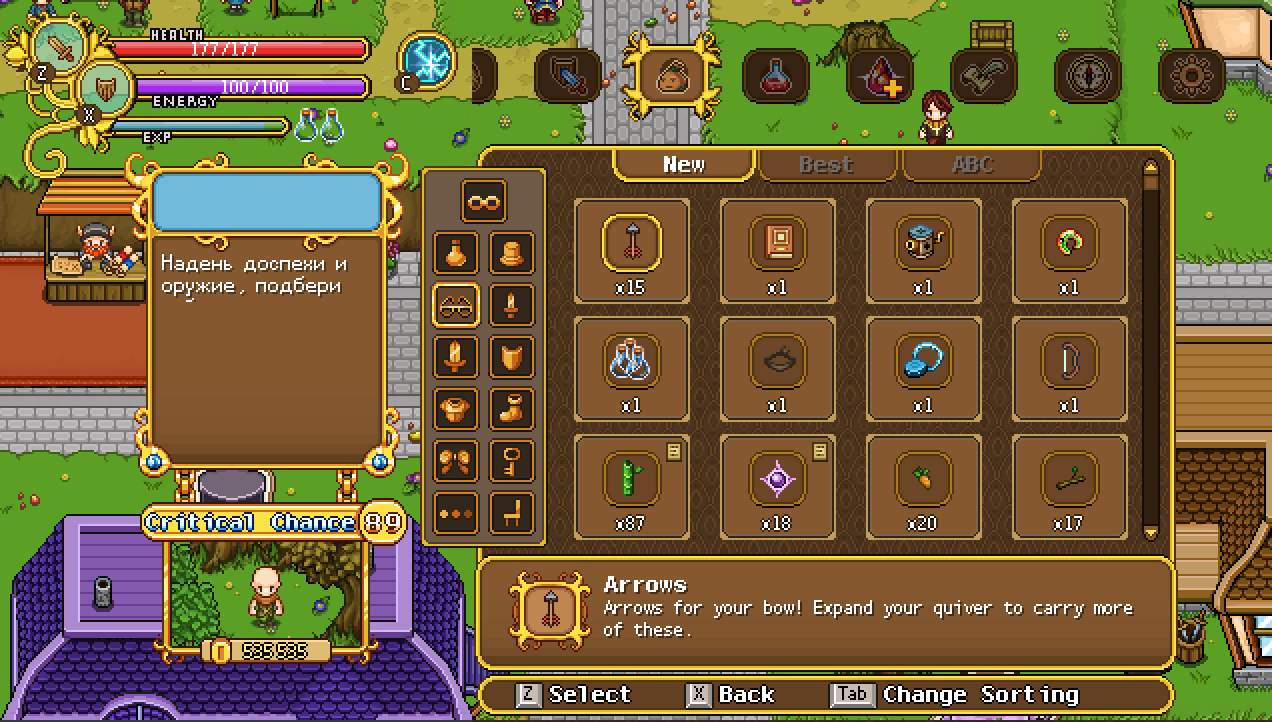
Good work guys, new menu redesign looks good, although some players might be a little confused about it (for example, that infinity button in the main inventory is confusing to me), but its okay, well figure it out. Keep up the good work and thanks for the amazing game!