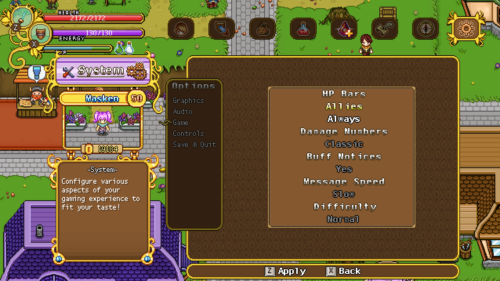
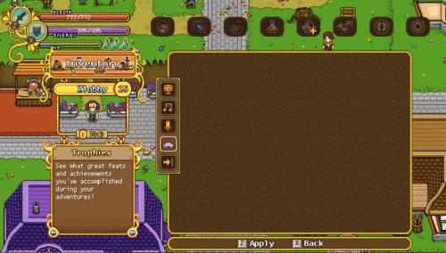
Moving on with the interface improvements, we’re not gonna take a look at the options menu! This one is the most basic one, but also the one in the most need of a slight upgrade in my opinion:
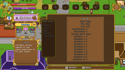
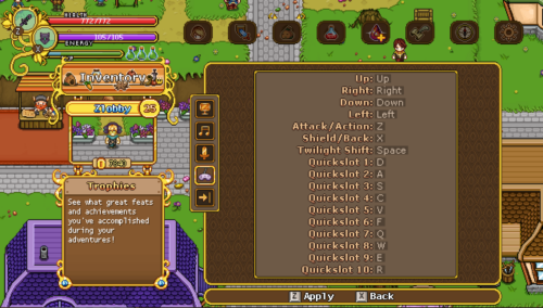
A bit more clear? We’ll continue working with this a little bit more… So in the same vein, the controls menu:
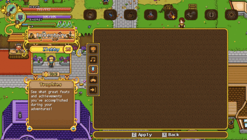
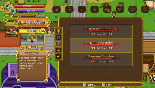
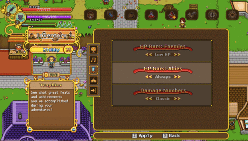
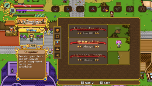
Next in our quest to make things a bit more clear and easily read, we decided to make a version of the options menu featuring screenshots (not that the ones provided below are samples to showcase the general design):
This way you’ll more readily see how your various settings affect the game without having to close the menu and trying them out for yourself!
With us deciding to go for the icons rather than the text versions, it’s time to make some slight adjustments to the designs of the journal section, where the icons will only be in a single row:
Note also the changes in the Trophies section, where we’ve decided to do away with the title part, making it fit the other designs a bit more!
Meanwhile in Fred’s department, we have some more sneak peeks of what to come: more grindea fighting and some desert fishes for the aquarium!




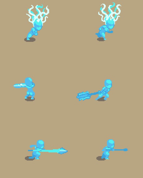


Sheeeesh… now I wish I could poke enemies with a spear.