Next up, we’re playing around with some other types of icons for the Talent & Skill menu, with a magic orb as the magic indicator and a star for the utility icon. We’re also considering a third option for the magic icon, with an old diagonal wizard staff. What do you guys think?

Now, time to give some more of those icons a colour wash! Here they are in their before and after states:

And now, time for the next menu to be redesigned: the quest info pages! Let’s have a look:

With the text menu being replaced by icons, we wanted to make a more easily read headline available on the left side for each category, so it’ll be quicker to learn which one does what. Currently, we’ve only had a headline for the main category, such as ‘Journal’, with the character box beneath it and another info box below that – however we feel like it’s very rare for people to even pay attention to what’s beneath the character box, and so moving things around might make the menu a bit more easier to understand. Hence:

I wouldn’t say it looks quite as nice graphically, but I do agree that this way it’ll definitely be easier to see and understand what category you’re on. What do you guys think?

Meanwhile, in Fred & Teddy’s corner, Fred’s been continuing on with Grindea animations! Here’s another sneak peek of that, featuring a running animation:

Teddy has also been hard at work, and besides more Arcade Mode stuff, he’s been spending some time optimizing the loading times of the game! Take a look at this before and after:


With these optimizations, we hope a lot of loading times will be removed, giving you a much more smooth experience while playing the game :)

Over on the very small super early betas, the next update is already up and running now, featuring the new books! One thing we decided to add is proper book fronts, which look something like this:

Sample of the actual text in the game:

And here we have some of the text with some of the color variations:

We’ll be adding more book covers as well! By the time the game is finished, I would like to have more variations, but for now the main difference will be the color:

Next, we’ll be upgrading the look of the map interface, seeing as we’ve been adding a bunch of new maps recently! Let’s take a look:

This is a bit more streamlined, and allows you to see more maps on each page!

We’re also adding a different way of showing the maps, namely a pop out function which shows you the map on a piece of paper! This is what it’ll look like:

Give it more of a map-y feel, doesn’t it? :)

Now it’s time to upgrade another interface! Let’s take a look at the good old quest part of the journal and see how we can improve it:

With this new setup, active and completed quests only need one menu, and whether a quest is active or finished will depend on whether they’re gold or silver colored, just like in the Trophy section! I also upgraded each of the quest indicator images while I was at it. What do you guys think? :)

In Fred’s (and Teddy’s) department, we’re playing around with some light effects for that Grindea sprite! Below you can see some tests, as well as a palette swap – it won’t be used the way it looks there, but it shows how we pretty easily can swap her colours around if we need to during the fight, for effect purposes :)

First up this week, editing that enemy info page a bit, allowing for larger numbers in each of the categories:

Another seed is on the way, through which you can grow a very strange plant indeed… Let’s take a look:

After some consideration of the previous version, we decided to swap it around:

And now, for the seed:

And all of the usual interface bits needed for you to grow this thing:

And now, something that’s been a long time coming: new haircuts! Remember the locked ones? Well they won’t be locked much longer, as we intend to fill up the remaining haircut slots – or at least add a bunch more of them. Here’s the first batch:

Remember how started improving the inventory menu a while back, preparing for the categories to be icons rather than text? Well, it’s finally time to start making those icons!

In this first test, I went for a monochrome look, but we’re not sure whether it’s the best way to go – perhaps it’s better to bring in a bit more colour to the menu, giving each icon a colour of its own. What do you guys think?

And here we have another option, the icons in colour! Which one do you prefer?

I personally feel a bit torn, since the monochrome one looks a bit less messy and more stylish, but it’s also nice to bring in more colour to the menu! It’s possible we’ll keep on iterating these options, or go for a mix of some sort, perhaps having the category you’re currently on show in colour. We’ll see!

Meanwhile, Fred has been doing some more work on Grindea! Here’s some of his WIP sketches:

…And Teddy’s been adding my personal favourite feature in a long time! Lizards in your house!! How cute isn’t this?

As you may have noticed in previous images of the seed system, the Jumpkin was missing from most of it! Therefore, let’s start off this week by making all of the Jumpkin stuff, including a new drop for the Jumpkin, replacing the pumpkin seeds it dropped previously (it’ll now drop a singular seed, which looks a bit different, which will let you plant it, but it’ll also drop a jumpkin stem)!

There’s also a menu button for the seed system store, which can be seen below as well:

Time for the final veteran portrait, this one featuring the lady with the giant hammer! Let’s have a look:

Now it’s time to make a little redesign of the enemy codex! As mentioned, we’re going to redesign most of the menu, but the enemy codex is the one we’re aiming to actually get into this patch as opposed to a future one, as it will show information on which enemies drop seeds!

Here’s what it used to look like:

And here’s the process of the redesign:

As you can see, we can now fit twice as many enemies on every single page, giving a better overview of each enemy and what it drops:

We’re not 100% this is the iteration that will make it into the game yet, but at the very least, it’s a start! What do you guys think? Better or no?

Continuing with a couple more iterations of the codex, these ones have fewer details for more readability, and some bigger spacing:

Which one is your favourite this far?

Meanwhile, Fred’s been working on some fun stuff, including a little cloud that will water those growing plats for you, and Grindeas idle animation! How cool is that?

On to the next mission, making drop appearances for each of the potted plants! First batch here:


And here’s the second batch:


And now it’s time to take a look at the new interface where you’ll be able to choose which of your seeds to plant! Going for a pretty minimalistic and streamlined design here, this interface will only show the seed, how much it costs to pot it, what sort of pot and plant it’ll result in and how much money you have!

I made two versions of this interface, one with static colours which you can see above, and one where the colours are different for each seed, seen here below:

And here’s the rest of the colours, in case we decide to go for the second version:

Which one do you prefer?

Next we have another portrait, of another of the veteran collectors we’re adding:


As for Fred, he’s been busy potting a lot of plants! Here you can see a whole bunch of them in their housing forms, including a jumpkin for which I haven’t made a proper pot yet:

Today we’ve had a meeting talking about various improvements for the game as a whole. One such thing we’ve been meaning to add for a while is a proper loading screen before the game starts up: on some computers the game can take a little bit to start (we’re working on making this quicker as well!) and so it’s really nice to be able to get confirmation that you actually pressed the button in the first place.

As such, we’ve decided to add a little splash screen followed by the customary Pixel Ferrets logo (as well as our sound design teams logos) before a (hopefully) short load screen will appear until the game has properly loaded. Adding the splash picture and the logos should give the game most of the time it needs to start up everything it needs, so adding those will likely come with the added benefit of the game feeling like it’s starting up a bit quicker than it actually does as well (haha..)

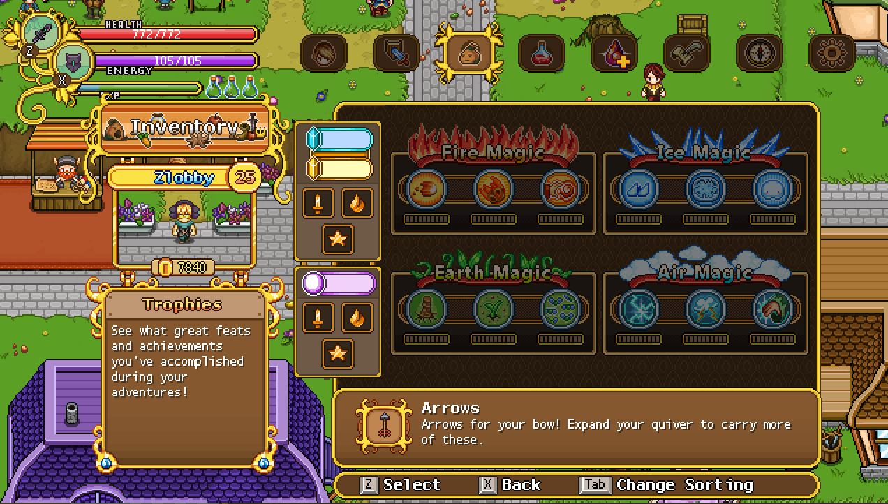
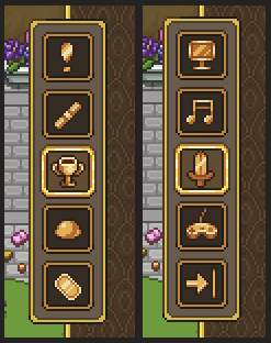
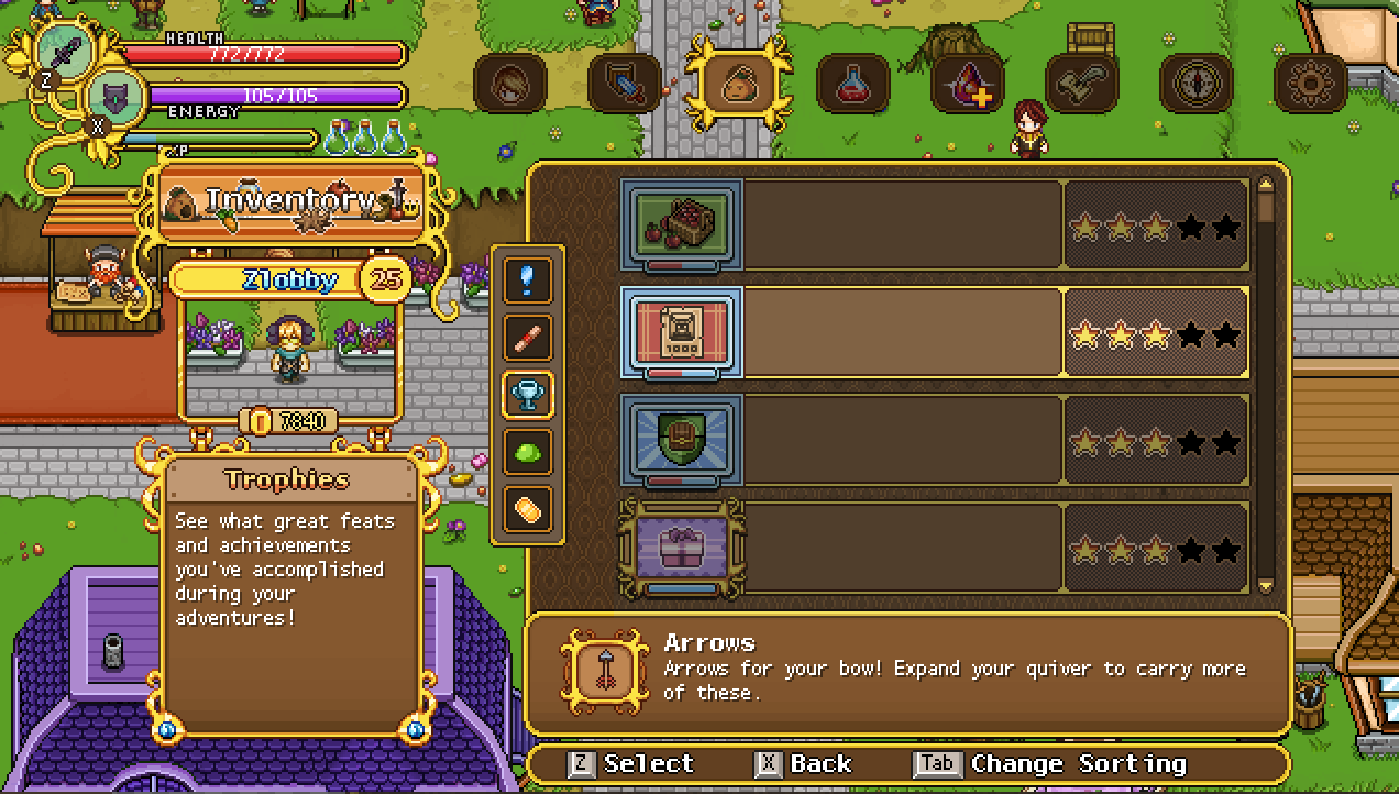
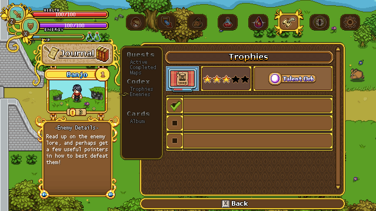
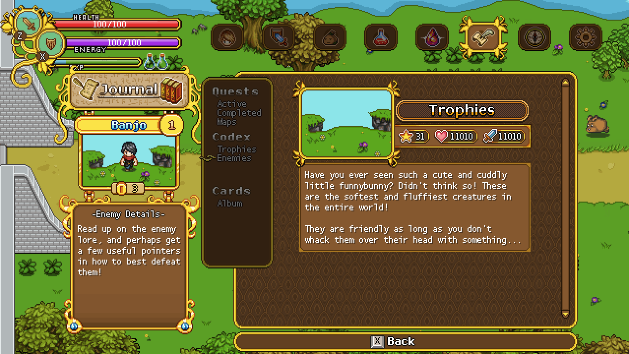
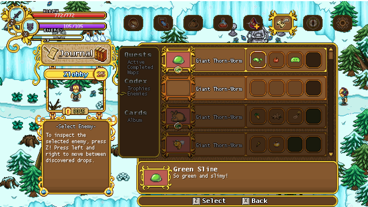
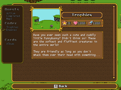
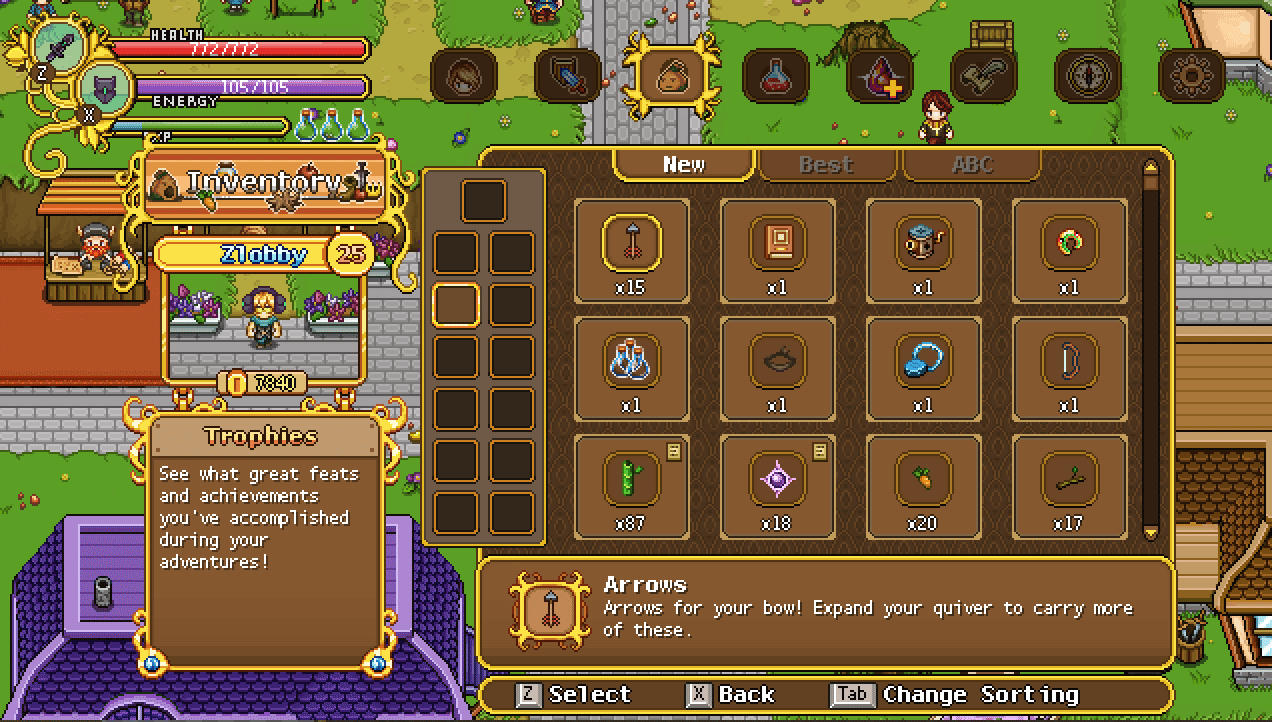
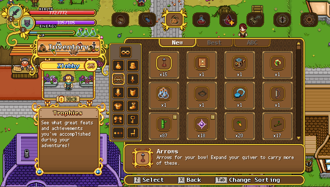
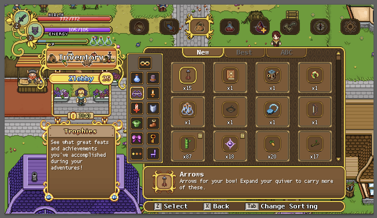
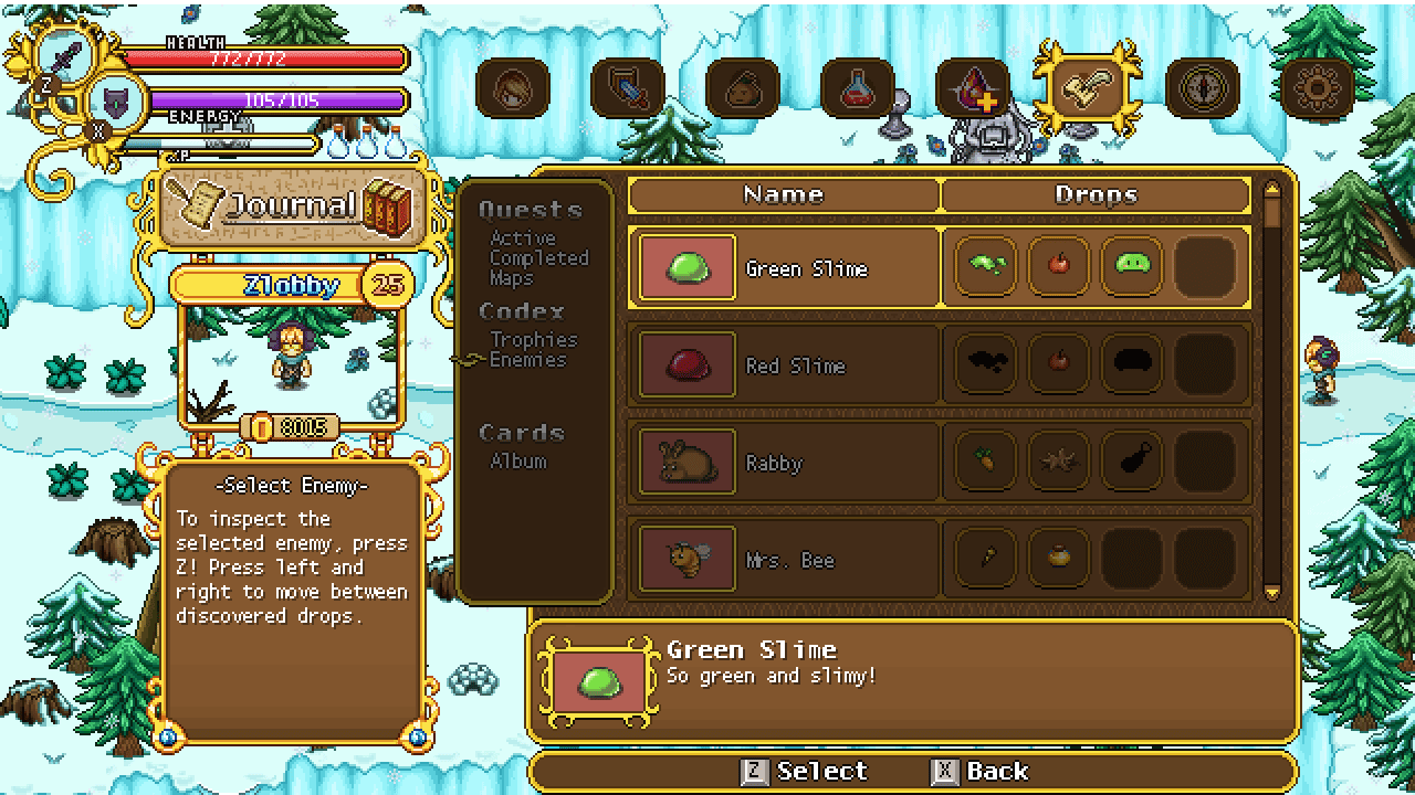
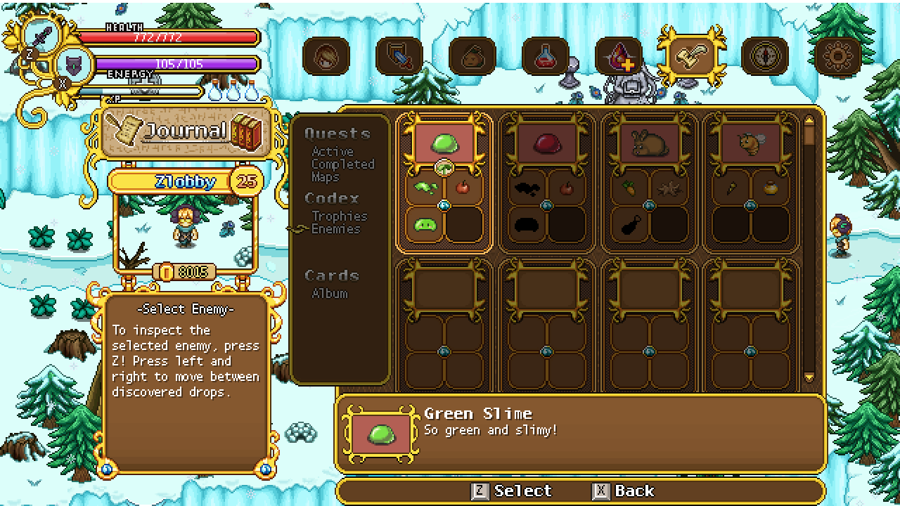
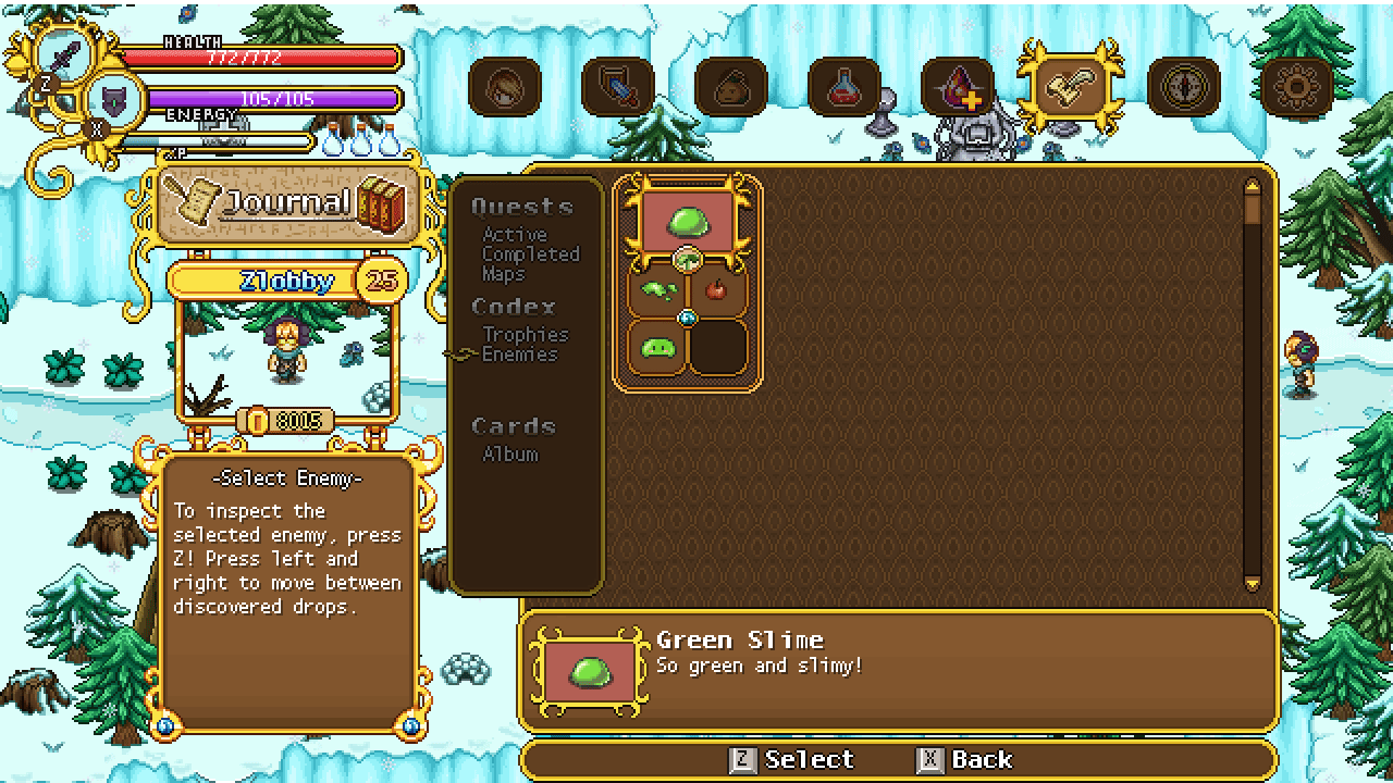
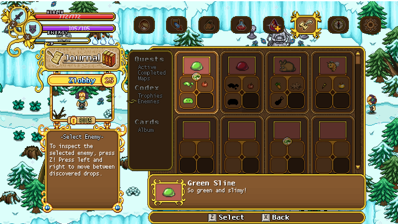
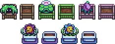
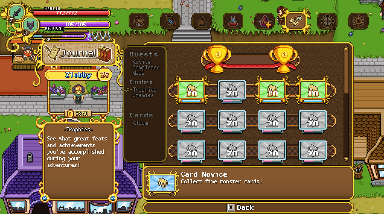
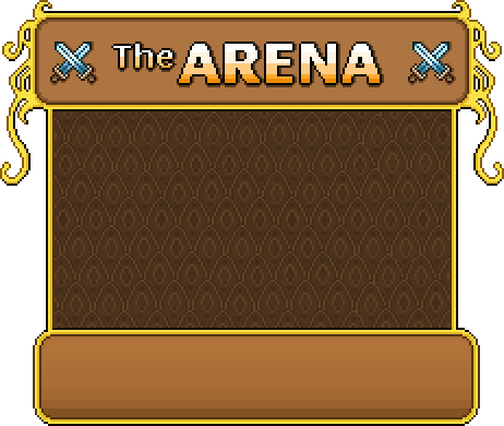
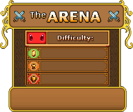
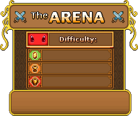
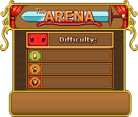
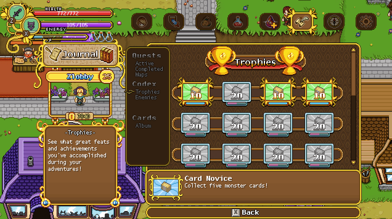
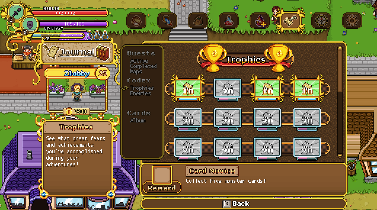
We’ve also made the decision to upgrade some more menus: you already saw our work on the Trophies menu redesign last week, and we’ll continue to work on giving most of the in-game menus an upgraded look that fits better with the game’s overall aesthetic as well as work better overall – some just haven’t been streamlined enough, or have issues with the game’s various translations. More on that later!

Another thing we’ve been discussing but won’t be added until later on, if at all, is lobby systems, where you can host your game in a public listing, allowing strangers to join you from the game menu itself. While this is a neat feature for players who don’t have friends playing the game and who do not want to join a community in finding players in a similar ping distance, we feel like people are managing just fine for now and that adding it would be better left to after release, if it’s even needed then. We’ll see!

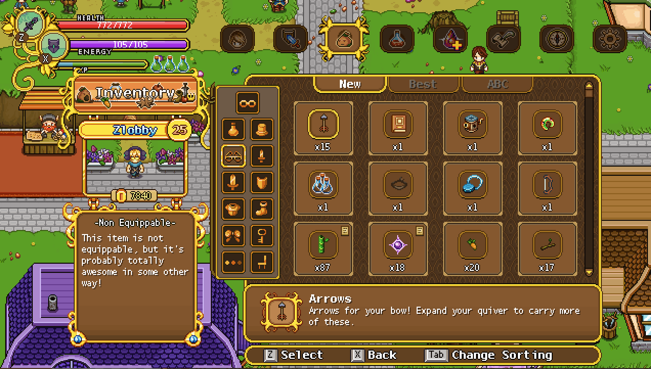
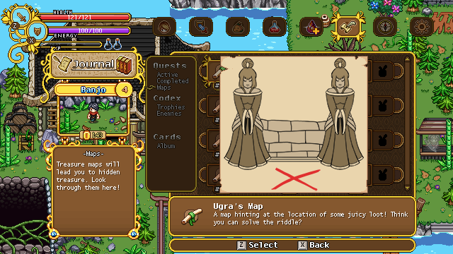
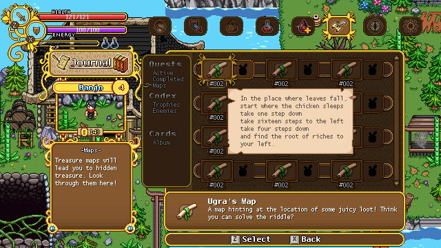
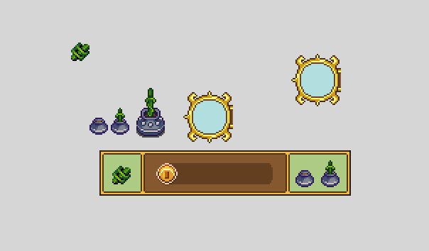
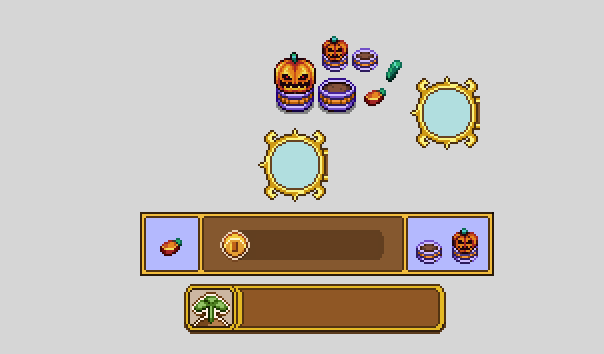
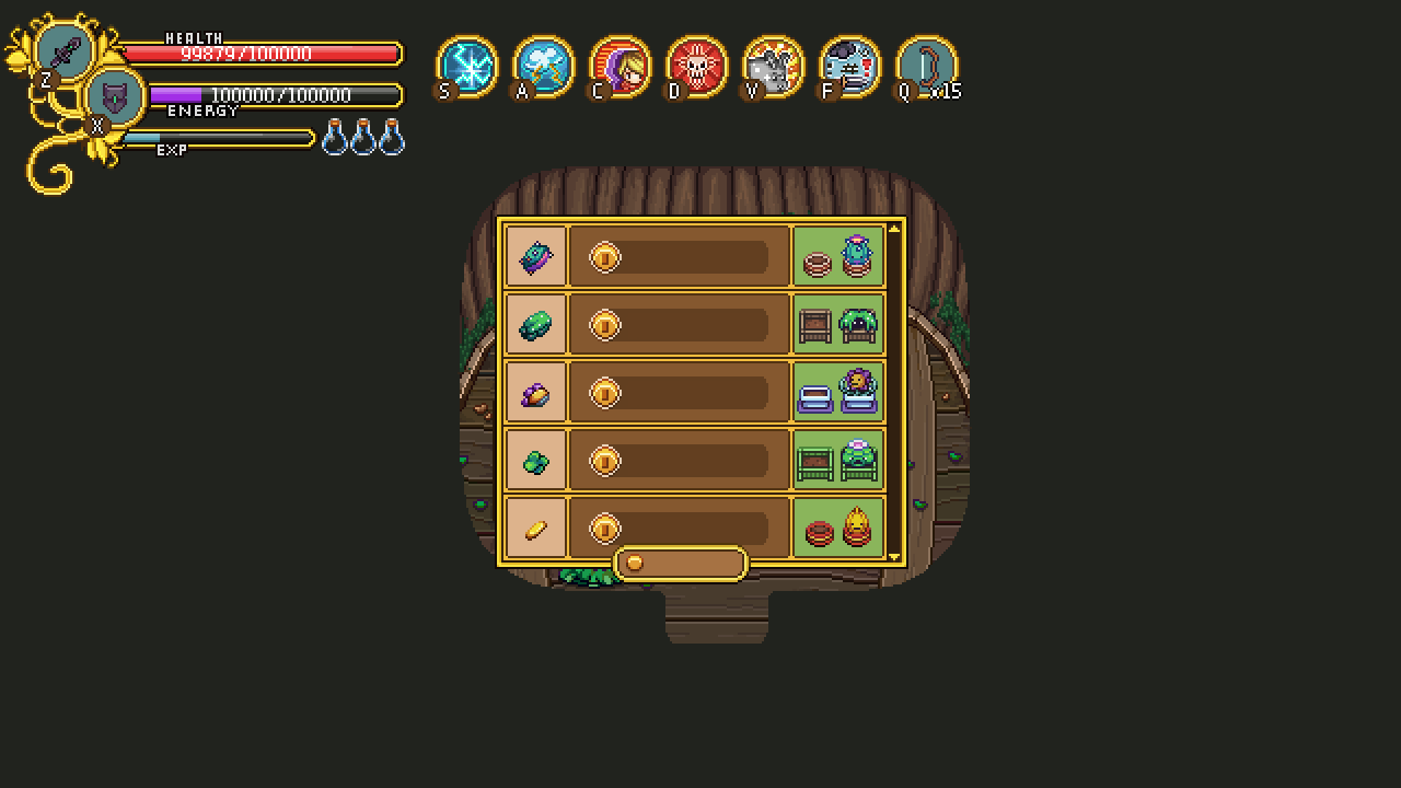
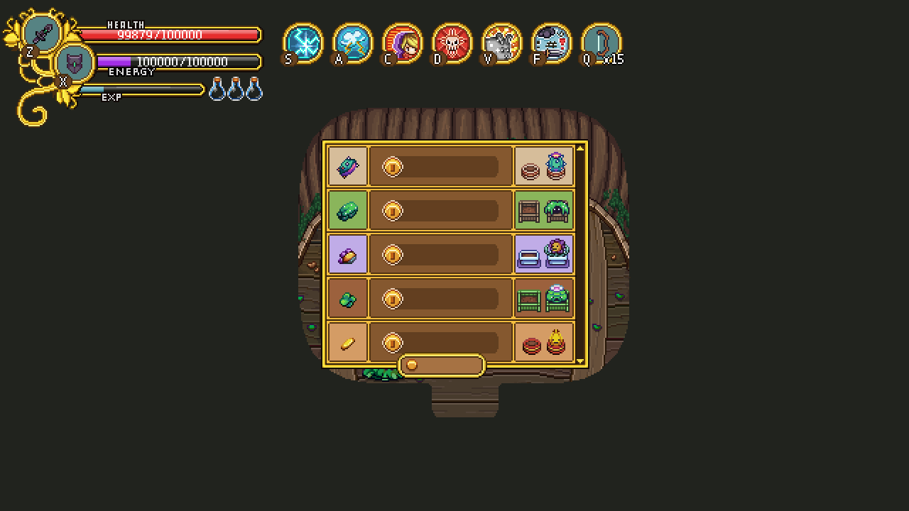
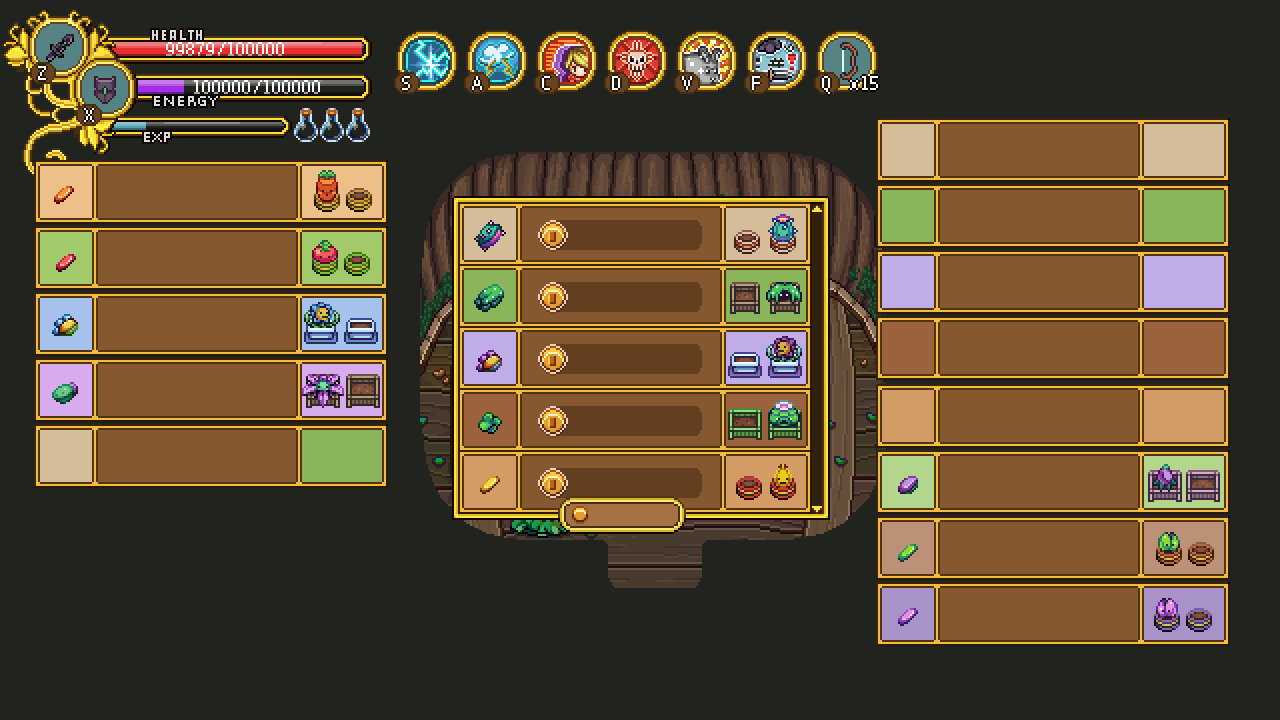
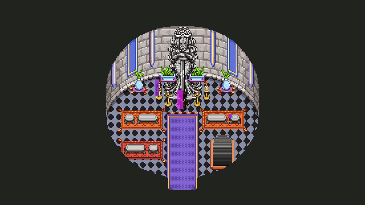
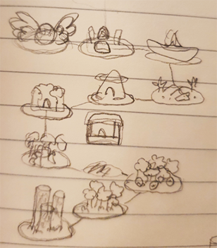
Now, let’s start work on some of the smaller menu improvements. In this post, I’ll mainly be looking at adding some flavour to the box on the left, where you can read a description of the part of the menu you’re currently in. With this new addition, you’ll get a more proper headline than the one in use right now, which is just more of the same boring white text.

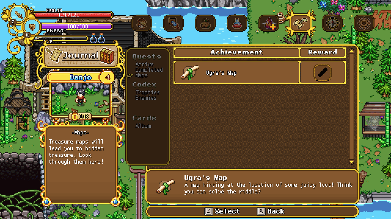
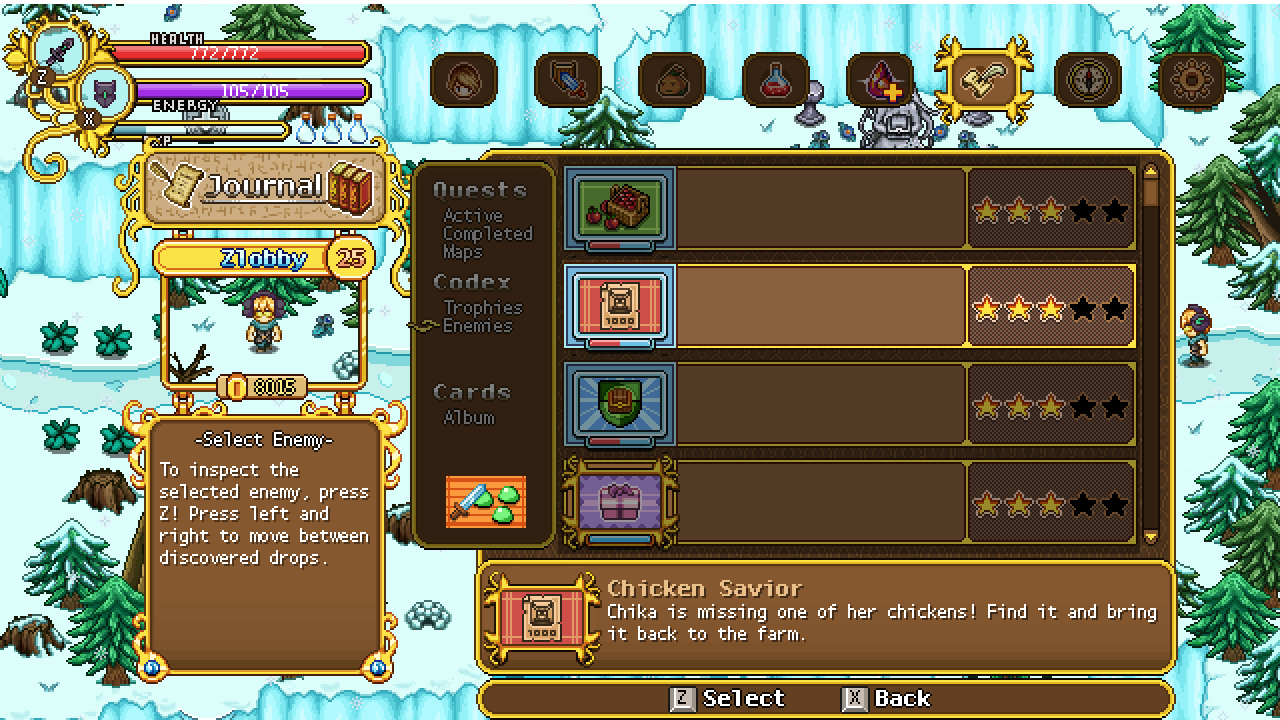
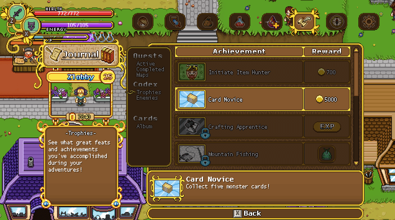
We’re also adding a reward box to the trophies menu on the info box to the right, where you can easily see what you’ll get for finishing up the achievement in question. While this wasn’t totally needed, we felt it’s nice for people to be able to know the reward, so they can decide if they wanna pursue a specific trophy over the rest.

In that same box, we’re also adding another proper headline – although we’re not entirely sure it’ll look in this exact way yet, since it takes up a lot of space and we might need all we can get in order to fit the lengthier descriptions.

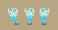
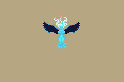
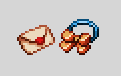
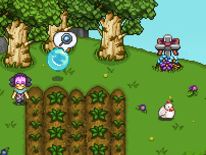
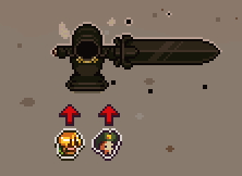
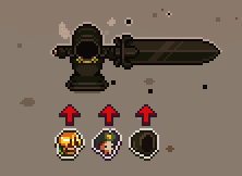
As a bonus, while I’m in the world of interface, here’s a little GIF featuring a battle indicator used for Bishop’s boss battle:

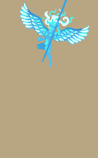
Okay, so time for us to take a look at that loading screen I mentioned previously! First of all, here we have the splash art that will appear before anything else. This won’t have the ‘windowed’ look, but will simply appear for a short while before the actual game window pops up:

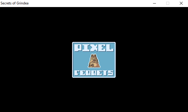
Once the game window starts, you’ll be greeted with the familiar Pixel Ferrets logo, as mentioned before:

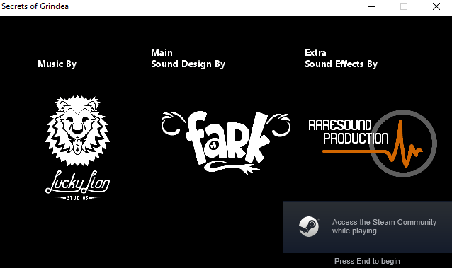
Followed by the three teams that have helped us bring the world of Grindea together in terms of sound effects and music:

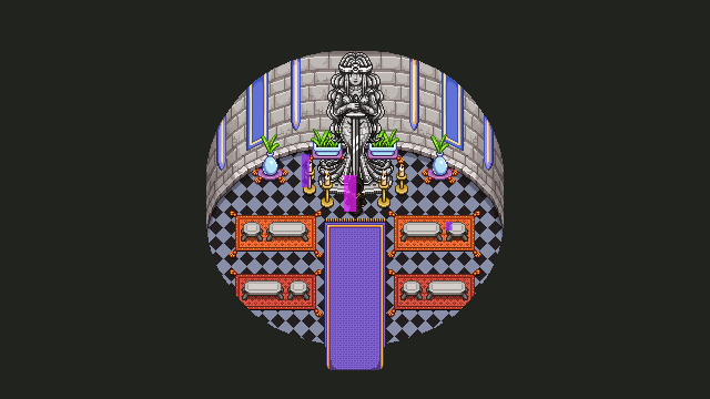
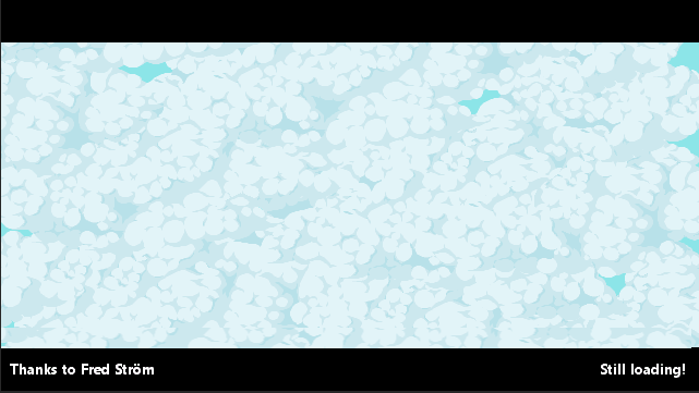
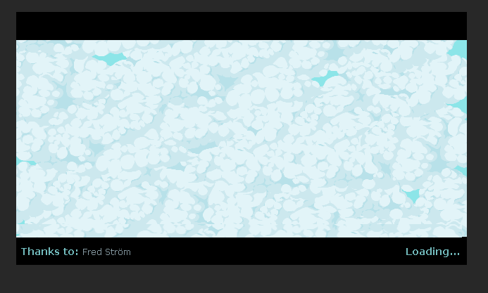
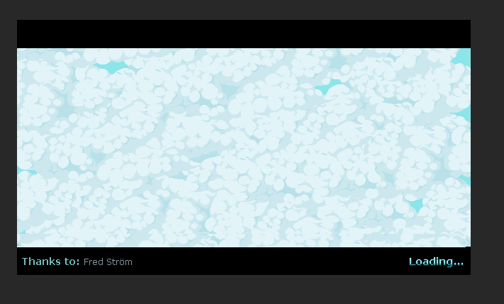
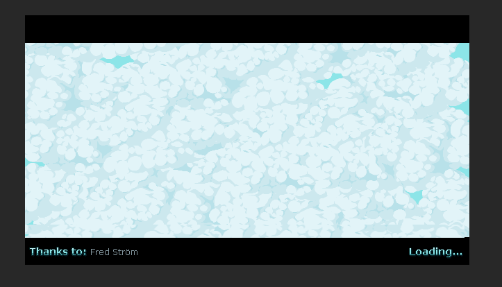
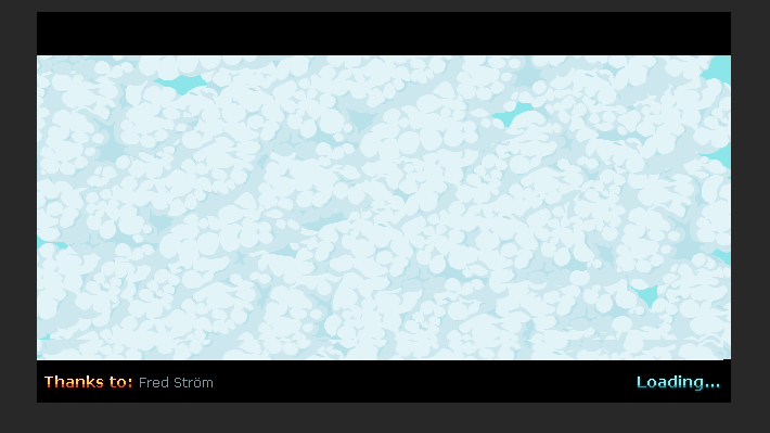
Once that is out of the way, you’ll be greeted with the actual load screen. It’ll start like this, completely covered in clouds, but once the game finishes loading, the clouds will part ways and the pre-game menu will be revealed. To the left in this load screen, we’ll also have a random backer’s names show up as thanks for helping us get this far:

A gif showing how it all plays out once the actual game window starts can be seen here (although my computer already properly loaded the game, so there’s not much of a load screen going on here haha):

Now, some of these things are a bit placeholder-y, one of them being the fonts and overall design of the texts used. For example, I’m not too fond of the readability in the sound design teams part of the load screen, with it being on two rows and a bit hard to read overall:

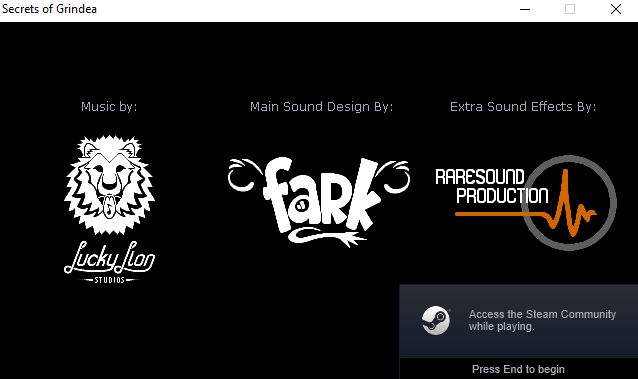
So I made a couple suggestions making it look a bit more streamlined and less in your face:

For the cloudy load screen part, there was a bit of a font issue as well. Here’s what it looked like before:

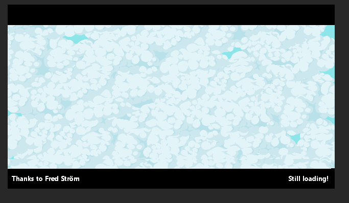
And here are some suggested improvements, with this first one being my personal favourite (although we haven’t made any final decisions regarding which one we’ll pick yet):

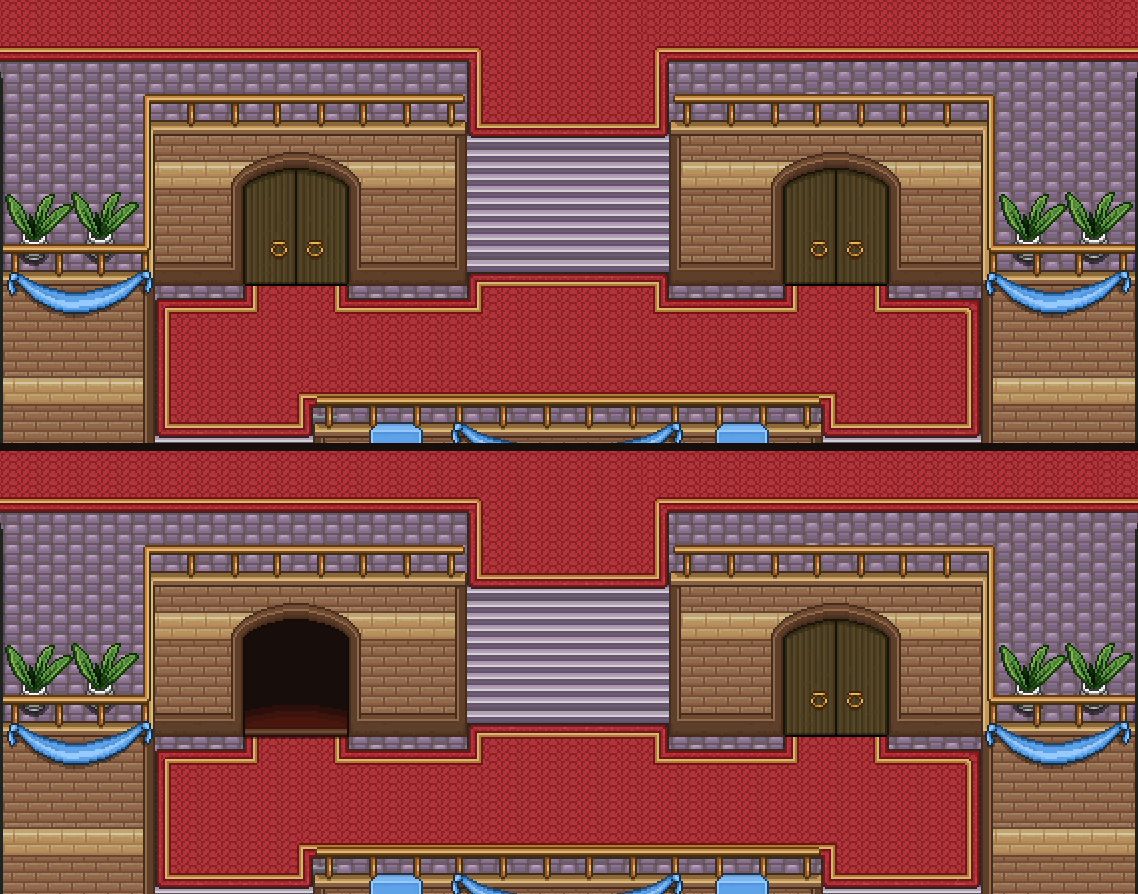
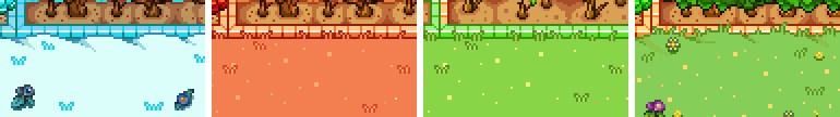
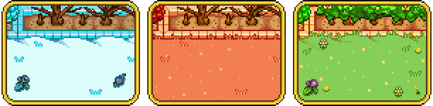
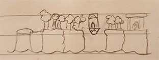
Finally, with this new load screen appearing, I felt like the old in-game load screen between areas look a bit lame (it was one of the very first things we added to the game, after all!) so I made a little mockup of what a new version could look like, tying back to the pre-game load screen we’re implementing right now:

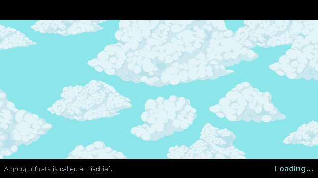
The text on the left will be replaced by the usual gameplay tips, I just didn’t have them on hand so I picked a random rat fact for now! The idea is that the clouds will be floating slowly across the sky, with possibly the occasional bird flying across – although hopefully the game won’t load for so long between areas that you’ll have to spend any longer amounts of time looking at it haha!

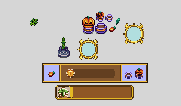
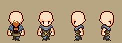
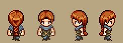
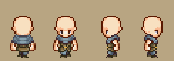
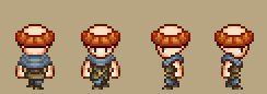
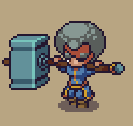
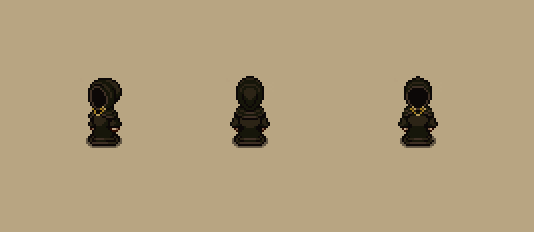
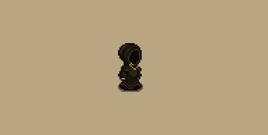
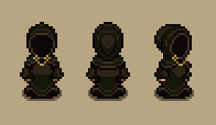
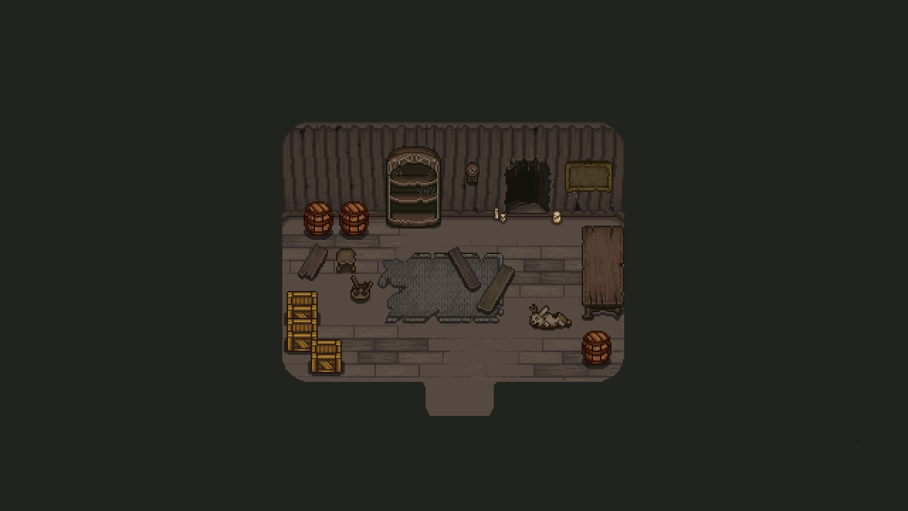
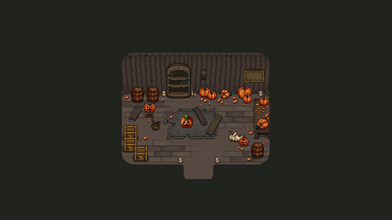
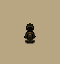
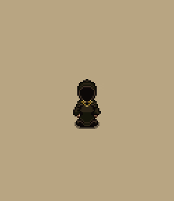
Meanwhile, Fred is working on adding and animating some new NPCs, namely the priest and apprentice that will appear in the church in Port Monnaie, as well as giving Bokus the ability to read and turn the pages of his book:

Now, as I mentioned last week we’re doing a bit of an archery challenge in Arcade Mode, and as such I was tasked with making a mobile version of the archery challenge!

For now, this style will appear on each of the floors, but I have a crazy idea of making a special background and use different bush cutouts for each floor, if I manage to find the spare time for it!

Next up, some additions and changes to the transmutation GUI! For starters, the mechanic needed a proper ‘shop title’ splash, and a button for activating the transmutation service to begin with, as seen below:

We also decided to make a few changes to the UI itself, adding a couple of maracas, removing the title bar (it seemed unnecessary), and changing the colours of the gems in the interface to better represent the rest of the UI colours here.

And now, some mixed stuff, starting with some improvements on the readability of the shop title splash I just showed:

An open door in the HQ leading into said transmutation room:

And some of our progress on a different part of the game, namely the Bishop’s battle! Here you can see some more of our iteration process, ranging from climbing the pillar itself to how the encounter with Bishop himself evolved from the placeholder version to what’s currently in the game! If you look closely, you’ll see that the background has changed slightly from the previous finished version I showed some time back: we’ve moved the bushes slightly out of the way to make sure they don’t distract from the battle:


Next, back to story mode, as we’ve been working on a redesign for the trophies menu! As mentioned before, we’re gonna change the trophies themselves around a bit as well, and in doing so we’ll upgrade the whole look of this part of the menu to better match the other newer menus, basically by adding more and better graphics:

Finally we’re looking at a bunch of effects he’s been working on for the card cave, shown here as videos!

The first video shows our very first iteration of how the cavities in the wall light up depending on how many cards you’ve collected. The second video show what happens once you’ve collected all of the cards, revealing a secret catalyst, and in the third video we have adjusted the colour of the flames and added some bonus effects to when the cards merge together into the catalyst:

The next thing we’ve been discussing and designing for the final dungeon is the Flying Fortress floor. In the beginning we wanted this to be quite phase shift heavy, but as we though more about it we felt the essence of Flying Fortress is more about bullet hells, so we started leaning more towards that. However, we’ve had a ton a random ideas, among others a phase shift puzzle where you need to collect items within a certain time and a bullet hell with guardians that block parts of the room with their laser beams…

In the end however, we settled for three rooms (for now, this might change), first one of those corridor where a number of orbs pass through and you have to run left and right so you pass through the orbs in the slot where one of the orbs is missing – I’m not great at explaining this in words, but you’ve already passed through such a corridor in Flying Fortress already, and this one will be pretty much the same – although we have some ideas for beams and such to make it a bit more difficult and high paced.

The second room will have a number of small platforms, 4 or more, which will get hit by a ton of missiles. The goal in this room is to phase shift to the one platform that won’t get hit by missiles and as such avoid damage. Once the timer runs out you’ll be able to proceed to the final room…

…which is all about bosses, namely Phase man – and not only one, but two of them(!), ending with a little burst of Gun-D4m. We’re pretty excited about this combo and hope you will be too!

For Seasonne, we all felt like the core of the area is the Toy Factory, but we also wanted a little dash of the regular snow area, and an appearance of Marino, since he’s a pretty big character and having Amalet stolen from you after Flying Fortress is a pretty important part of the game, after all.

As such, you’ll begin this floor by appearing in a small Seasonne-esque area with the usual Seasonne enemies minding their own business. At the end of the area is the Toy Factory building, which you enter, and find yourself in a room with a locked door, a blocked path and a chest. In the chest is a key for the locked door, but before you have a chance to unlock it Marino appears and steals it from you, dashing through the blocked path, breaking the things that blocked your path before.

The next room will be one of two challenge rooms, but we haven’t yet decided which one of these it’ll be! In one, you think you’ll have to solve a block puzzle, only for each and every block and piece of it to come alive so you have to defeat it literally by force. The second would be a lot more like the room where you battle a ton of gift boxes, only with more kinds of gift boxes with new abilities!

After that, you’ll end up in a room with a conveyor belt where you’ll chase Marino for a bit before ending up in a room where you’ll battle him along with having to dodge falling bombs and trains, much like in the later rooms of the Toy Factory!

Next, time for some mixed stuff! Your mother’s grave in Startington, some new items made for an additional part of the ghost remembrance quest in the Ghost Ship, as well as an expression for the newly added ghost you’ll find there soon:

And here’s some more new stuff, featuring bigger versions of the catalysts, new backgrounds for the temple of seasons character and enemy codex, a new set of stairs in the Port Monnaie church, and a slight edit of the Startington grave:

Meanwhile, Fred’s been working on more Bishop stuff and some new player animations, one which can be seen here:

So last week our goal was to each come up with one or a few design ideas for the first floor in the final dungeon, after which we’d go through each of our suggestions and pick our favourites, building our dungeon one floor at a time.

As we mentioned, our guidelines were to remind people of the journey they’ve made throughout the game, bringing back “old classic” events and mechanics. Some of our ideas for the first floor, representing the very beginning of the game, ranged from battling your own sword and shield, a bullet hell with wooden swords, bees circulating around you and attacking you one by one, or an arena where you battle a block puzzle that comes alive.

In the end we decided to combine a few elements of the early parts of the game, namely the arena trials, finding your shield and sword to proceed and battling the Black Ferrets on the bridge. Our main idea is that you’ll start on a Pillar Mountains looking area (perhaps even a pillar), where you have to find your sword and shield by fishing and solving a block puzzle while the Arena commentator Mr Plott comments on what you’re doing, and you’ll only be able to proceed after handing your items to Grandpa Joe who blocks a bridge over which you’ll battle an ever increasing amount of Teddy & Freddy, culminating in a battle against Vilya herself before you’ll be able to progress to the second floor, a floor which will be centered around the Pumpkin Woods.

We also decided on some details around the dungeon. Previously, we’ve decided that the thing that turns the dungeon into what it is is an ancient artefact mirror, which transforms the tower into challenges to stop you from reaching the top. As such, we want to incorporate various mirror effects here and there (like for instance, Grandpa Joe shattering into glass pieces when you show him your sword and shield, enemies spawning by appearing through mirror glass and such). We also reiterated that we want the main focus for each floor to be something iconic to each part of the game, focusing on the story beats and ‘feel’ of certain areas.

Next up, the Pumpkin Woods floor! For the this we felt the key component was the curse of the woods, making you unable to progress, and the hunt for each of the items needed to clear the curse. To capture this, our idea is to create a set of rooms with a ‘lost woods’ feel where you’ll end up back in the first room by taking the ‘wrong’ exit, and having you battle five mini bosses in a room each.

The mini bosses we have in mind here are Pumpking and Helloweed from Arcade Mode, plus a similarly difficult mini boss based around Jack o’ Lantern which will also appear as an Arcade Mode floor boss later on! We’ll also design a challenge based around the Jumpkins and Ghostys.

For the Jumpkins this will most likely involve a living-vegetable like mayhem room with loads of jumpkins, while the Ghosty challenge idea we have so far is more about finding and defeating the correct one out of a bunch that will surround you – though our ideas here are still very much up in the air. For now, our main focus around this floor is the feel of having to cleanse the wood once more, this time by collecting the items from more difficult enemies than simple elites like you had to the first time around. We’ll dice into more specific design details once we get to this floor, our overall idea holds regardless of how we design the challenges.

Once you’ve defeated all of these mini bosses and collected their key item, you’ll be able to cleanse the curse with the aid of a Grindea statue, just like in the original Pumpkin Woods, complete with a minor appearance from Bishop; after that, it’s onto the next floor, featuring the Flying Fortress! :)

Now, you’ve seen a bunch of Bishop’s attack animations made by Fred, but now that we have a basic sketch for the arena, it’s time to start some prototyping of the fight!

At the moment, Bishop has three distinct attacks/patterns, but we have plans to add more as we go along. For now it’s a sword-throwing attack, a giant scythe attack and an attack where a bunch of Bishops emerge from the ground with spears:

We know Bishop disappears a bit into the dark background when he’s towards the top of the fight area, but we have plans on making him more visible by adding a shader that makes a subtle aura or outline around him when he’s against the dark parts. Other than that, what do you guys think so far?

In Arcade Mode, it’s high time we get a proper map through which you can track your progress! As such we’ve been talking about various ways to illustrate this, ending up with illustrating them as isles:

Now, the layout of these isles isn’t in it’s finished version here, the idea is that we want to illustrate how you move upwards a bit more, so we’ll play around with how we place the isles as we move on; and as such might change the design of these isles a bit as well.

On top of that, there are two more isles missing – that of the room where you get your reward for finishing Arcade Mode, and the bonus floor you get to only if you’re strong enough! These will only be added once they’ve been made in their proper forms in the game, though, so I know exactly how to design their isles.

In Fred’s department meanwhile, it’s all about Bishop and giving him more animations! Let’s have a look:

Good evening everyone!

Have you had great holidays despite the strange year we left behind? We’ve been taking it easy, not meeting to many people – in fact, me and Fred and Fred’s brother (whom he lives with) decided we wouldn’t go anywhere and risk getting or spreading the virus, so we celebrated christmas and new years together on the island instead!

Today we got back to work, and the first thing we decided on doing is having a meeting to discuss our upcoming patches!

There are three big patches left, one featuring the final story mode stuff (except for the ending bit), where we’ll add the last bunch of backer items, some arena stuff (making you able to rebattle bosses in the arena + some bonus challenges), adding a fight with bishop and the cave where you can track your progress on how many cards you’ve found (as well as getting a special item once you’ve collected them all).

The second patch will involve Arcade Mode, where we’ll be reworking the challenge rooms to make them a bit more fun and varied, add a proper map so you can track your progress, adding a proper room to end your runs as well as a final boss battle featuring none other than the goddess herself, Grindea! We’re also gonna make sure we feel each run is varied enough and possibly add more types of rooms to make sure each new run won’t get too repetitive.

The third and final patch before proper release is the Main Story ending patch, where we’ll add the final dungeon, both endings and both final bosses (the version of the battle you face will depend on whether it’s the default or true ending path you’re on)! It’s possible we’ll save the final battle of Arcade Mode to this patch as well, so both endings come out at the same time.

We’re aiming for the first patch to be done by the end of March – however we’re not sure whether this is actually realistic or if we’re just being hyped after having some time off for two weeks! Regardless, we’ll do our best to make it happen :)

Stay tuned for our continued progress as we head into this new year together!

So the first thing for me to do is a proper house for the Trick & Treat twins. We might postpone any optional boss battle they might have been part in, but they still get a house of their own!

The first floor was made ages ago when we still had big plans for those guys, so I decided to add a bit more detail to it:

This place will also be the home of another smaller character (in more than one way) – the evil mandarine I made a portrait of quite a while ago (still remember him?)

Next up, we’re working on adding that stuff to the arena! As part of that, you’ll be able to select difficulty for the boss rebattles, and so I was tasked with making an interface for said difficulty setting:

As you can see, there will be three settings available, and they will be Default (the way the boss was when you first encountered it), Scaled (which means we scale its difficulty to your current level), and Overpowered (which will be a much more difficult version, overpowered for your current level)! I haven’t added the texts to the buttons here as they will the rendered directly in the game engine:

Working on this interface again makes me feel like it looks a little bit bland, so I feel like I might improve on its general look in the near future as well…. :)

(You know what, said and done, time to touch up these old UI graphics a little bit:)

Meanwhile in Fred’s department, it’s all about giving Bishop some more weaponry! Scared yet?