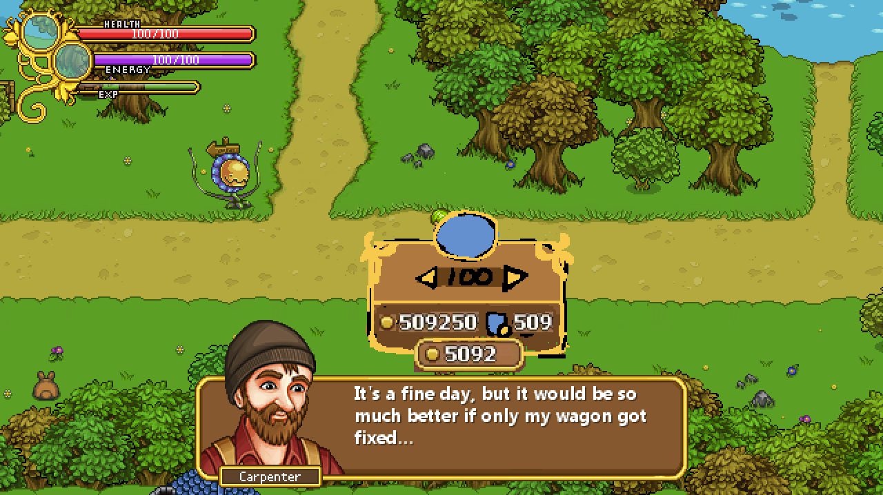
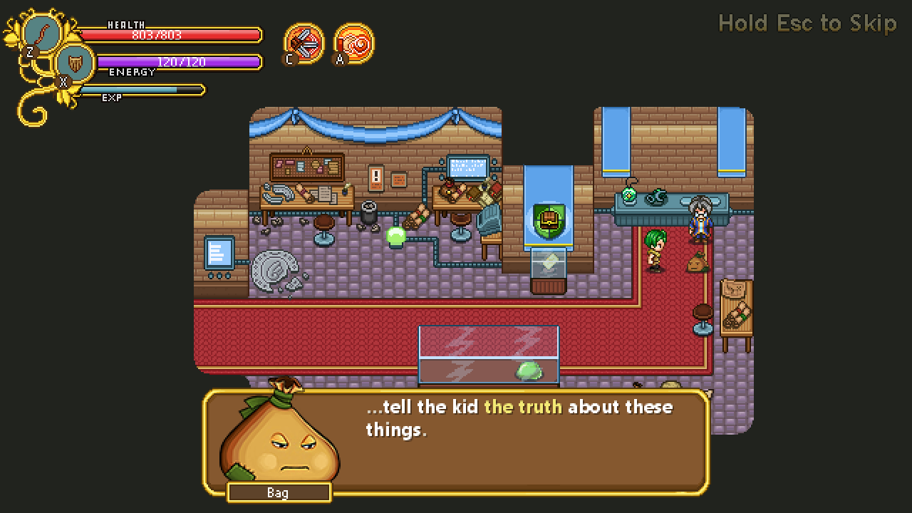
Weeeee’re back! In fact, one whole week has passed since we got back to work and it’s time for a new weekly recap~

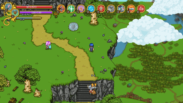
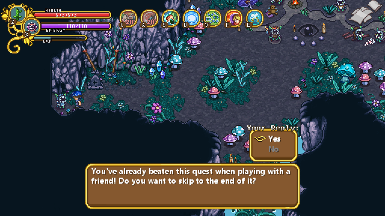
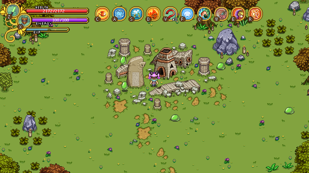
As you know, before taking this break, we launched a patch with the complete rework of our current skills in hope of making them more balanced (and fun). We’ve read all of the feedback coming in, and for now there aren’t any major changes we want to do (aside from a bunch of bug fixes that Teddy already has been working on). We will keep monitoring the feedback and possible change a few things, however: such as increasing the HP of certain enemies that have lost some of their tankyness due to the increased damage of most of the skills.

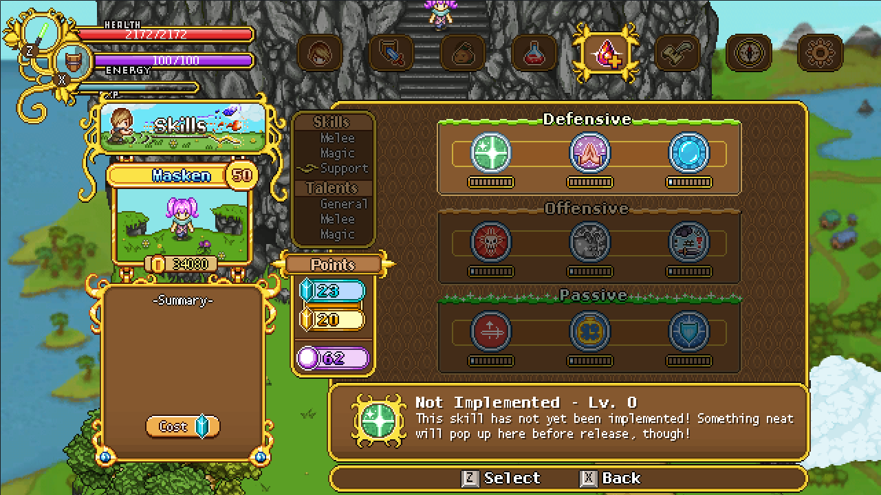
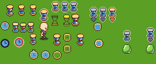
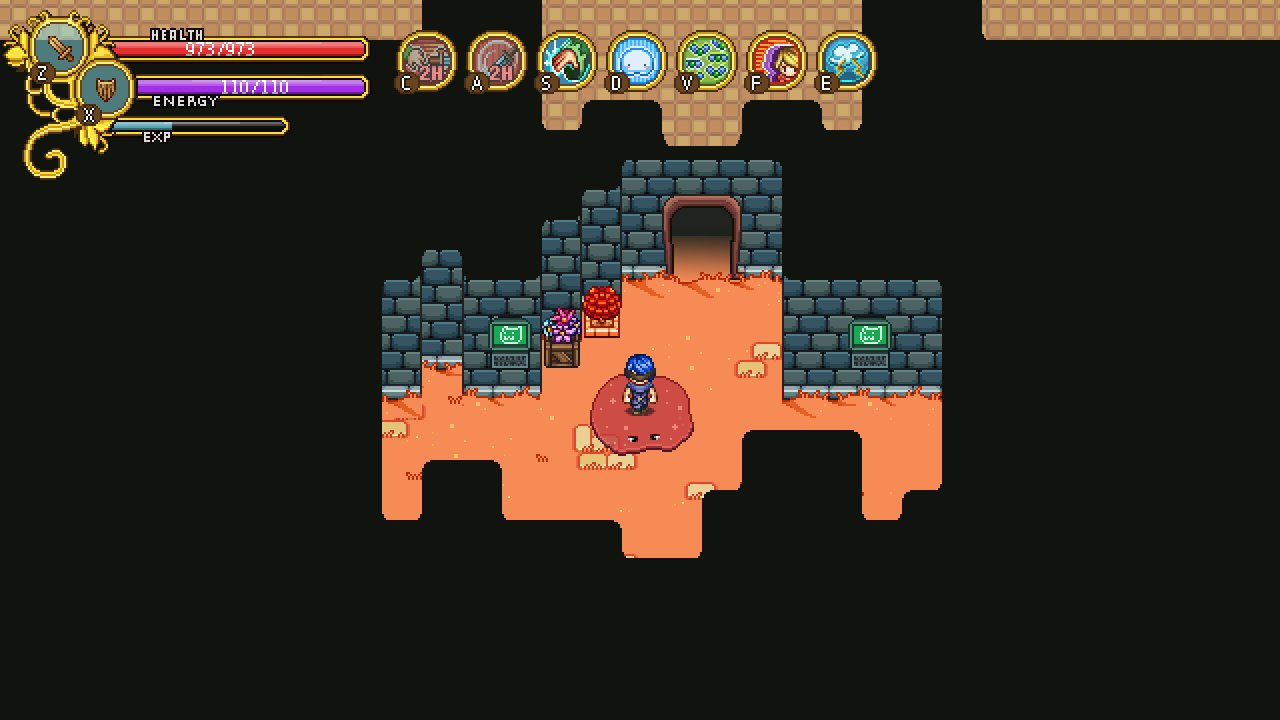
Now, to properly start the next step on our journey to actually completing this game, we had a meeting today discussing the additions of more talents! We have wanted to add a bunch for a while now, as mentioned before. For now, we’ve decided on adding 5 new Melee talents, 5 new Magic talents and 10 new General talents!

Starting with the Magic talents, some talents we discussed and confirmed will be added are:

Fast Talker – Increase Castspeed
Soul Siphon – Hitting an enemy with a wand projectile will grant the user some EP
Concentration – Increase resistance to having the (magic) spells channeling interrupted by enemy hits
Specialist – Increase damage depending on how many skillpoints you have in the same magic tree (as an example, the more fire skills you level, the stronger your fire skills will be overall)
Wand Master – Icreased damage from wand projectiles

As for the General talents, some you may expect there are:

Got You Covered – Increase buff duration
Metabolism – Increase EP regen
Health Insurance – Increase healing from health orbs
Lady Luck –  Introducing a low chance of enemy attacks missing your character
Utility Flow – Chaining Utility skills lower their EP cost (the more utility skills you use in a row the cheaper their cost in EP, up to a maximum percentage). A talent designed with the true support players in mind, who need more EP to buff a full team!
Kinetic Energy – Get EP from blocking attacks with your shield
Efficient Counter – Perfect Guarding lowering the EP cost of the next skill

And the Melee talents we’ve decided on so far:

Knowledge is Power – MATK gives ATK
Riposte – Perfect guarding within x range of an enemy deals some damage to the enemy you guarded against
Blood Thirst – Killing an enemy grants increased attack speed for a short duration
Combo Starter – After a normal attack, your melee skills have increased critchance for a short duration

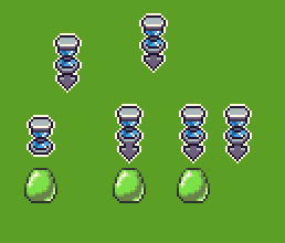
We’re currently experimenting with a melee talent that increases the attackspeed of your next normal attack(s) when you’ve been out of combat for a short while. In the general tree, there will also be at least one talent relating to the bow.

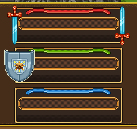
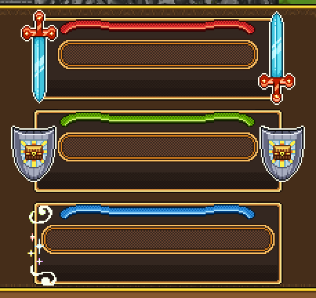
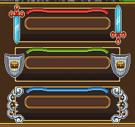
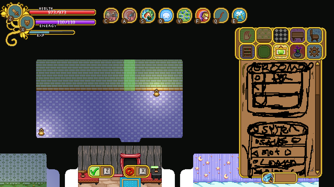
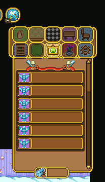
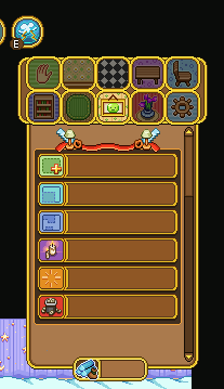
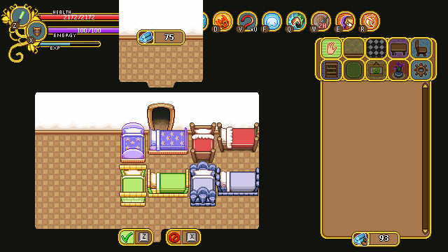
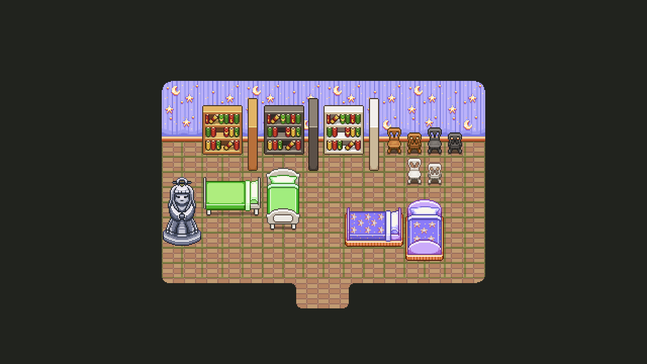
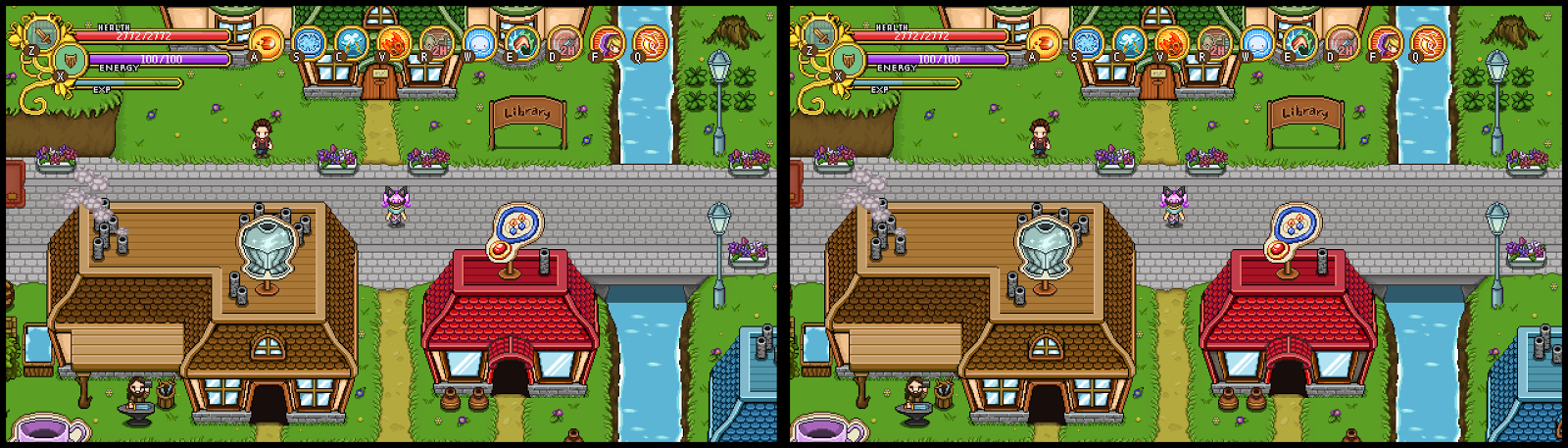
We’re also considering increasing the number of talents in the general tree to 21 (as opposed to the planned total of 20). The reason for this is that we’d like to fit all talents in a single page, without the player having to scroll down. Our idea is to go for something like this (super early mockup WIP, obviously, we’ll have to adjust all of the graphics to make this work):

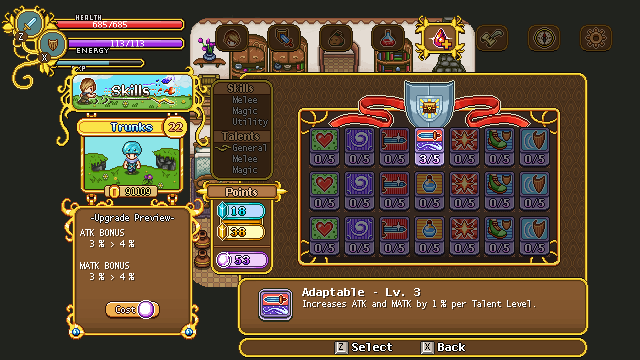
It’s a bit cluttered, but with a few adjustments we hope it won’t be too messy on the eye. We believe, at least, it will be better this way than to introduce scrolling. In the Magic and Melee talent sections, things won’t get as cluttered either, as they won’t have as many talents: at least for now, our max total is 15 each.

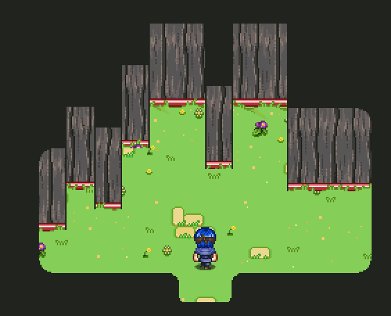
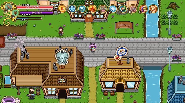
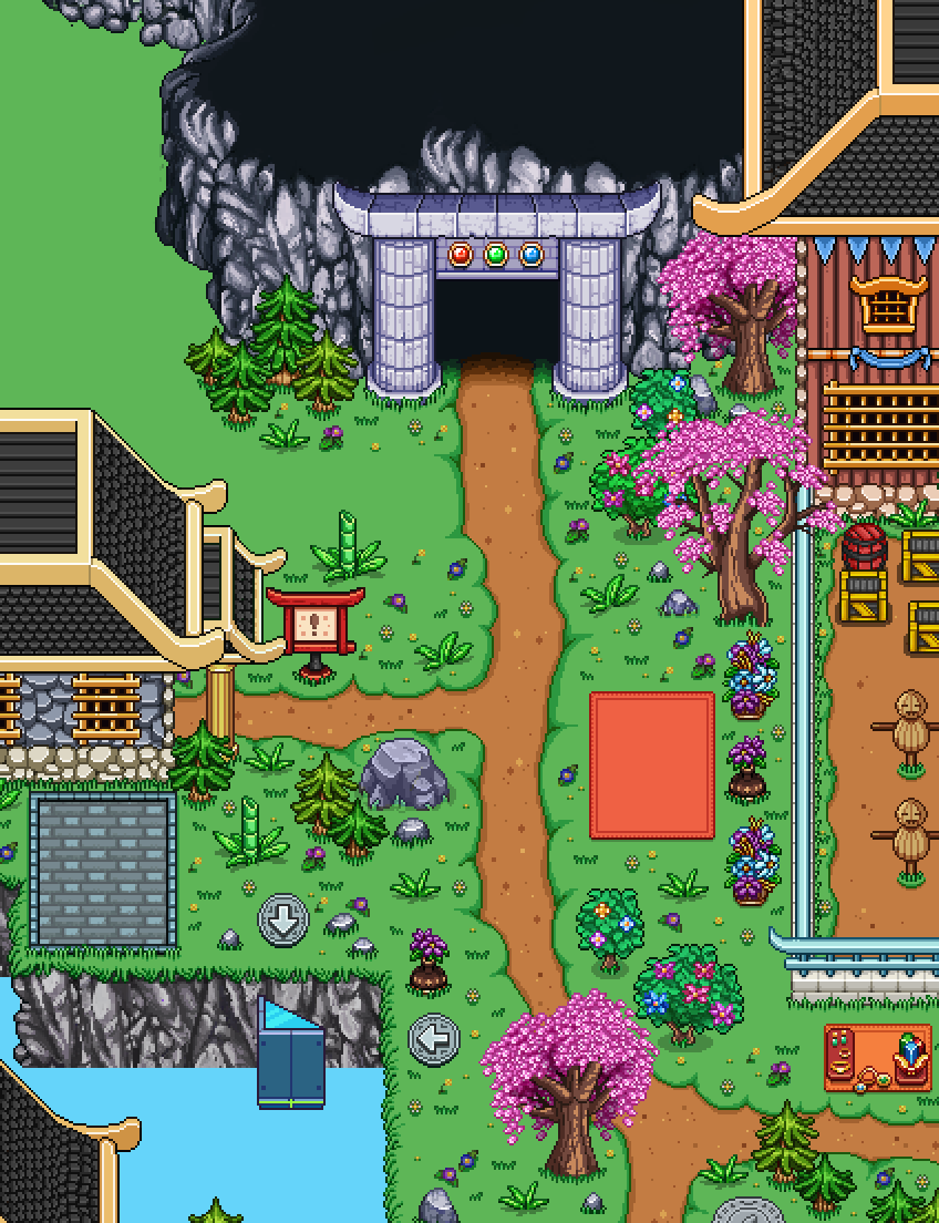
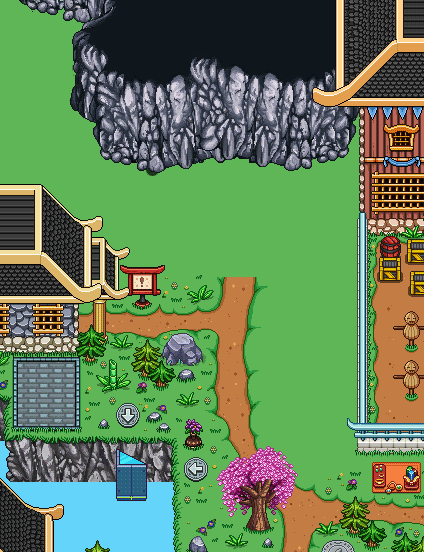
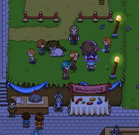
As for Arcadia, now that the first stage of the Arcadia is done – that is, the main buildings – it’s time to take a look at it and see where things can improve. As a reminder of what things looked like where we left off, take a peek below:

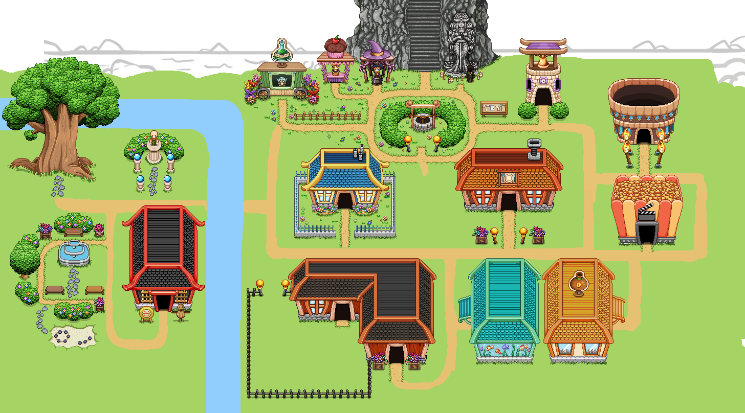
As you can see, not a lot of details or even finished pathways. The reason for this is that I wanted to be sure all the distances felt nice when actually inside the game, after the main buildings were properly made.

To check this, Teddy uploaded the background into the game and we could run around as if it were a real map, only without any colliders or the ability to actually go inside any of the buildings. While doing this, we did feel like the distances are fine, but we came up with a list of other changes which will be what I’ll be working on next:

* The map’s size will be increased in each direction. The reason for this is not so that there will be more room for the buildings, but rather so that more of the edges can be seen, such as the background that will be painted in the top part of the map, or the woods that will serve as the edge of the map.

* The Clock Tower will get another floor and I’ll remake the clock in its middle part to become a lot bigger and detailed enough that it will show a different time depending on if it’s daylight or nighttime.

* The Arena will be reworked: we’ll make it a lot bigger, to make it feel epic enough.

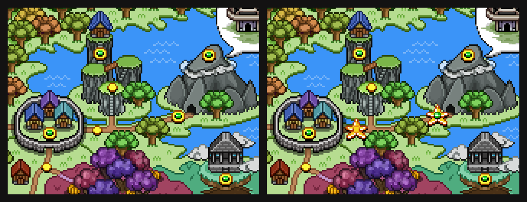
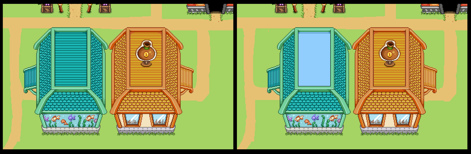
* The Aquarium and the Bank will both be moved slightly to the right, aligning the path to the bank with the path to the cinema. This to make a little more space between the farm and the Aquarium.

* The top, middle part of the roof of the Aquarium will be turned into a pool of water, where silhouettes of fish can be seen once you start catching some!

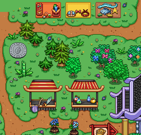
* The benches in the fountain/garden area will be moved a bit higher, to make more room for whatever characters might find themselves sitting there in the future!

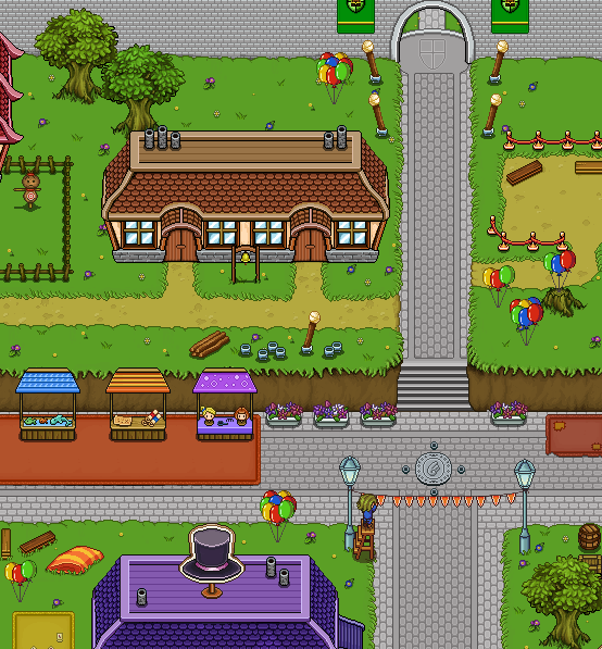
Along the way I’ll also start making the proper paths and decorate the areas with flowers, fences and other small things. Already, we feel this place is a lot more vivid than the old Arcadia was, and by the end of it it’ll hopefully be a truly cool and polished place :)

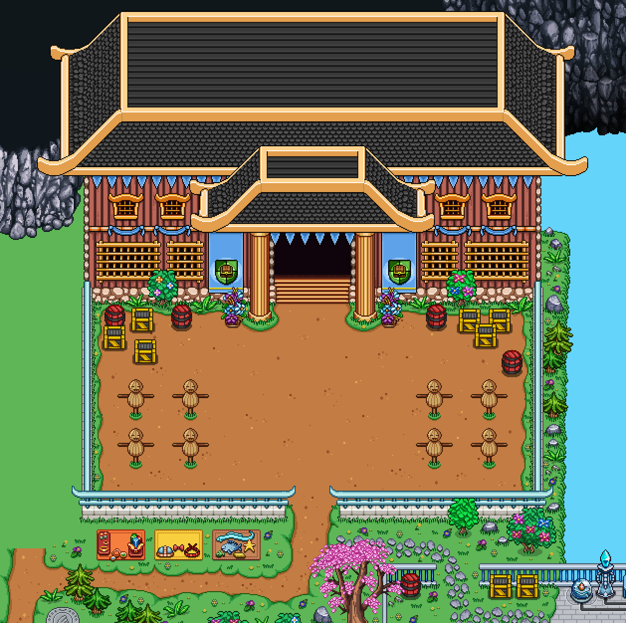
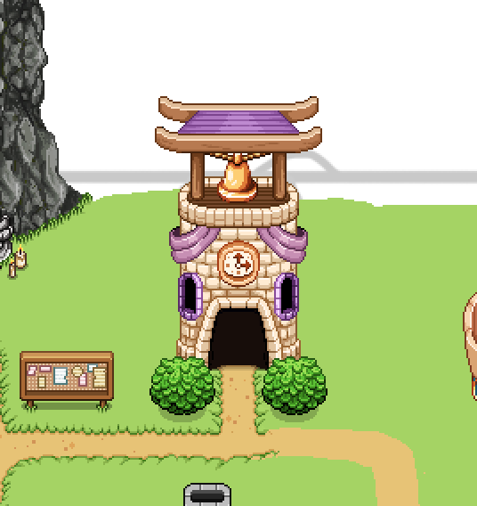
Now, time to fix those things! First up, the clock tower:

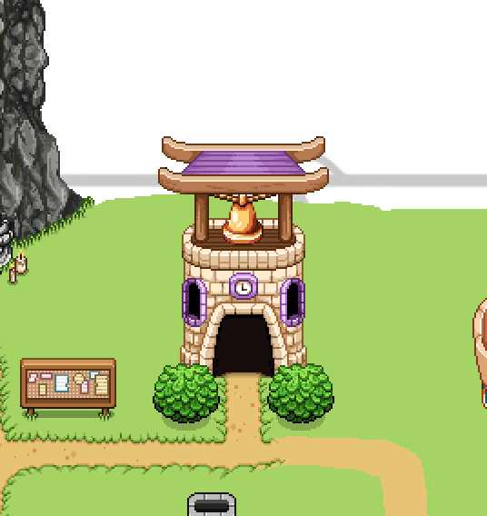
As some of you mentioned, it’s a little short, so we’ll make it slightly longer (though honestly, not by much: we still want the bell on top to be clearly visible when you enter the building). We also wanted to make the clock bigger and more detailed, so that when you change what time of day it is, the clock will change as well. Also, some silly decorations, because why not:

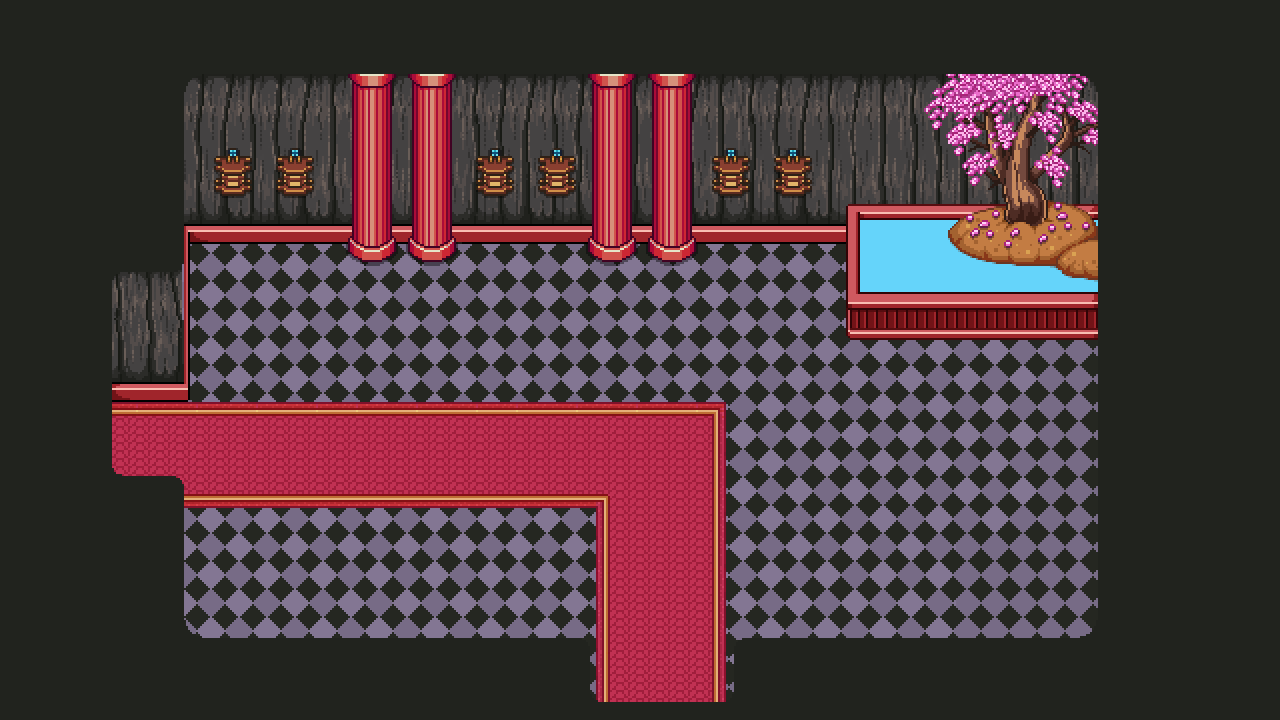
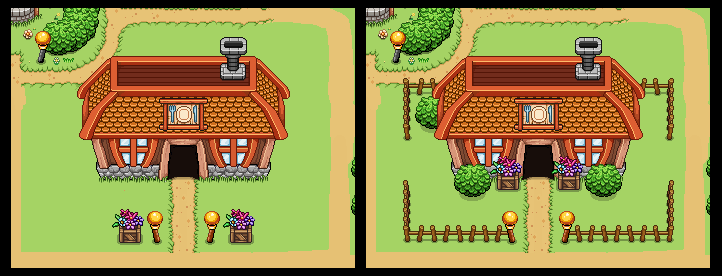
Next up, some minor detail additions for the Cinema and Inn, adding some fences and decorations. Proper grass, flowers and further details will be added once this second iterations of town is completed:

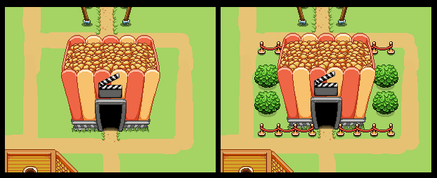
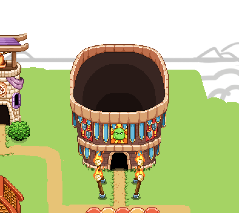
Moving on to the Arena, we decided to make it larger (and in turn, more detailed) so we made the top part of it higher, and the whole thing wider. For decoration, we added a few posters showing upcoming challenges or fights to take place in the arena. I mean if they don’t advertise what kind of stuff goes on there, how will the NPCs of Arcadia ever get interested enough in going? Gotta sell those tickets!

And here’s the new and improved, slightly bigger arena:

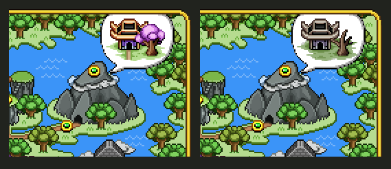
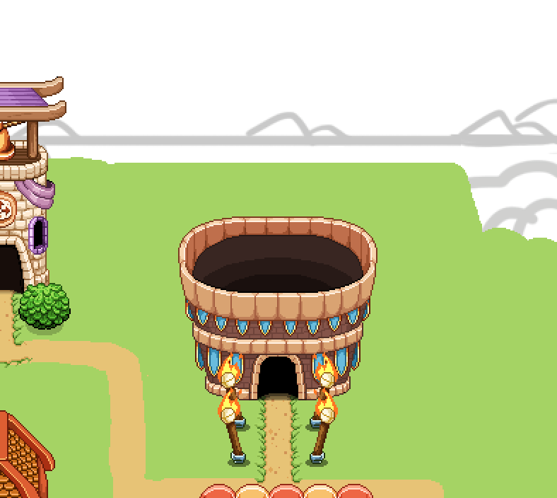
We’re also preparing the Aquarium change(s)! First by moving it and the bank to align with the cinema, and next filling the top part of the Aquarium’s roof with water. In the water you’ll see fish silhouettes once it’s properly added to the actual game:

Finally, increasing the size of the map:

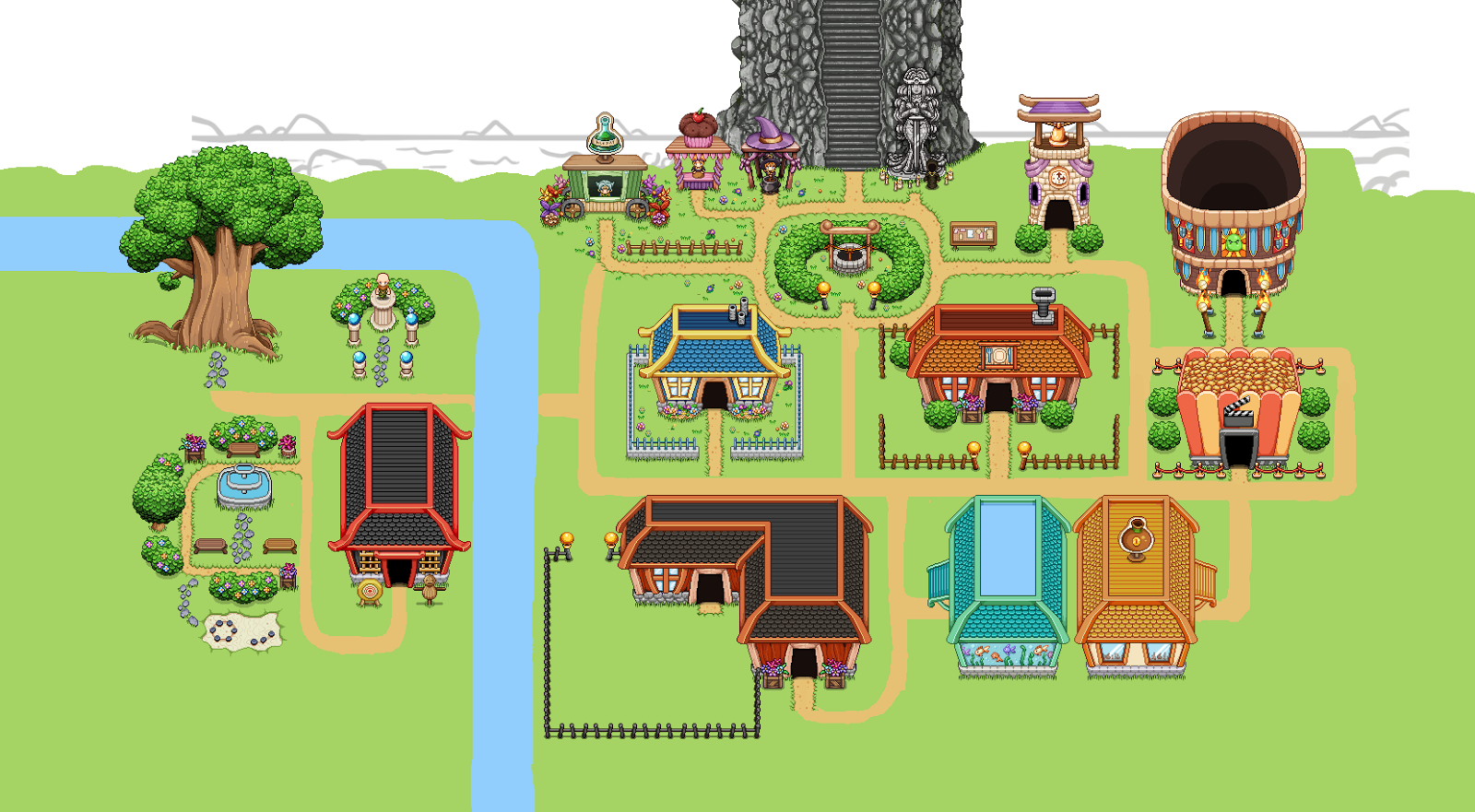
It is rather a lot bigger now, but most of the extra space will be covered in trees and only serve to not make it feel like the map is cut off too close to you. It does feel a little more epic if you can imagine the vast forest expanding around the town, after all!

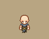
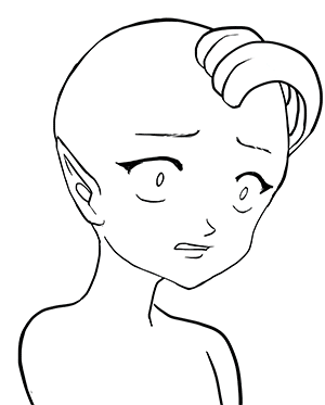
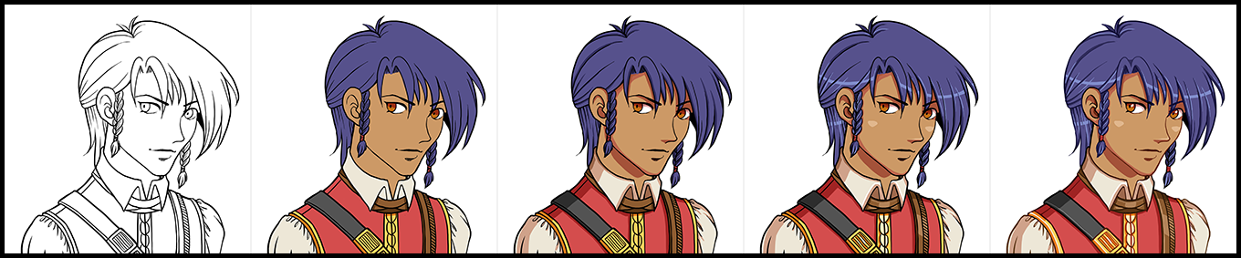
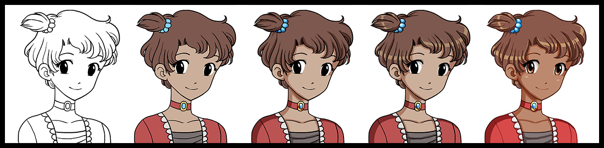
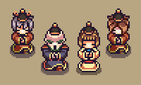
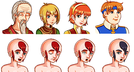
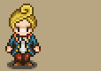
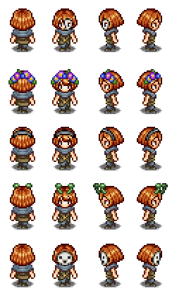
And to end things this week, I’ll throw in a brand new portrait!

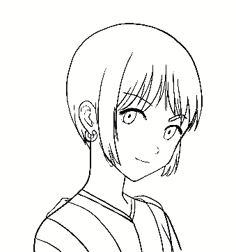
Since I got back I wanted to try a slightly different rendering style for the final sprite (particularly for the eyes), which I think turned out alright:

After a couple more weeks of designing, implementing, polishing and remaking, we have finally patched the frontline beta to include the new set of Utility skills! With the addition of these skills, we expect the game change a lot for some players, if not all – we suspect a lot of you have longed for something to use spare silver points on, and many of the Utility skills offer new paths of gameplay. In short, we can’t wait to see how you guys use them, and what the feedback will be.

While we hope it will be possible to balance all of this properly (we’ve done our best so far, but we’re always ready for your feedback on what’s broken and what may be too lame), we are aware that depending on your feedback, we might have to rethink certain things. For instance, if every single one of you hate a specific skill! Because of this, it’s important to let us know what bothers you (and what you like!) so we know how to proceed. As always, feel free to share your opinions on this patch and the skills here or on the forums!

And as always, to see the full patch notes, go to this forum thread. Now go ahead and try them out!! :D

.. and in the meanwhile, let’s take a look at what our previous workweek looked like, with the Utility skills coming together:

First up, some skill Icons, starting with the Focus skill (the very first frame of each WIP-animation shows our current placeholder icon made by Teddy, and the last frame is my reinterpretation):

Focus is the meditate skill which allows you to channel EP by holding the skill button, and allows you to cast a skill for free after a set amount of time. Since it’s EP focused, we decided to use a purple background (as the EP meter is purple).

Next, the Barrier, which in our game kind of looks like a bubble engulfing the character, and so I wanted to focus on that in its skill icon:

For the blink skill, we had a bit of a hard time coming up with something that would resemble the skill at all, in such a limited amount of space. The color of this skill was later changed to orange/yellow to avoid healing associations:

Next, Death Mark, or as it’s called now: Reaper’s Blade, fittingly using a skull (I modified the one used in the animation where boss-Vilya yells out insults at her minions in the second battle), and added some decorations based off of a sword behind it. Red, as it’s an offensive skill that will help you deal a lot more damage:

For the Stasis icon, I focused on the stasis effect, which grays out an enemy and disables them from combat. In this case I took a Rabby sprite, turned it black & white and painted some background patterns around it. In the final version of this, the whole thing is black and white, however, I added more color to the background later to make sure it stands out from when the skill is unavailable (at which point all skills are grayed out):

Finally, for Challenge (or as it’s called now: Provoke) I brought out boss-Vilyas insults once more! As you yell at the enemy you’re targeting, your own character will begin cursing at them in a similar way, so I thought it’d be nice to use the same graphic indicators for the insults:

And here’s the lineup:

In the end, we decided to divide the buffs into three, so they’re now divided into one that boosts you damage and crit, one improved version of haste (increased cast and attack speed) and a defense and shield boosting buff. The icons of these can be seen below, along with their “buff timer” counterparts:

Our reasoning is that separating attack/castspeed from the damage buff allows for more varied builds, and each of the buffs can be stronger than they could be if they buffed more things. With that in mind, we’ll likely cap each of the Utility skills at three silver points as well, with each level making a bigger difference.

Now that the buffs are in place, it’s time to implement the targeting system for them. As mentioned in a previous post, you’ll be able to buff your friends in multiplayer one at a time, with a system similar to what we use for the Frosty Friend: you start channeling the spell, and as you do so several arrows will appear showing your friends. Press in the direction of the friend you want to buff and the buff will land on them. To buff another friend, simply cast the spell again and press in another direction. In order to buff yourself, you’ll need to press upwards after channeling the spell – but only in multiplayer. In single player the buff will automatically target yourself.

Our first idea was to show each character’s face along with the arrows, but as Teddy started implementing this targeting system, he came up with a different plan: showing the entire characters, including what they’re doing:

While this wasn’t exactly what we had in mind from the beginning, it kind of grew on us as we tried it out. At the very least it makes it easier to know which direction you need to press for which friend, as you can check what they’re doing right now and compare it to what’s going on in the arrows, while our previous idea would make things a little confusing if you had several friends with the same face and hairstyle.

One might argue that this version is a lot more messy, and I supposed they’d be right: however, seeing as you’ll not bring up this interface a lot after confirming which direction your friends are in (most likely you’ll just quick-cast your buffs as seen below once you get a hang of it, anyway), we don’t view this as a too great drawback.

As can also be seen above, if you bring up the cast menu again after buffing everyone, you’ll see a timer counting down on top of each character. These timers show how much time is left before the buff runs out, which makes it easier saving up EP. Once the buffs run out an icon and text will appear above each character which indicating that this has happened (as seen below). This will only be visible to the one who cast the buff(s). You can always recast a buff before it runs out, so long as you have the EP to do so.

In the above GIFs, the arrows used are placeholder arrows (the Frosty Friend’s arrows, to be precise), with the character stuck randomly on top of them. Because we didn’t have any arrows that fit this purpose already, I made a bunch. The bottom image shows how we intend to place the characters on top of them, which is slightly different to how they’re standing on the Frosty Friend arrows as well:

The next step on our quest to implement the Utility skills was making the proper menu backgrounds for it! The old one was rather outdated, and in fact much older than the rest of the skill menu:

So the first thing we needed to decide was what kind of layout we want to use for these guys. Three in a row, or two next to each other with the buffs centered beneath them?

To avoid any confusion when jumping between the different levels, we decided to go three in a row, but make them slightly longer so they’d be more visually pleasing. Next, time for some decorations, beginning with a sword to don the offensive utility skill section:

For the defensive utility skills, I made an edited version of a shield that’s used in a different section of the menu (the talent area, to be precise):

Finally, for the buff section (which we haven’t given a proper name yet – might become something else entirely), some magic and glitter:

And in the end, here’s the new and improved utility skill section! At this point still missing the title texts and actual skill graphics, but that’s for Teddy to puzzle together with the engine:

In Fred’s department, the Utility skill stuff kept going on. First, the development of the blink:

From the beginning, what you see above is the effect we intended for the blink. However, because of how it looks when you’re not travelling in a straight line (for instance, if you blink diagonally), it became more of a hassle than we first anticipated. We could either rotate the effect in engine, which left us with a bunch of ugly artifacts, or we could have Fred make the effect in 8 directions – both options which weren’t too great.

So, we ditched the above design and decided to go for light globes spawning around the character instead instead:

In the newest iteration, the globes are a bit smaller than what is seen in the above GIF, but it sill gives a good idea of what it looks like.

For the Stasis skill, we still needed one more thing: an indicator of some sort above the enemies as you target them, before you unleash the skill. Fred came up with a bunch of suggestions based on our initial discussion, where we though it should either be a clock or an hour glass, indicating time stopping for the enemy in question:

In the end, we decided to go for the hourglass, and as an added bonus, Fred made a quick animation as you unleash the spell on an enemy: having the hourglass either turn of shatter as the skill lands. While we liked both ideas, the shattering hourglass is the one we’ll use in the game for this skill:

The Focus skill, which allows you to regenerate EP faster, got a new indicator appearing beneath the character:

The purple lines serve as a timer, of sorts. If you channel the spell until all four lines appear, you’ll be able to cast the next skill free of EP. We’ll also have a different channeling animation for this skill, possibly where the character is hovering above air – but at the time of writing this (which was before the patch) we’re still uncertain whether this will be available in the initial patch, or if it will be added in one of the many upcoming bug fixing patches once you start trying out (and breaking) these new skills!

Finally, a little sneak preview of the work in progress of that damage buff we’ve been talking about:

We’re not 100% it’ll look like this once it’s done (could be a little too big for a skill that will be cast rather frequently), but it’s just a bit too funny not to show!

Now, I hope you enjoy the patch and come back to us with lots of feedback. Actually finishing all the skills seem like a big step closer on our journey to finishing the game as well, wohoo :)

Last week me and Teddy had full focus on getting the house building tools up and running, and I’m happy to say the patch is ready and has been uploaded!! Finally you’ll be able to be more creative with your house, adding new rooms and editing their shape or size in more detail.

The full patch notes can be seen here, and as always, we’d LOVE to hear your feedback on these new tools, anything that may be confusing with them, improvements to be made etc. Let us know! You can comment either here or in the thread above (or make a new suggestions post on the forums).

Last week, Fred was also gone on vacation, and since he returns tonight and the build tools are done (aside from some polishing and anything we learn from your feedback), our next move will be to get together and discuss the support skills! Yes, finally! We’ve put them off for so long, but with the game drawing ever closer to a finished state I guess it’s best we finally get to adding them before there’s no reason to use them anymore, right?!

We’d like to thank all of you for your input and suggestions in regards to them up to this point, and we’ll consider each of them as we move on to iron out in which direction we want to take these spells. Again, though, it’s unlikely there will be any kind of healing skills, but most of you are used to the thought of that by now! It’s a cool skill to have, but we’ve made the decision it won’t be available in Grindea (unless you’re a certain NPC) for a variety of reasons I don’t think we need to rehash once more.

What we DO end up implementing we’ll only know after tomorrow’s meeting, and will be disclosed in a future post!

Since I don’t get to do much for the support spells (it’s mainly Teddy implementing mechanics and Fred doing animations for them), I’ll return to focusing on the Arcadia rework and its new floors until the skills are properly decided and I can make icons for them (likely after some prototyping as been made). We’ll keep you updated!

FOR NOW THOUGH, let’s take a look at last week and the path to creating the tools you now have in your game:

In the first screenshot (above), we added a very simple way of being able to drag each wall tile down however far you need. At the point of this screen, it’s a very basic way of handling things: the darkness above each wall tile looks very square and unpolished, and the black outlines have actually been added manually in Photoshop as a visual test.

Since we don’t want the outlines to be completely black in the final game – it will look jarring next to some of the wallpapers – what we’ll do is have me make a 1 pixel wide line for each wallpaper, using a much darker version of its own color. This way we can also manually account for the lower part of the wallpaper being a different color. For the particular wallpaper above, this would mean the outline will be dark gray and dark red.

As a next step, we polished the darkness, and added a way to pull wall tiles upwards as well, as seen below:

If you’ve an eye for details, you’ll notice the corners aren’t as rounded as in the previous screen. The reason for this is that rooms with multiple extra corners (such as the one above) looked super weird with the smooth corners attached everywhere – it looked less like a house, and more like an organic shape. Even now, the edges might look a little bit too rounded, but I think this is a lot better, and I feel completely square corners would end up looking too flat.

Next step: attaching doors that connect your rooms. Each wallpaper will have its own door, and unfortunately as of now you won’t be able to mix and match between them.

When making the doors, we had two options regarding sizing: either making them 40 pixels wide, equaling 2 floor tiles – which honestly is rather small compared to most doors in the game – or going for 60 pixels / 3 floor tiles, which is rather huge compared to most doors in the game.

SO, I made a bunch of suggestions, the left ones being 40 pixels / 2 floor tiles and the bigger ones on the right equaling 3 floor tiles of width:

In the end, we decided to go for the smaller doors, as they don’t look quite as gigantic and it seems easier to fit in doors that are 2 tiles wide inside your house. It’s going to be a challenge keeping each door this tiny, but that’s what makes it fun too, right? Continuing on, I made one door for each wallpaper, both facing upwards and to the sides:

And now that those are out of the way, it’s time to return to something we haven’t touched in a rather long while… User interfaces! First, we need to get some stuff together so you can purchase the lumber that allows you to extend the size of your house and rooms!

And it all begins with a basic item sprite (you will be carrying the lumber in your inventory, after all), and a modified version for the shop menu:

Next, we begin sketching what the lumber purchasing interface could look like. Since lumber is a very different item compared to furniture, we wanted to keep them separate. Therefore, rather than being part of the regular sales, lumber purchasing will have a special interface, loosely based on the Nurse in Arcade Mode:

The main things of importance in this interface is how much lumber you wish to purchase (and how much it costs), how much gold you have, and how much each lumber costs at this level. We decided that after you’ve purchased a number of lumber, the overall price per lumber will go up. This way it’ll take some extra work (or rather gold), to get those huge mansion type buildings!

Once we were satisfied with the sketch I went ahead and made the rendered version, also featuring how much lumber you currently own, which we realized might be interesting to see as well:

Next up, the build tools menu! Gotta access those tool some way, right?

Every menu we design starts with a basic sketch, and in this case a messier one than usual! In the above screen, we were discussing various ways of making the tools available to the player, sketching as we went on. Our first idea was to merge the build tools with the hand tool, but we quickly changed it to be its own focused menu in the settings tab, where we could fit all of them – including the light settings, which would be slightly out of place otherwise.

Similarly to the shop menus, this menu will use buttons that allow you to enter each tool. In the above screen, I added some of the already made shop menu buttons to see what it’d look like if we used them as a base for the new bunch. Since the size in length fits well with the background and it’s edited to fit all font types in height, we decided to stick with these and just swap out the icons to represent each tool.

Next I began editing the background to make the buttons stand out more, as well as making room for the menu title (which as of now will be”Room”). The icons on each side of the band (on which the title text will be) will move with the text, so no matter the length of the title they will be a pixel or two away. We made it this way to make sure it’ll look as good as possible in the translations:

Then it’s all about making those icons, and doing our best to come up with images that fit with the tool and make them easier to understand. Can you guess what each tool means below?

The correct answer is, from top to bottom: Add New (room), Resize, Reshape, Light Settings, Clear and Delete!

Add room will create a ready room with a door that you’ll be able to place on the wall in the room you’re currently in. Resize will replace the current resize system and allows you to pull at any of the walls, making the room longer in that direction. In Reshape you can pull down (or up) walls to change the shape of the room, and Light Settings will replace the current light setting – after you press the button, it’ll allow you to change the percentage. Clear will clear all furniture from the room, and Delete will, naturally, delete it.

Since this will be the new settings menu, you might wonder what will happen to the Save and Load options. They will remain in their own box, beneath the above Room settings (you might have to scroll down to access them). These are designed much in the same way, and will work just like the Light Settings button: after you press their buttons you’ll be able to edit which slot you want to save/load into, just like before:

And now, some work in progress gifs showing the early stages of the build tools:

First up, the add new (room) tool, seen above! The cost of the room will be shown in the middle, and you use the arrow keys to decide where to place the entrance.

Below, you can see the prototype for the resize tool, where you use arrows to first select which wall you want to make bigger, and then keep pressing the arrow key in the direction you want it to increase. As you do this, the amount of lumber needed to complete the action is shown. Right now it displays with a minus sign, while the add new room does not, but in the end they’ll both use the same format.

You’ll be able to pull at the walls however long you wish even if you cannot afford it, but you won’t be able to confirm your edit unless you have enough lumber. The reason for this is so that you can try making the room the size you want it and see how much lumber you’d need to make it that big before you go purchase more at the Carpenter.

Finally, there’s the reshape tool, where you can edit the inside of the room. Pulling down (or up) these walls don’t cost anything, so you can redesign the shape of your room freely!

In case you missed it, the housing patch is now up and running, so if you haven’t tried that yet, go ahead and test it!

The initial feedback seems very positive, and I’m actually surprised to see how many of you seem to really enjoy building your houses! The interiors that have been posted all look great and so creative, I didn’t even know you could make such cool layouts with the things we made so far. Thank you for that all of you! We’re still going to introduce a ton of new pieces of furniture, of course, and we’ve already gotten a ton of cool ideas based on your suggestions! If you have any more ideas for housing and what to do with it, please go ahead and let us know by commenting or posting on our forums!

Now, we’ve decided that we do want to further improve the housing system – specifically the layout – and we’d rather do it now while it’s fresh in our minds rather than sometime in the future. Since we estimate the development time will be more or less the same between creating pre-designed layouts or having you guys make those layouts yourselves, we’ve also decided to go for the the later, allowing you more freedom in your house building endeavors.

This of course means a whole new set of design decision that needs to be ironed out before things can be implemented properly. For one, we need some kind of build tool where you can edit the walls, pull them down or up and change the size of each individual room. This will be a challenge in itself, but will have to wait until the system runs properly (Teddy has already started working on this).

Second, we had to discuss whether increasing your house size would be completely free or something you pay gold to do. The idea we came up with is that each tile/square in the house represents a number of “Lumber” (might change the name later). This means that as you expand your house you’ll use up lumber, but should you make it smaller again, you’ll regain them. You will be able to purchase the lumber at the carpenter store for gold, though we haven’t decided how expensive it will be yet.

As now, there will be a minimum number of tiles each room can be, but you’ll have a lot of options in terms of the shape, since you’ll be able to move each wall tile up or down. While this system will need a lot of fine tuning, I think it’ll be great in the end!

As for the general feedback we’ve received since the housing launch, two requests stood out above the rest: bookcases facing sideways and chairs facing upwards!

The reason we didn’t include sideways-facing bookcases was, honestly, because we thought it looked boring and we thought nobody would be interested in that anyway. After listening to your feedback, we know we were wrong, and agree that there’s definitely uses for them – and so they will be added in an upcoming patch!

Along with the bookcase update, there will also be chairs facing upwards, so you can put chairs in all directions. We always intended to include these, but for some reason, we kept forgetting to actually make them. Oops!

As per request, there will also be a style for the female statue without the moss, as pictured below:

As you can see, there’s also a bunch of beds in that picture, and you might wonder why. Well, we’ve had a discussion about the perspective in the game and whether some items look better in their correct form or not.

You see, the vertical beds that are currently in the game are wrong according to the perspective – they are much smaller than they should be, compared to the horizontal version – and Teddy suggested we should correct it since it was something that bothered him as he was flipping between the two.

When I took the above screen, I had started fixing the vertical beds, but something felt kind of off. I asked Teddy to upload the Pumpkin Woods bed so we could test it and compare it to the old, smaller version.

Turns out we ended up preferring the smaller one, even though it’s technically wrong. For some reason, the beds end up feeling huge when they’re in their correct size, and it actually felt a lot worse than flipping between the original ones. I will still fix two that felt a little too small, but the rest will be kept the same, and the “fixed” versions will go to the trashcan!

Another thing that will be added is the !-mark seen above. It will appear above important notices, and serves as a warning of sorts. Or just to make the boxes a little more interesting-looking, if you will!

We also decided to do a bunch of fixes to items that didn’t properly fit within their tiles/squares, making placing them in a house rather awkward. First up, the beer keg, which has been changed to a bigger version. In the original, left version, it was simply too small and left a lot of space on each side. Making it even smaller (to fit a single square) wasn’t an option, so instead we decided to make it a lot bigger. It now takes up 4 squares, and while there’s still some space remaining, there’s not nearly as much of it:

Next up, some of the Temple of Seasons bushes, which used to take up about 1.5 squares, also making them very annoying to place within your house. For these, we decided to make them smaller instead:

This flower crate also got a smaller version, which now fits a single square as well:

The Pumpkin Woods bench and chair, which weren’t pictured above:

We’ve also started working on a new object, which is a weapon stand where you can place your 1- or 2-handed weapons to show off within your house. In the top left corners of the below picture, you can see two of our iterations for the 1h version. In the end, it’ll be something closer to the right one, as it shows off the weapon better and feels more balanced:

In semi-related news, another thing that will be included in the next patch is the long-awaited feature of being able to skip quests you previously finished in a multiplayer session! Before this patch airs, you’ve had to redo every single quest in single player, regardless of how far you got with your friends (unless you were the one hosting). Now, you’ll get a notification about having completed any given quest in a previous multiplayer run, and the option to skip to the end of it:

As for Fred, his focus has been more enemy animations, as well as laying the groundwork graphically for those weapon stands that will feature any weapon of your choosing as a housing item!

In order to make the weapon stands work, Fred selected a frame from one of the attack animations featuring each sword and edited it to fit the weapon stand sprite. He also had to add a hilt to each of the ones that needed one, since he never made on for the animations: the main character’s hand typically covers where it would have been.

And as for the enemy animations, things are moving forward with the desert enemies and in particular with the Mrs Bird enemy:

Finally, there’s another portrait for the upcoming desert town! A winter fae, to boot – Talk about getting out of ones element!

This poor guy has been dragged along to the desert by a summer fae friend. How cruel! He doesn’t particularly seem to enjoy the heat, does he?

This week we uploaded another patch to the frontline beta, featuring a bunch of smaller updates! The biggest changes, from the patch notes:

World Map Completion: Based on a suggestion on our forums, we’ve added completion tracking for the World Map! It tells you how many cards, drops, fishes, quests and secrets you have yet to find in any given area. This should help people figure out what it is they’re missing for that juicy 100 % completion! Note that the Achievements and Crafting completion is still tracked via their own menus.

Damage Numbers: The new default setting for displaying damage numbers is “Composite”, which turns your damage into one big number per enemy instead of many small numbers. We did this change mainly because some builds dish out so many hits that the old damage numbers cluttered everything, and in multiplayer this happened pretty much regardless of builds. It also makes damage over time a bit more readable, as well as how much damage a flamethrower or blade flurry cast actually does in the end! For people unhappy with this change, there’s a “Classic” option that mimics the old style, as well as an even more streamlined option called “Minimalistic”, and of course… an option to turn off damage numbers completely!

HP Bars: Enemies now have HP bars above their heads by default. These appear after an enemy has taken damage, and fade away after a while if no new damage is taken! Also, low HP allies in multiplayer also have their HP displayed above their heads. Both of these types of HP bars can be disabled, or set to always appear if an enemy or player is below full HP.

There’s also the accessory shop, among other things (which we already began preparing in last week’s post), and a bunch of new characters!

Joining his sister in the store will be this young fellow! Yes, it’s a guy, you know the drill, Vilya can’t draw guys… though I think they do look a bit manlier now…maybe (ignoring the braids)??

01-wip

Anyway! Being the heir to their father’s business, he’s sick and tired of the boring stuff and would like nothing more than to become a collector. Perhaps there’s some way you can help him? We actually haven’t decided on any quests surrounding this family but it would be pretty cool :)

02-sprite

There’s also the father of the accessory store’s shop keeper and her brother! This is one famous merchant, visiting to check up on his daughter who has moved abroad to open up a shop of her own:

01-wip

As mentioned before, he’d like nothing more than for one of his children to take over his business, but with the daughter setting up a store of her own and his son’s lacking interest… Whatever will become of it?!

02-sprite

Now, remember the person entertaining a bunch of artifacts in the first part of Tai Ming?

01

Well, they’re back! Only this time in the second zone! Some of the artifacts have been replaced, and this Helmet appears instead!

02-wip

Not much is currently known about Helmet, but I’m quite sure Teddy has come up with some awesome dialogue for this guy (or girl). I mean, life has to be kind of cool as a helmet, right?

03-sprite

…Right?

Now, as always before a patch, there’s a bunch of smaller things to be edited or fixed!

First up, the accessory-siblings. We adjusted the skin tone of the brother slightly to make him fit in better with the rest of his family, and changed the hair color of the shop owner girl for the same reason:

accessorybrother

accessorysister

We also played around with the Accessory shop title, which previously was called “Accessory & Co” but is “Ruby’s Rubies”. Our current favorite (and the one who made it to the patch) is the middle one:

accessorytitle

Next up, we wanted the Accessory shop to stand out a bit more, so I was tasked with changing its colors! Below is the previous version as well as two color alternatives for the shop. We’ll probably go for the standard wall color, though in the future I might go back and edit the houses in Evergrind City in general.. Who knows what colors the walls will end up having then?

Before:

accext01

After, version 1 and version 2:

accext02

The ruins in the west needed their own title to appear as you enter the area as well as a name! We settled for Ancient Ruins for now, subject to change if we come up with something else… :)

ancientruins

Some of you noticed the chest closing in the present after you opened it and the water is low. Fear not, it has been solved – the chest will now remain open. Though where did the plants go? :o

chestinrubble

Then, since a flashback scene with Mana and the children (Zhamla and Tessen) has been added, so I got to make a bunch of new expressions for our favorite nanny! :)

mana

Finally……. Back to the third Tai Ming map and that old shrine!!

01

Aside from being a place to battle enemies in the present, this room will also hold another flashback orb, with the people of Tai Ming enlisting the help of the Flying Fortress crew to deal with a certain threat.

Since I don’t know exactly how much of the room will be shown in the flashback orb yet, I’m keeping the past version quite bare for now. I’ll probably add more decorations once I know where and how the cutscene will play out :)

02

Next week we’ll continue working on the third part of Tai Ming, and since the holidays are coming up and we’ll spend some time apart we’ve begun having more design meeting so everyone knows what’s coming next in the game! For those cases when we want to work but can’t get a hold of the others to ask questions, you know. Therefore, I expect the next two posts (or so) will contain more design talk and mentions of upcoming features…. But we’ll see :)

This week we continue to prepare things for a mini-patch adding the new features we talked about last week (new damage numbers etc)!

Remember the Accessory shop from the last recap? Well, someone has to run it! Time for another portrait~

01-wip

This girl comes from the Merchant Isles and has moved to Evergrind City to open her Accessory shop! Her father and brother will be visiting as well, checking out her new business, so they will be upcoming portraits later on :)

02-sprite

Last week I also mentioned adding some stuff to the world map. A big thanks to Own who came up with the great idea in this thread :)

So, for a long time now we’ve wanted to add some things to the world map in order to give more clarity for people wishing to 100% the game and as a general incentive to explore each area a bit more thoroughly (if you see how many secrets you have left you feel more inclined to find the rest, right?)

map01

So anyway! We have two sets of additions. First, a bunch of icons on the left side, indicating (in order) Enemy drops, Cards, Quests, Fishes and Secrets. Next to these icons will be a counter showing how many you’ve got vs how many there are (for example 06/10). These numbers are map specific and will change depending on which part of the map you’re hovering over.

The second part is the pet and map counter in the lower right corner of the map, indicating how many pets and maps you’ve found vs hos many there are. These are global and will show the same number regardless of which area you’ve currently selected.

We also plan on adding a percentage next to each area name, so in the case above, it would say “Evergrind City 48%” indicating I have achieved 48% completion of said area. As some things get added in patches or you unlock new quests as you progress through the story, it will be possible to get 100% on one area, only to have it revert back to say 70% as new content gets unlocked. When this happens you’ll get a notice letting you know your map has been updated, and there will be a “New” sign above each part of the map with new stuff to do/find :)

Now, with the world map expanding and new areas being added, it’s time to rebuild and add to the world map :D

First of all, it’s time to rebuild some of the puzzle pieces that make up the world map. These will be changed further as we go along and add the desert map & the maps past it. But first things first! This time, it’s the upper left corner that has been adjusted.

Before:

puzzlepiece01a

After:

puzzlepiece01b

Next, time to take a look at what happens beneath those puzzle pieces… Previously, we hadn’t added the ancient ruins above the western Evergrind fields, so there was no need to include it on the world map. Now that it’s been implemented, no more excuses!

We also expanded the size of the winter area a bit in the process, filling out some empty spaces and making sure the ruins don’t look too big compared to their size in the game.

Before:

mapadd01

After:

mapadd02

But what about Tai Ming, you ask? Of course, the old town needs some kind of indicator as well! We’ve solved that by adding a speech bubble indicating the city’s past or present state (depending on how far along the story you are) once you enter the town for the first time:

taiming

Finally, I made the stars which will indicate when you’ve achieved 100% completion of an area. I thought my 200+ hour character Masken who I use to bug test things would have a ton of these stars, but turns around I’m a terrible Collector – no stars for me :(

stars

How many will you get once this gets uploaded to the beta? :D

Finally, a brief return to the third Tai Ming zone! The exit/meeting room in it’s present state:

exit01

It’s always fun painting broken glass and vases, so I got to have some fun with this! Also had to split the table in two, so the flashback orb can be placed in the middle, showing everyone around the table!

exit02

Also, no enemies in this room so no problem having a bunch of props lying around :)

Hello guys!! This weekly recap will be a little different, to say the least! I (Vilya) had to go home to my hometown for a funeral last week, so I haven’t prepared anything to show on the blog. But rest easy, things have kept moving on in the Pixel Ferrets office anyway!

While Fred continues to prepare a ton of cutscene animations for the third zone, Teddy has set his sight on fixing and adding a bunch of things we’ve wanted to include in the game for quite a long time!

First up, and perhaps most importantly – new damage numbers! We’ve totally revamped the way these work. Take a look below for the old version:

damage_old

And now, the new version:

damage_new

So a bunch of things have happened here! First up, there will be tiny numbers showing how much damage you make with each hit, and a big number showing how much damage you’ve done in total within a limited amount of time! So long as you continuously damage an enemy this number will continue to increase. When you crit, the damage text flashes and there are pretty stars flying about! We also have plans to have the damage number increase in size the longer/bigger your combo is, and add some smaller stars to the crit-effect as well. But all in good time…

Another thing you might notice in the above GIF is – yes – Health bars above the enemies! Wohoo! I’m personally very happy about this update, as it makes hitting enemies much more satisfying when you can see their hp dwindle. True, you could do so before by checking the lower right corner, but it’s just not as effective (at least, I kept taking damage while doing that) or as satisfying. The health bar will appear once you hit an enemy and disappears after a while after you quit dealing damage to it.

And YES, this means health bars in Multiplayer will be a thing! You’ll be able to see the health bar of your friends when they go under a certain amount of HP, so now you’ll know who really deserved that health orb, and who was the petty thief!

Teddy also added The Western Ruins to the game, so there’s one more “Sorry this area ain’t implemented yet” notice gone. You can’t actually do anything here yet, except look at the scenery and battle a few slimes, but hey! At least it’s not an annoying invisible wall:

ruins

Also, we’ve finally added the Buy Back feature, which we’ve talked about for a loooong time. Shady Merchant is now officially your go-to guy for buying back anything you’ve sold in the game, and the Accessory Shop has moved into a building of its own:

shady

accessory

Ok, ok. One more thing. In order to make it clearer when a quest has been updated, we’re adding this new feature:

questupdate

This is still an early work in progress, but the idea is that whenever a quest gets updated in some way, you’ll get a notice saying ‘Update’ above your head, after which the corresponding quest window will flash in the upper right corner. If you’re currently tracking another quest, it’ll fade back to that one after some time, and if you don’t track any quest at all it’ll simply fade away. This is all to make it a bit easier knowing when you’ve done something that change the objectives of a quest, or if you’re tracking another quest and ‘accidentally’ make progress in another, so you know what’s going on.

We also plan on doing a ton of improvements on the in-game map before Fred is fully done with all the animations needed to implement the scenes in Tai Ming’s third zone! There will be a ton of helpful trackers there, showing you exactly how much you’ve got left to do before achieving 100% on each area. But that’s for another post!

Before saying bye-bye today, here’s one of the few non-spoiler animations Fred is able to show you guys. Behold, a bunch of praying priests:

praying

Stay tuned! :)

Hey guys! It’s me, Vilya, again! I’m the one who usually writes these blog posts, but as I’ve been gone for a little more than a week taking care of a critically sick cat, Fred took care of the last two recaps.

Since we all used to live together (me, Teddy, Fred and the two cats), and we still get together in the same apartment for work every day, the cats are very dear to all of us, meaning it’s been a tough couple of weeks. BUT, good news, Link the cat seems to have stabilized for now after a super serious and seemingly random bout of severe anemia, which had him hospitalized for over 5 days at one of Sweden’s biggest animal hospitals. He’s still eating a ton of medicine but he seems to get more and more energetic every day, so let’s hope he makes a full recovery!!

We’re officially back in the office and have been working as usual for a couple of days, so things should hopefully be back to normal unless something else happens! For this post, let’s take a look at some of the things we did before going away, which didn’t make it to a recap yet!

First up, continuing on Zone02 we have been adding the ancient version of the collector’s HQ:

BG-HQ

Here you’ll get a quest or two that need to be finished before you can continue your adventured deeper into this mountain village! There will be a bunch of ancient collectors sparring here as well, which should help making the area feel alive :)

Oh yeah, and those shops below the HQ?

Shops01

We decided to make them actual shops so you don’t have to travel all the way back to Evergrind in case you missed buying something there! Here’s their interface graphics:

Shops02

I also went ahead and connected the road leading from the HQ and the building to the left with the exit to the third and final Tai Ming map, meaning the only major thing left to finish on this map is a gravesite in the northwest:

BGExit

BGExitGIF

We also decided we wanted the bamboo decorations to be destructible, and in a pretty fun way at that! Instead of destroying the whole thing at once, you’ll have to whack ’em down, piece by piece. As such, they are now made of several parts:

Bamboo

And when you decide to destroy them, this is what it’ll look like:

BambooGIF

Although we might add some additional effects, such as shaking of the sprite!

Finally, to mix things up, a portrait:

portrait

It was such a long time since I made portraits, but I have to get used to it quickly again! There will be a lot of NPCs in this village, after all :)

OK, that’s all for now, time to get back to work with full speed!!! Please stay healthy little cat, we have a game to finish! :D

You heard it, there’s one more festival post, but this could be the last one. What remains now is mainly for Teddy to put everything together, so hopefully we’ll have a prototype of the festival up and running sometime next week for our frontline users! :)

So what have we been up to this week? Well, first of all, Vilya finished the treasure cave you saw a preview of last week:

TreasureCave

She also made a bunch of new expressions for characters appearing at the festival:

faces

As well as creating a little space for candy, where she’ll sell candies to festival visitors:

Candy

She and Teddy also started working on getting the mini-games in place, meaning some simple interfaces:

FightMockup02

As you might guess, this particular mini-game involves hitting a button at the right time (when the arrow is near ‘max’), in order to hit the machine as hard as possible!

We also added Oak to the festival, along with some pets to entertain the kids of Evergrind City:

pettingzoo

And we’re also working on preparing the city for the festival, meaning once you get back to town after beating the Temple of Seasons, there will be some hints that something is about to happen:

pre-festival

We’re also planning on adding some additional NPCs working on getting this in order, which Fred is currently working on in fact!

Speaking of Fred, he has of course been busy doing flavor animations for festival goers as well! Here’s a few:

Gogogo

String

Hammer

See you again next week, with a post that hopefully will have some non-festival stuff! :)

Another week has ended, in which Teddy finally ha gotten around to work on the infamous cutscene! While there’s still a lot of work to be done, the groundwork has been laid and some interesting reveals will take place…

cutscreen03
What in the world could the Bag mean? Hang in there and you’ll find out in time!

Fred has kept working on stuff for the festival, mainly NPC flavor animations and the such to help the festival feel alive and bustling!

Balloon BellHead CottonCandy

Meanwhile, Vilya has been working on a bunch of different things, including giving the Shady Merchant a shop title of his own:

shoptitles

As mentioned before, he will start selling items you’ve previously sold to other NPCs, making it possible to buy back stuff you regret parting with. We thought a fun thing to do would be to increase the amount of items surrounding him as you sell more and more stuff to the other shopkeepers. Right now we’ve made 6 different steps:Merchant Progress

There’s also a bunch of new hats (and next week there will be even more!):
Hats

Vilya also made a bunch of icons for upcoming achievements, including getting 10 and 20 cards, as well as catching all pets & fishes (though the later two won’t be implemented until the game is done, as we’ll keep adding both pets and fishes until that point):
achievements

Aaaaaaand to end this post, there’s two more portraits:
06 - Finished Sprite06 - Finished Sprite (1)